Andy Warhol’s 1950s Album Covers
What? An article about album covers by Andy Warhol with no banana? Not even a zipper? It can be done, for the famed artist spent a good portion of his time in the 1950s creating album covers for classical and jazz music labels and artists. A decade before he was associated with the New York Avant-garde scene, the Velvet Underground and the entourage of celebrities surrounding his Factory studio, Warhol was honing in on his art with a very different style than the pop art realm he became famous for.
Warhol moved to New York City in 1949 after graduating from Carnegie Institute of Technology, now Carnegie Mellon University, in his hometown of Pittsburgh. As a beginner artist he had to pay his dues and seek work anywhere he could, but he went about it quite methodically. His friend Imilda Tuttle remembers a visit to a book and record store: “He just stood there and went through every record album, looking for record jackets he liked and jotting down the names of the companies that produced them. Then he went home, called up the companies, and said ‘I’m Andy Warhol, I’d like to do a record jacket for you.’”
1949 was the year Warhol created his first album cover, for Columbia Records. The project was commissioned by the New Museum of Modern Art (MOMA) and features early 20th century Mexican music conducted by Carlos Chavez. Robert Jones, art director at Columbia at the time, remembers: “I gave him three little spots to do for the corners of the standard albums, at $50 apiece. He needed money. I know that these little spots must have been amongst the first things he did, certainly in the first three to six months he was here.” Warhol used previously painted images of Aztec musicians featured in the MOMA concert program, rearranged them vertically, added a totem and abstract black marks, and placed his drawing on the left side of the album cover.

This cover is noted for the use of the blotted line technique, one that Andy Warhol use throughout the 1950s for artistic and practical reasons. The primitive print making method involved copying a drawing from a tracing paper to an absorbent paper, adding ink to the drawing and then transferring the ink to the copy. The process resulted in the dotted, broken, and delicate lines that are characteristic of Warhol’s illustrations. He discovered the technique by mistake, when he spilled ink during a transfer. He started to make multiple copies of each drawing with different ink applications and colors. This allowed him to present many options to a potential client, increasing the chances of at least one being chosen. Robert Jones recalls that when Warhol got the assignment for the Mexican music cover “Two days later he came back with a stack of drawings to satisfy the drawings we needed.”
Here is another album cover using that technique from the same year:
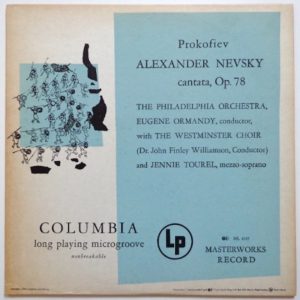
A few more album covers followed in the early 1950s, mostly for classical, easy listening and radio broadcasts. In 1954 Warhol created his first art for a jazz album cover, commissioned by Bob Weinstock, founder of Prestige Records. More importantly, this engagement introduced Warhol to legendary album cover designer Reid Miles, who is estimated to design 500 album covers over a period of 15 years. The album for which he entrusted Warhol to work on was the second that Thelonious Monk recorded for Prestige. The original plan was to feature a photograph of Monk on the cover, but Miles changed his mind and instructed Warhol to combine printed and hand-written letters.
Nine years before the Factory was established, this was the first time Warhol delegated work to someone else. He did not stray far from home and assigned the hand written portion of the cover to his mom, Julia Warhola. Julia, who immigrated to the United States in 1921 from Austria-Hungary, had an artistic spirit and enjoyed singing folk songs, drawing and making crafts such as embroidery and bouquets of hand-made flowers. In 1952 she followed her son and moved from Pittsburgh to New York City. An early influence on the young artist from a very early age, her skill in decorative handwriting is featured on the Monk album. Julia had to wait three more years before she got her own credit on an album cover – read on.
The first side of the album includes tracks recorded by Monk at Rudy Van Gelder’s studio in Hackensack. New Jersey in 1954. Here is a great track from that session, named after the studio location, Hackensack.
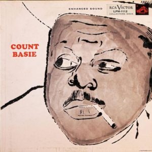
Warhol’s next jazz-related album cover was in 1955, this time for the RCA Victor’s release of a Count Basie recording. This is a historical cover, for it is the first time Warhol created a celebrity portrait, well before his much better-known images of Marilyn Monroe, Elvis, Mick Jagger and others. Although the technique is very different from the one he used later on, it too was based on a photograph, provided by RCA and used on the back cover of the album.
Count Basie
Warhol decided to focus on specific features in the photograph including the lines on the forehead, mustache and cigarette, and then applied gray wash for the skin color.
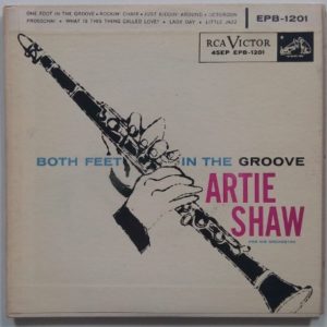
The following year one more album cover for RCA Victor showcased another staple of those early works, this time a focus on the hands of the musicians. The subject was Artie Shaw, the successful jazz band leader, with an album of recordings made in the 1930s and 1940s. Again using a photograph as a reference, this time of Shaw in 1941, Warhol ignored the main subject of the photo and only drew the instrument and hands. Notice also the great use of typography and its position related to the drawing.
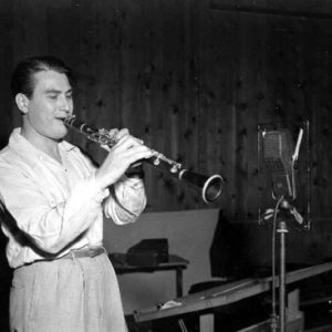
Artie Shaw, 1941
1956 and 1957 were standout years for Warhol and album covers, with a number of great works he did for Prestige and Blue Note. The first is the Prestige album Trombone by Three, featuring Jay Jay Johnson, Kai Winding and Bennie Breen. The album was previously released with a different cover, a wonderful Kafkaesque drawing by Mad Magazine artist Don Martin. On its re-release in 1956, Prestige engaged Andy Warhol for the second time, asking him to come up with an alternate cover. Warhol was inspired by an 8th century drawing of King David surrounded by musicians.
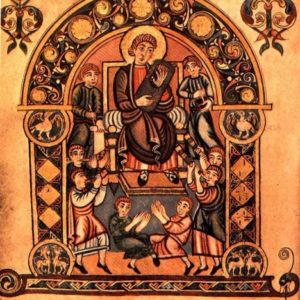
Keeping the same poses, hairstyles and rolled up sleeves, he created a drawing with India Ink, replacing the trumpets with horn sculpted from elephant tusks. Not really the same as trombones, but he had the artistic freedom.

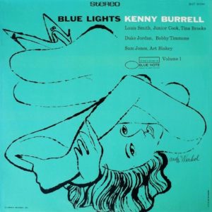
In 1956 Warhol also created one of his best jazz album covers, this time his first assignment for Blue Note Records. That year Blue Note started manufacturing LPs in the 12” format consisting solely of original material and asked Reid Miles to help design the new enlarged surface now available for cover art. Miles called on Andy Warhol and together they collaborated on a number of albums for Blue Note. The first was Kenny Burrell’s self-titled album, for which Warhol drew a close up of hands playing a guitar, influenced by the many photographs taken by label founder Francis Wolff. Henri Matisse is an influence here.

Another collaboration between Miles and Warhol for Blue Note yielded a cover for one more album by Kenny Burrell in 1958. This was a double volume set featuring the same cover with different background colors. It features a drawing by Warhol that matches perfectly the mood of the album, conveying class and music for an adult audience. Warhol was likely influenced by photographs of Hollywood pinup starlets from the previous decades, and he used the technique of foreshortening to show the full stretched feminine figure in perspective. At this point Warhol was a well-known artist, mainly due to his work in advertising, and he now got to sign his name on the front cover.
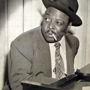
The last album cover we will cover (ha!) today is the first not to feature any imagery by Andy Warhol, spare cutting and pasting of text. It is also the front of the most unusual musical content in this article. Louis Thomas Hardin, blind since childhood, was a musician who also built a number of musical instruments made of wood and strings. Early in his career he named himself Moondog, after a pet he had growing up in Missouri, who used to howl at the moon. Unable to finance the transcription of his musical scores, originally written in Braille, he had no chance of commissioning his works and resorted to street performances. For over 20 years he used to stand on the corner of 6th Ave and 54st in New York City in a Viking custom, playing music and reciting poetry.
Moondog
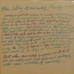
Moondog’s music cannot be categorized under any one specific style. A lot of it is percussive yet melodic, while other pieces incorporate street sounds and jazz musicians. In 1957 Prestige Records released the album The Story of Moondog, one of the most unique recordings to be released on the label.
For the cover, Reid Miles asked for the calligraphy services of Warhol’s mom. This time the album cover consisted solely of her work, a handwritten text of Stewart Preston’s poem about Moondog. This task did not come easy to her. Nathan Gluck, Warhol’s assistant in the 1950s and 1960s, recalls: “She would misspell words and start over again, and the writing would start small and get bigger and slant upwards. And finally Andy told her just to do it. Then he cut the whole thing apart and pasted it up so that it made a bit of sense.”
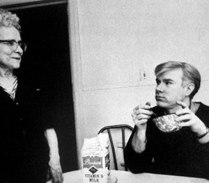
Andy Warhol with his mom, Julia Warhola
For the first time Julia Warhola received credit on an album cover, although she preferred to keep herself anonymous. Almost unintelligibly, on the right side of the cover below, the vertical credits read: “Calligraphy/Andy Warhol’s Mother.”
As the 1960s rolled in, Andy Warhol became increasingly interested in pop art. The Campbell soup cans, Elvis Presleys and Marilyn Monroes were still to come. The Factory, Velvet Underground and that Banana a thing of the future. But I still have a soft spot for his album art of the 1950s, a time when jazz albums cover design was an art form in and of itself.
Article written by: Hayim Kobi