October 2018 | Aurora Garrison
The remarkable career of Andy Warhol begins in the 1950’s in New York as a magazine artist, 5th Avenue department store fashion window store designer and commercial advertising artist. Intuitively, Warhol morphed his early successes in commercial art scene and revolutionized the art world by parlaying his considerable tools and unique accoutrements of commercial art into works of fine art. The art world would never be the same.
The bitten apple filled with colorful rainbow stripes was the official Apple logo from 1976 to 1997. Using this original image, Warhol covered the entire image with bright hues and drawn lines. His artwork transforms the dull, lifeless silicon chips of a computer into a living, vibrant icon of color, passion, potential and beauty. Bright lines and bold colors announce to the world that the Macintosh brand and the Apple computer are a revolution. Warhol makes computers sizzle with possibilities.
In his characteristic bold outline techniques found in his iconic paintings and sculptures like “Campbell’s Soup Cans” (1962) “Gold Marilyn Monroe” (1962) and “Brillo Boxes” (1964), Warhol indelibly inscribed into the art world a bright, neon Pop Art line: ABW and AAW. “Art before Warhol” and “Art after Warhol”. Warhol single-handedly turned the art world upside down with his iconic works that challenge art critics to find the dividing line between commercial and fine art.
“I just paint things I always thought were beautiful, things you use every day and never think about.” Warhol is reacting to the abstract expressionism of the 1950’s and frenetic drip-style art works like “Autumn Rhythm” (1949) and “Convergence” (1952).
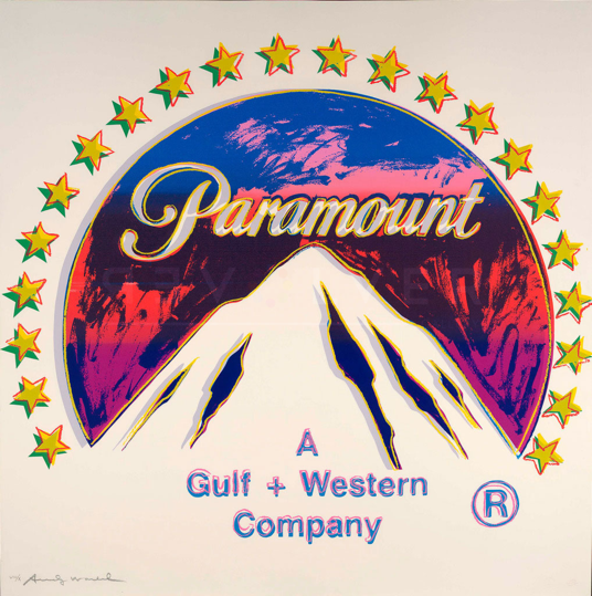
“Paramount” (1985), signed by Andy Warhol.
Warhol was fascinated with movie stars and films from an early age. In the 1980’s, he had a special interest in Paramount, where his friend, Jon Gould, was an executive. The first Paramount logo was made in 1912. At that time, the 24 stars encircling the mountain represented the 24 actors and actresses that had signed contracts with the studio. Warhol’s recreation the 1952 revised logo, whiting out the background, and cropping the logo just outside the circle of stars, fills the foreground with white, giving the image a three dimensional feel. “It’s the movies that have really been running things in America ever since they were invented. They show you what to do, how to do it, when to do it, how to feel about it, and how to look how you feel about it.”
In 1951, Pollock said, “It seems to me that the modern painter cannot express his age, the airplane, the atom bomb, the radio, in the old forms of the Renaissance or any other past culture. Each age finds its own technique.”
The 32 bombshells Warhol tosses into the art world of Pollack and abstract expression of the 1950s is “Campbell’s Soup Cans” (1962). Simply and succinctly, Warhol employs his commercial art talents, techniques and tricks and paints grocery store soup cans.
The chaos on the canvas of abstract expressionism is replaced with chaos in the art world. By 1964, utilizing the never-heard-before silk screen process for a work of fine art to create the “Brillo Pad” sculpture, Warhol drops the atom bomb on the art world: What is art?
So stunning are Warhol’s early 1960’s works of art, that contemporary art critics coined a new word for Warhol’s mold-breaking oeuvre—“Pop Art”. Warhol’s artistic revolution is complete by the mid-1960s. Armed with only common items found in grocery stores–Campbell soup cans and Brillo boxes—Warhol launches a cultural revolution following his artistic triumph. Most surprisingly, he knows what he has done:
“Once you ‘got’ Pop, you could never see a sign again the same way again. And once you thought “Pop’, you could never see America the same way again.”
In this tour de force, Warhol reverses his 1960s Pop Art success when he employed commercial art concepts into fine works of art. In “Ads”, Warhol brings Pop Art concepts, colors, techniques and themes back into 1980s commercial art, further developing his legacy where art can be discovered in both popular culture and advertising—upholding his proclamation, that after Pop Art, Americans “would never see America the same way again.” And he’s right.
Warhol confesses, “I was always a commercial artist,”. To emphatically prove his point, Warhol launches yet another artistic assault on the commercial art world.
Warhol’s Ads Portfolio (1985), consists of 10 original “ads”, is one of the mostly highly sought after collections in the contemporary art market. The images Warhol creates for the Ads Portfolio are taken from a cross section of industries: fashion, technology, automobiles, film, fuel, luxury brands, and confections.
Warhol was fascinated by movie stars and their celebrity status. This work is recreation of a Japanese ad for the 1955 film, Rebel Without a Cause. The subject is the famous actor James Dean, in a promotion shot for the film. Warhol, a Signiant director in his own right, knew the power and substance of movies: “People sometimes say that the way things happen in the movies is unreal, but actually, it’s the way things happen to you in life that’s unreal. The movies make emotions look strong and real, whereas when things really do happen to you, it’s like you’re watching television — you don’t feel anything.”
This series, commissioned by Feldman’s Fine Art, is one of the last portfolios issued before Warhol’s unexpected and untimely death in 1987. And the series in remarkable is range, scope and artistic execution.
The prints in the Ads Portfolio are particularly important works in Warhol’s oeuvre because these prints reflect his reinforce his recurring themes of consumerism and commercialism. In essence, this series is a visual kaleidoscope through Warhol’s life’s work.
“Blackglama (Judy Garland)” (1985) signed by Andy Warhol
For this piece, Warhol drew inspiration from the 1968 black and white Avedon portrait of Judy Garland from the famous Blackglama campaign with the tagline, “What becomes a Legend most?”. Warhol transforms the monotone photographic image into an indelible, electric blue iconic depiction of Garland, whose face is highlighted as if by the bright lights of a Hollywood film set. The glamorous celebrities photographed for the campaign, including Lauren Bacall, Bette Davis and Bridget Bardot, each received a Blackglama’s $8,000 black mink coat.
“Success is a job in New York”
After graduating in 1949 with a Bachelor of Fine Arts degree, Warhol jaunts off to New York to pursue a career in advertising. The advertising industry and Madison Avenue advertising firms in ascendancy. Jobs are plentiful and talent to sketch on blank, white art boards are in demand. And as the advertising business revenues skyrocketed, Warhol became one of the highest paid freelancers of the era.
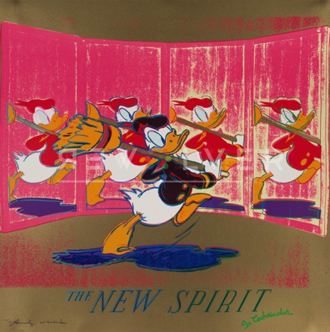
The New Spirit (Donald Duck) (1985), signed by Andy Warhol.
The image of Donald Duck is taken from a short film created by Disney for the U.S. government. The film’s purpose is to promote the benefits to the country of everyone’s tax dollars. Repeating Donald Duck’s picture makes him appear to be moving, just like in the original film.
One of the earliest commissions for Warhol’s commercial illustrations was with Glamour Magazine. He created cartoon drawings of women climbing corporate ladders that were attached to an article entitled, “Success is a Job in New York”.
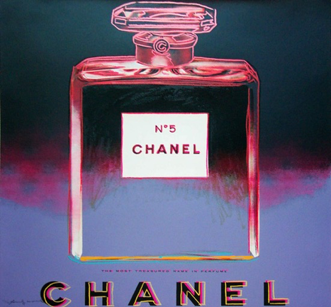
“Chanel” (1985), signed by Andy Warhol.
Warhol renders the classic, world-recognized bottle and logo in minimal colors, highlighting the square lines. The viewer can smell the mystery and elegance of the Chanel perfume from the wispy, airy floating lines and images bleeding through the clear glass bottle.
Over the next decade, Warhol would become one of the most successful, in-demand illustrators in New York. Warhol’s artwork was sought by agencies for luxury brands, such as Dior and Tiffany’s. Warhol was canonized for his special style with awards from the prestigious Art Directors Club for his work that appeared in publications such as Harper’s Bazaar, Vanity Fair and Vogue.
The work depicts Life Savers, an iconic American brand of ring-shaped hard candy. Depicting candy in cheerful colors, Warhol reminds the viewer of childhood and American innocence. The images of candy are accompanied by neon colored letters that read “please do not lick this page!”, contributing to the playful and multi-sensory effect.
Warhol recognized his own success, “Being good in business is the most fascinating kind of art. Making money is art and working is art and good business is the best art.” Warhol’s style held special appeal for the luxury brands who wanted their products associated with Warhol’s artistic style that was especially glamorous and alluring to their high-end customers.
Warhol reproduces a widely recognizable corporate logo for Mobilgas. The logos of the Mobil Oil Company were readily recognized by car owners across the country. “I just happen to like ordinary things. When I paint them, I don’t try to make them extraordinary. I just try to paint them ordinary-ordinary”, the artist once explained.
Other commercial artists in this era that were aspiring to become fine artists, like Warhol, were working alongside Warhol on Madison Avenue. However, sensitive to the societal restrictions of the times, they would use aliases to conceal their identities as admen. Always marching to a beat of a different drummer, from the very beginning, Warhol signed his ads. Today, many of these commissioned works are highly valued for the artistic style and historical place in art history.
“An artist is someone who produces things that people don’t need to have, but that he – for some reason – thinks it would be a good idea to give them”, Warhol summarizes art, ads, artists and admen.
And Back to Artist Again
As Warhol became recognized as a fine artist in the 1960’s, following his first gallery showing at the Ferus Gallery in Los Angeles in 1962, he continued to take commissions for commercial projects throughout his years as a successful fine artist. He never loses contact with the value of his commercial art and the value it has to his clients and their customers.
In 1985 Warhol was the Pope of Pop and his career was enjoying a resurgence on the market. In the Ads Portfolio, Warhol transforms everyday advertisements into colorful works of art, with unique character and distinct identity.
While many of the artists of the era were careful to hide their “daytime” jobs in advertising, Warhol did not kowtow to the art world’s elites that believed a commercial artist could not make fine art. Warhol said, “The commercial and the fine art are intermingled and kind of feed into each other all the way through my career.”
“Volkswagen (Lemon)” (1985), signed by Andy Warhol.
A grass green VW Beetle is set against a deep blue background, with text that alludes to the original advertisement tagline “We pluck the lemons; you get the plums”.
Warhol’s future success as a fine artist is evident from the beginning, as is his identity as an artist. “I was always a commercial artist,” he said shortly before his death in 1987, aged 58.


