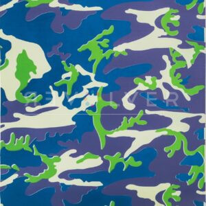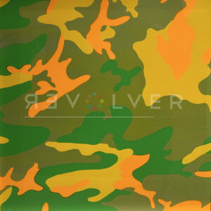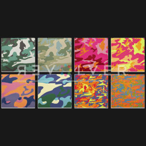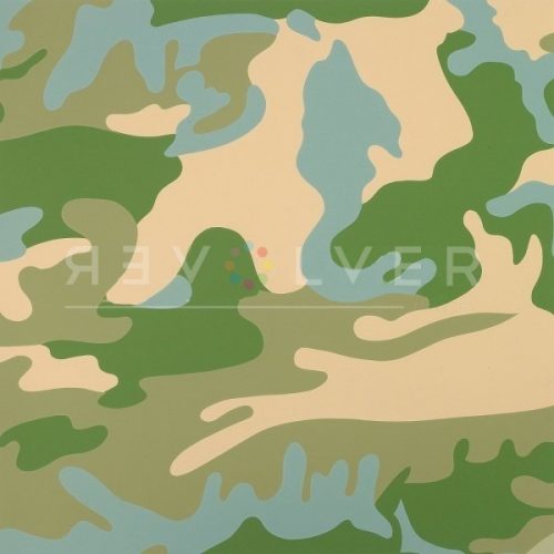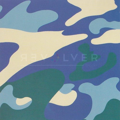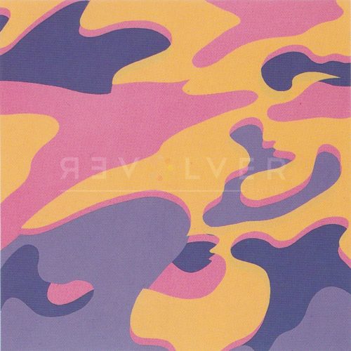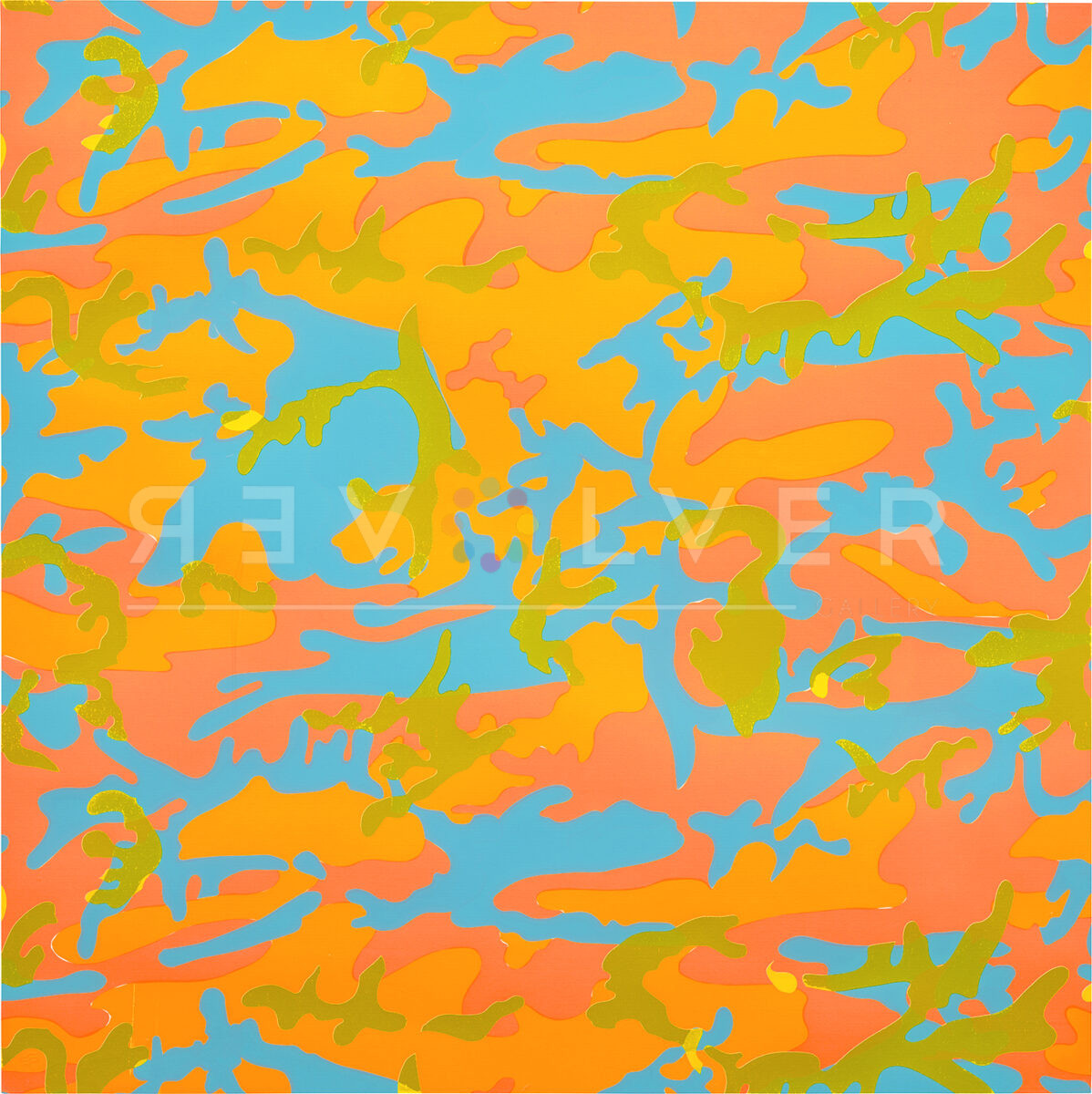
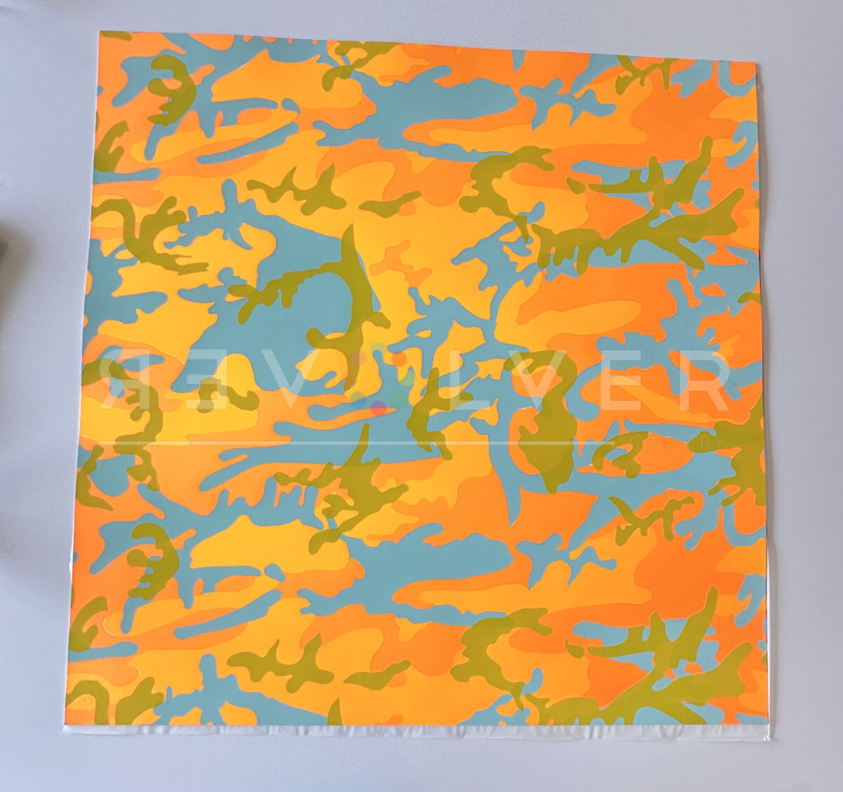
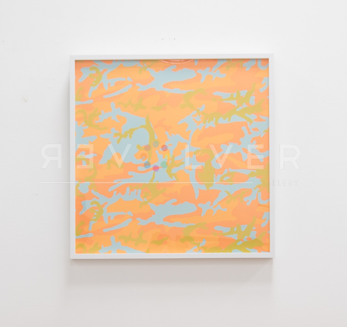
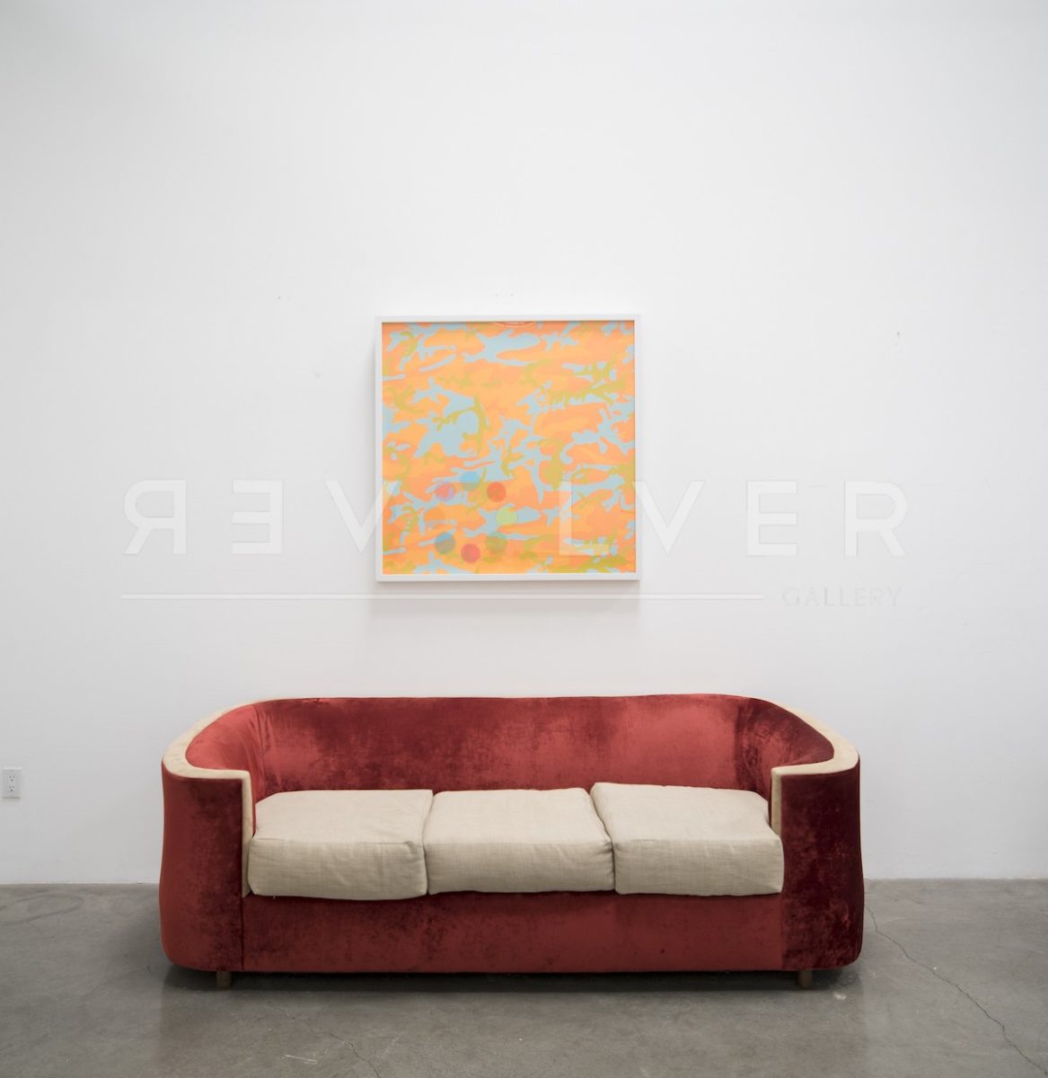
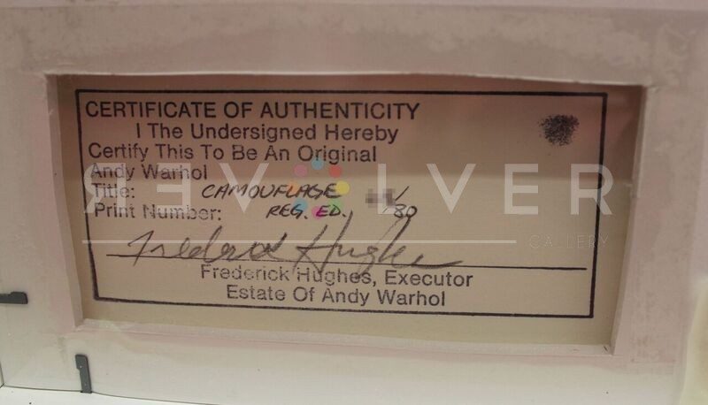
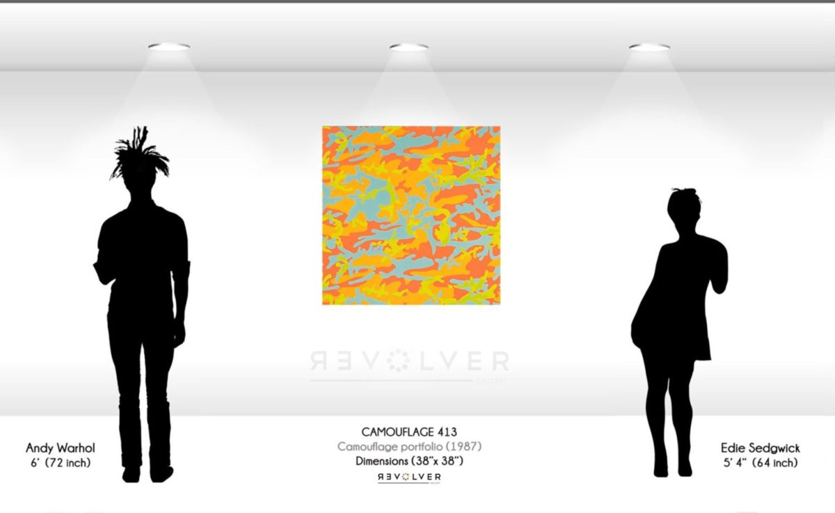
Andy Warhol created his eight print portfolio, Camouflage in 1987, along with collaborations in the fashion industry to market his series. This portfolio featured the recognizable camouflage design with a Pop art twist. Warhol incorporated inorganic, bright colors to the organic shapes and forms seen within the abstract pattern. Camouflage 413 is the final and eighth print of the portfolio, demonstrates fluorescent oranges, alongside the complimentary yellows and blues. With his signature use of colors, Warhol transformed the subtle print the military relied on for concealment, into one of high vivacity and appeal.
Camouflage 413 by Andy Warhol as Part of his Larger Body of Work
Initially, the concept of Camouflage was to recognize America’s military involvement in the Middle East and their war efforts. However, as his prints progressed, their significance further developed. For Warhol, camouflage gave him an opportunity to work with an abstract pattern that was also immediately recognizable. As a result, he stressed the identifiable aspects of the print by incorporating obvious colors. The contemporary fashion industry embraced Warhol’s new version of camouflage, as they wanted to make bold statements with clothing. Warhol’s Camouflage portfolio is one of the last series created by the famed pop artist before his death in 1987.