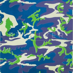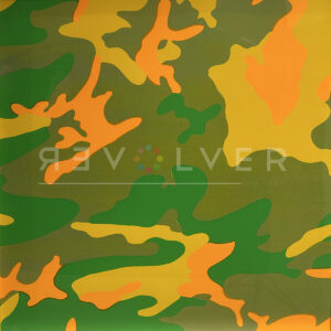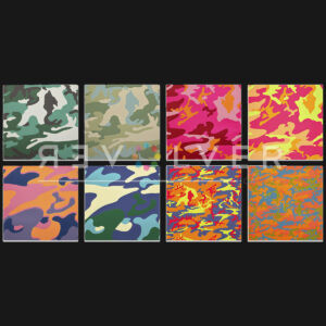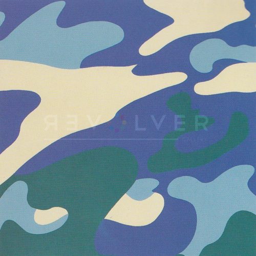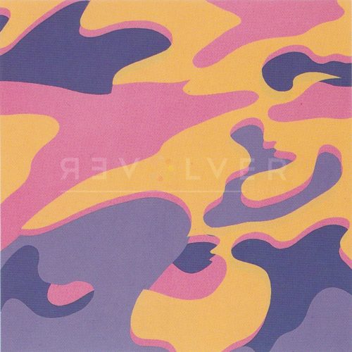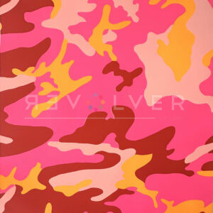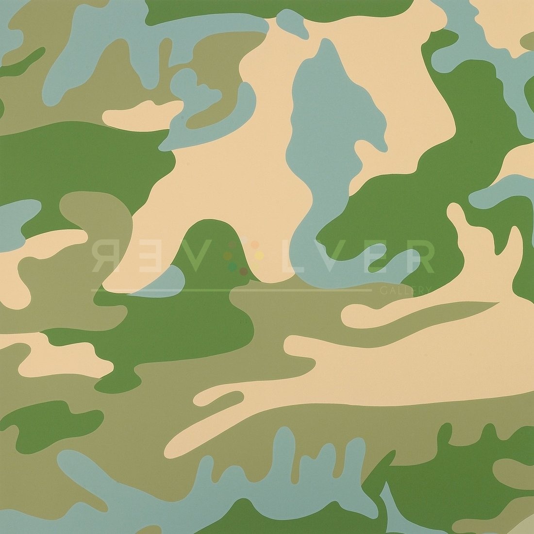
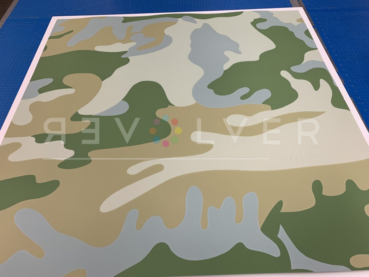
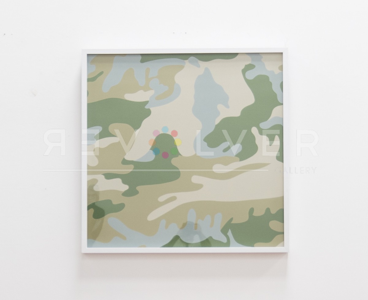
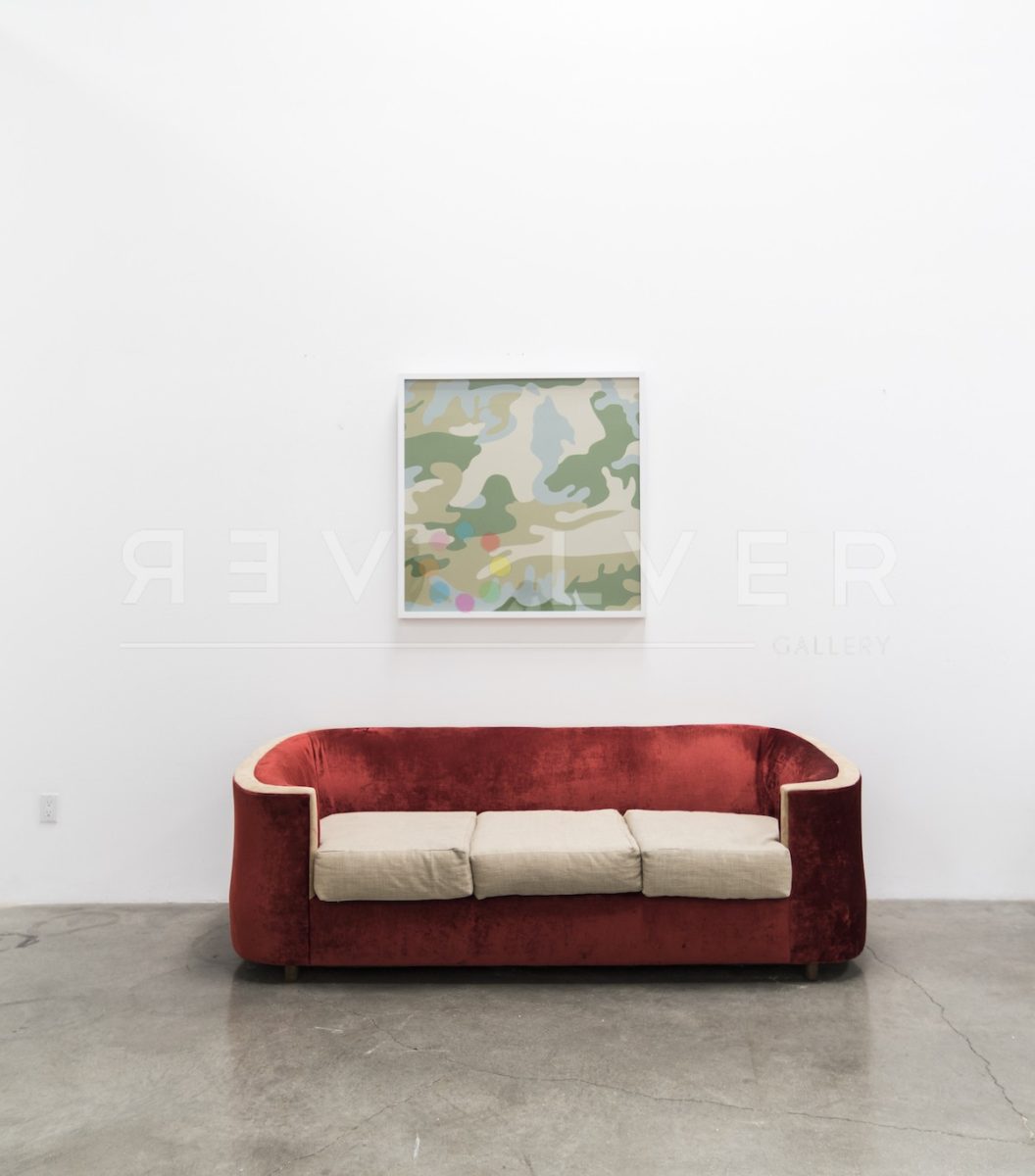

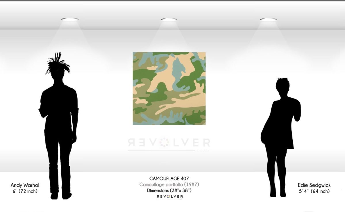
Camouflage 407 is part of the Camouflage portfolio by Andy Warhol. The series of 8 screenprints gave Andy Warhol a chance to work with an abstract pattern that was easily identifiable by Americans. To enhance the recognizable aspects of the camouflage design, he used bright Pop colors. This print features a slight stray from the traditional greens, with additions of blues, signifying the start of a progression away from subtlety into vivacity. Warhol’s play with different color schemes in the Camouflage series gave each print its own individuality and character. This print is characterized by neutral shades of forrest green, beige and cream with accents of lilac.
Camouflage 407 by Andy Warhol as Part of His Larger Body of Work
Warhol chose the camouflage design to pay tribute to America’s military participation in the Middle East as well as other war efforts. Camouflage print has been used throughout history to help disguise equipment and men during war. However, Warhol saw camouflage in a different perspective. He wanted this series to attract attention with synthetic colors. As a result, Warhol was approached with many opportunities in the contemporary fashion industry. Fashion houses desired to make bolder statements in their clothing designs.