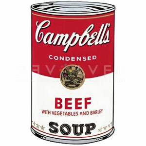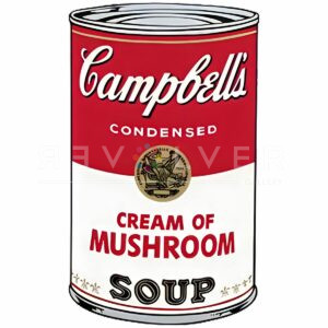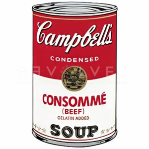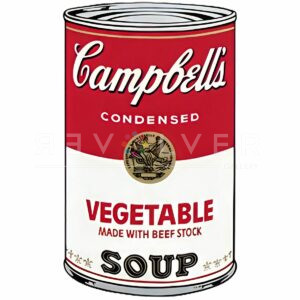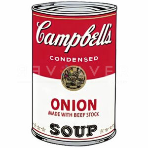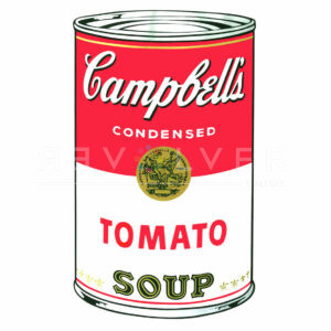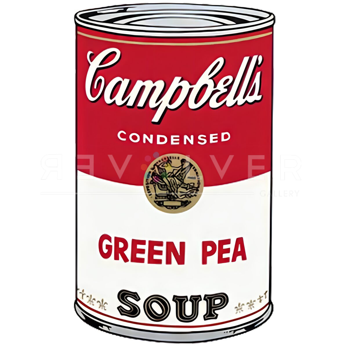
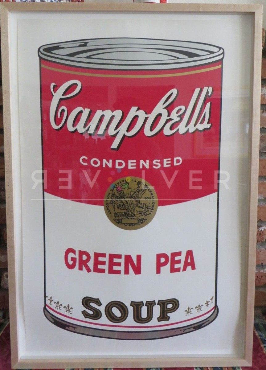
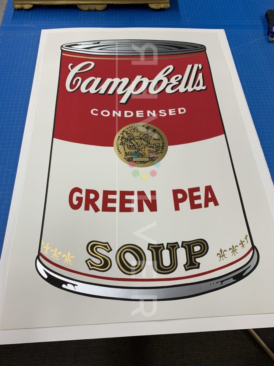
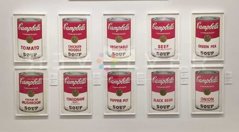
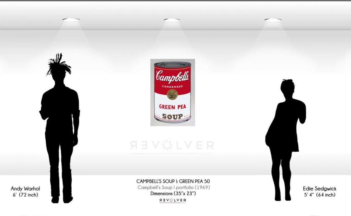
Campbell’s Soup Cans I: Green Pea 50 is a screen print by Andy Warhol from Campbell’s Soup Cans I, published in 1968. Warhol created this portfolio eight years after his original 32 Campbell’s Soup Cans debuted at the Ferus gallery in Los Angeles. In 1969, he published yet another Campbell’s portfolio, titled Campbell’s Soup Cans II. In the later portfolios, Warhol utilized his signature screen print technique to achieve an even closer replication of Campbell’s product; although, Campbell’s Soup II includes added illustrations for each flavor. Decades later, the soup images are perhaps Warhol’s most recognizable creations. Both Campbell’s I & II are some of the artist’s most valuable screen prints.
Campbell’s Soup CansI: Green Pea 50 and similar works cemented Warhol’s name as the pioneer of Pop Art. The original debut of the soup cans shocked audiences. Why were 1:1 reproductions of a common household soup hanging on the wall of a Los Angeles art gallery? At the time, abstract expressionism dominated the art world. Thus, common artistic themes included ideas such as emotion, nature, violence, and human struggle. Consequently, people saw Warhol’s soups as harshly commercial, and they questioned the merit of such work. Artists and critics debated the value of the exhibit, which was reminiscent of a grocery store aisle. However, many people enjoyed the showing, and in the end, it became a huge success that catapulted Warhol to fame.
Instead of focusing on “outdated” themes, Warhol’s Pop Art brought new life to the art world. He asked what was really authentic and relevant to human life, and at the time, the answer (for him) involved 20th century advancements like industry, commerce, and mass production. Thus, Warhol considered quotidian commodities like soup cans to be true reflections of society.
Campbell’s Soup Cans I: Green Pea 50 is heavy with Warhol’s fascinations and philosophy. Warhol’s inspiration to paint and screen print the Campbell’s Soup cans has to do with his fascination for simple commodities, and the fact that he claimed to drink Campbell’s Soup almost everyday for 20 years. He had a very positive view of capitalism and consumer culture. Warhol thought that products like Campbell’s Soup cans, Coke, or Life Savers, were amazing miracles of modern society. For instance, he loved that no matter where you go, Coke remained the same everywhere. He is quoted saying: “You can be watching TV and see Coca Cola, and you know that the President drinks Coke, Liz Taylor drinks Coke, and just think, you can drink Coke, too. A coke is a coke and no amount of money can get you a better coke than the one the bum on the corner is drinking. All the cokes are the same and all the cokes are good.”
Ultimately, presenting the soup cans was a bold move by Warhol. As avant-garde art, they helped inspire a new generation of artists, and allowed the public to re-think common ideas of what artistic value. Because of this, Campbell’s Soup Cans I: Green Pea 50 and similar works became some of the most acclaimed works of modern art.
Photo Credits:
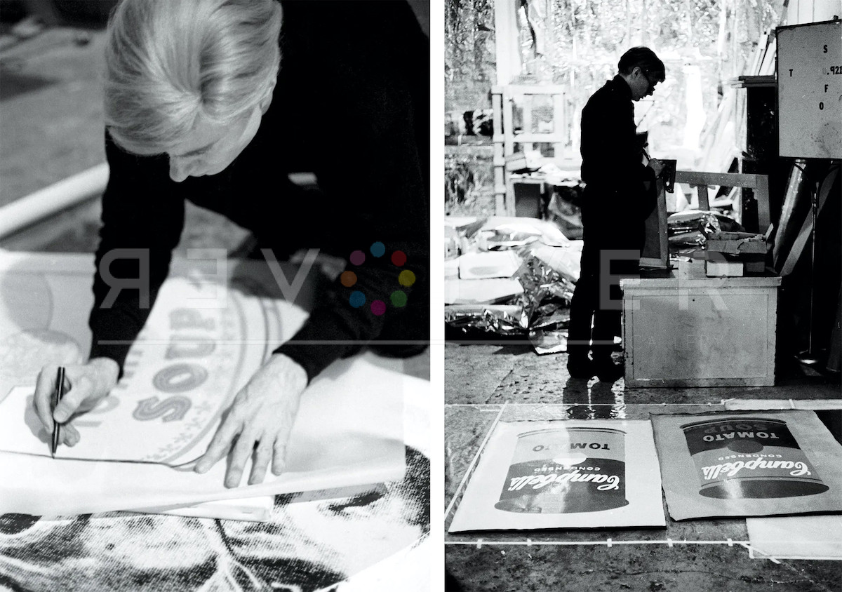
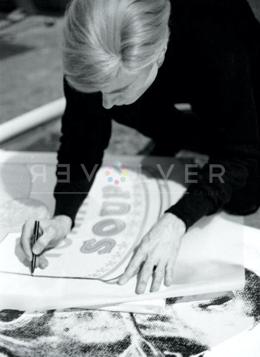
- Andy Warhol tracing Campbell’s Soup silkscreen, The Factory, New York City, circa 1965 © Estate of Nat Finkelstein © 2021 The Andy Warhol Foundation for the Visual Arts, Inc. / Licensed by DACS, London
- Andy Warhol and Gerard Malanga make a painting, 1964. Vintage gelatin silver print, 10¼ × 14¾ inches; 26 × 38 cm. Photo by Matthew Marks.
- Andy Warhol, 1964. Vintage gelatin silver print, 10¼ × 14¾ inches; 26 × 38 cm. Photo by Matthew Marks.