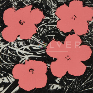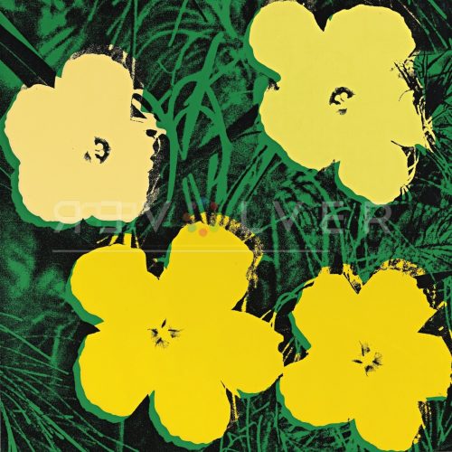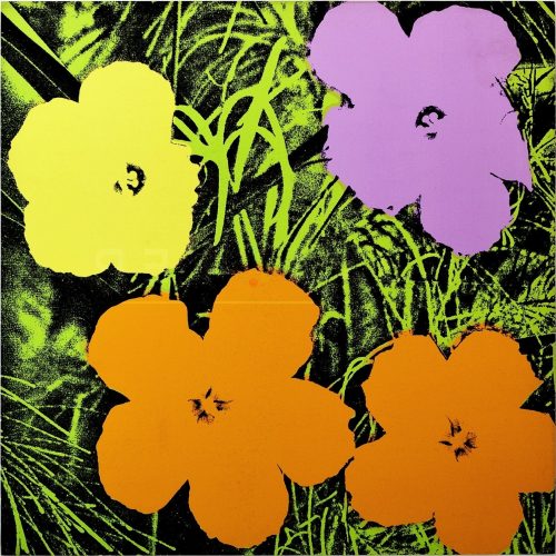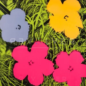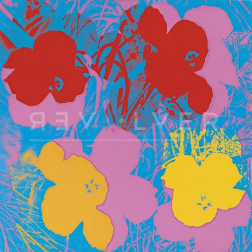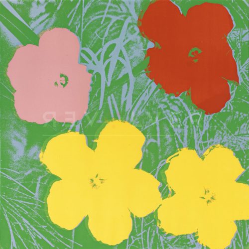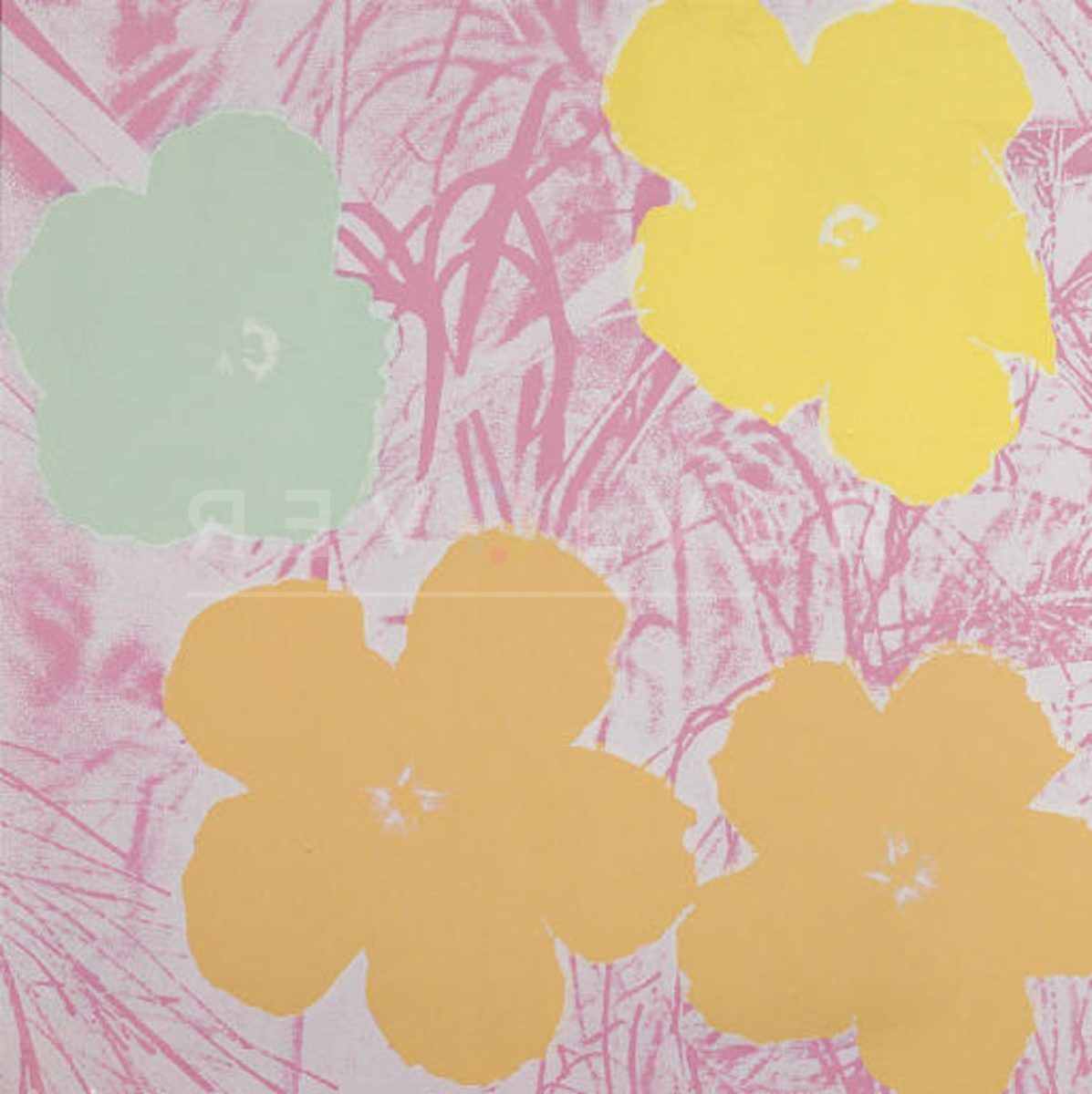
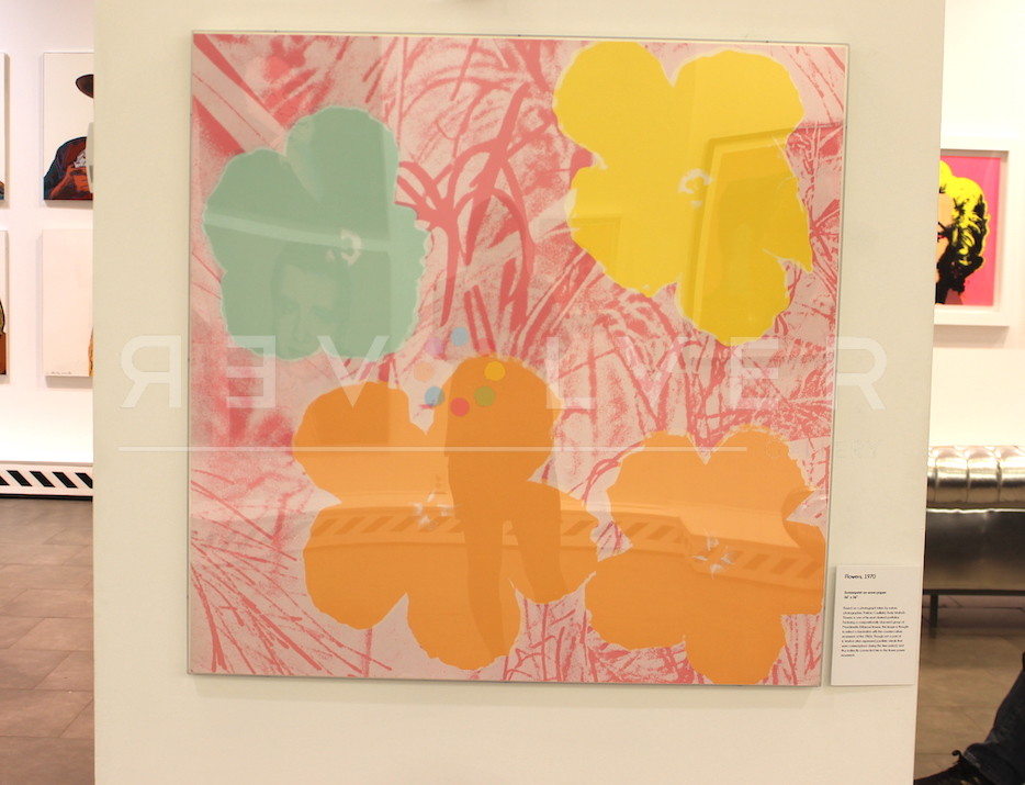
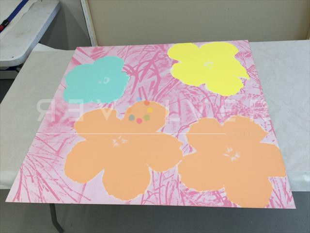
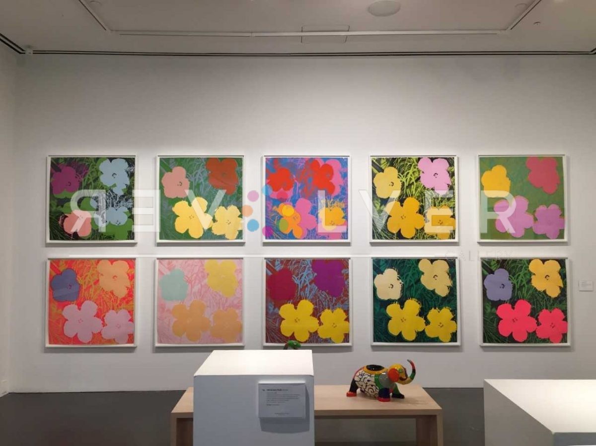
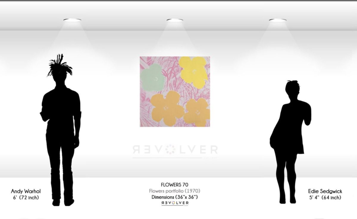
Flowers 70 by Andy Warhol is a screen print from his Flowers series, created in 1970. The subtlety of the Flowers portfolio was a delicate diversion from Warhol’s more immediately recognizable subjects. In 1964, Warhol’s friend and curator, Henry Geldzahler, said that too much death and tragedy had appeared in his work. Flowers proceeds the infamous Marilyn Monroe series, and The Thirteen Most Wanted Men mural. Flipping through a June 1964 issue of Modern Photography, Geldzahler landed on a photo of a hibiscus by Patricia Cauldfield. She would later sue Warhol in 1966 for the use of her photos as inspiration for the prints. The flowers would be heavily altered, and became reminiscent of the psychedelic themes of the hippie movement, the aesthetics of which were just beginning to take shape during the creation of Flowers.
The repeated patterns in the man-made, the structured randomness of nature; these notions were nearly taken to the surreal, and acted upon with patience in Flowers 70. Their debut at the Leo Castelli Gallery struck observers with a vivid array of colors. The high saturation and contrast in Flowers 70 is perhaps the most engrossing quality. The idea of simple alteration to what has already been altered is a central theme in Warhol’s works. For instance, Warhol did not find his hibiscus subjects outside, but instead in a section of Modern Photography about a new color processing system.
In an interview with the Financial Times, Warhol looks back on the impact of his commercial art philosophy: “I wanted to present the mirror of consumption to consumers without any moral overlay or overview, and by that to dislocate their sense of priorities in art… Why not turn the tables and show what is latent and myth-generating in the seemingly trivial or materialist?” When looking at Flowers 70 one is transported to an alternate reality, where any earthly notion of what is natural becomes an unreal. The dislocation of the senses that Warhol focused on happens instantly in his Flowers series.
Wherever Warhol went, a sphere of mystique and fame would appear. The things that entered that sphere would never be seen the same way again. Attuned to what was popular and fashionable, Warhol would grip onto a single quality of something, then hyper-fixate until new meaning emerged. For example, by reducing the intricacies of a hibiscus, the planar quality of its shape remained. Therein, the borders of the flowers more intensely contrasted with the background, instead of existing within it. In other words, the flowers stood out and captured the viewers attention. In succession, the Flowers series makes a garden out of technicolor. The incredible variety of hypnotic colors makes Warhol’s Flowers 70 one of his most preeminent works.
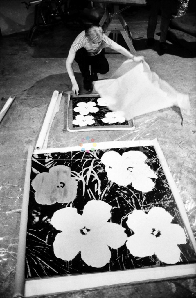
Photo credit: Andy Warhol silk-screening Flowers, 1965-7. Photo by © Stephen Shore.