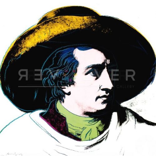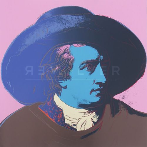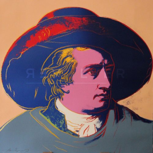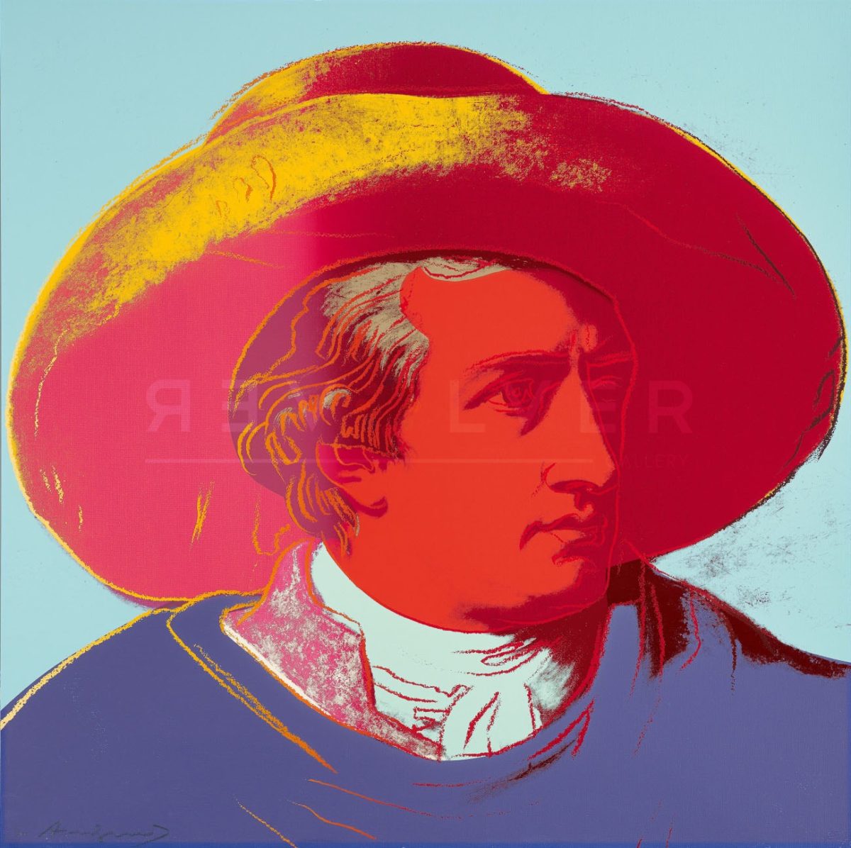
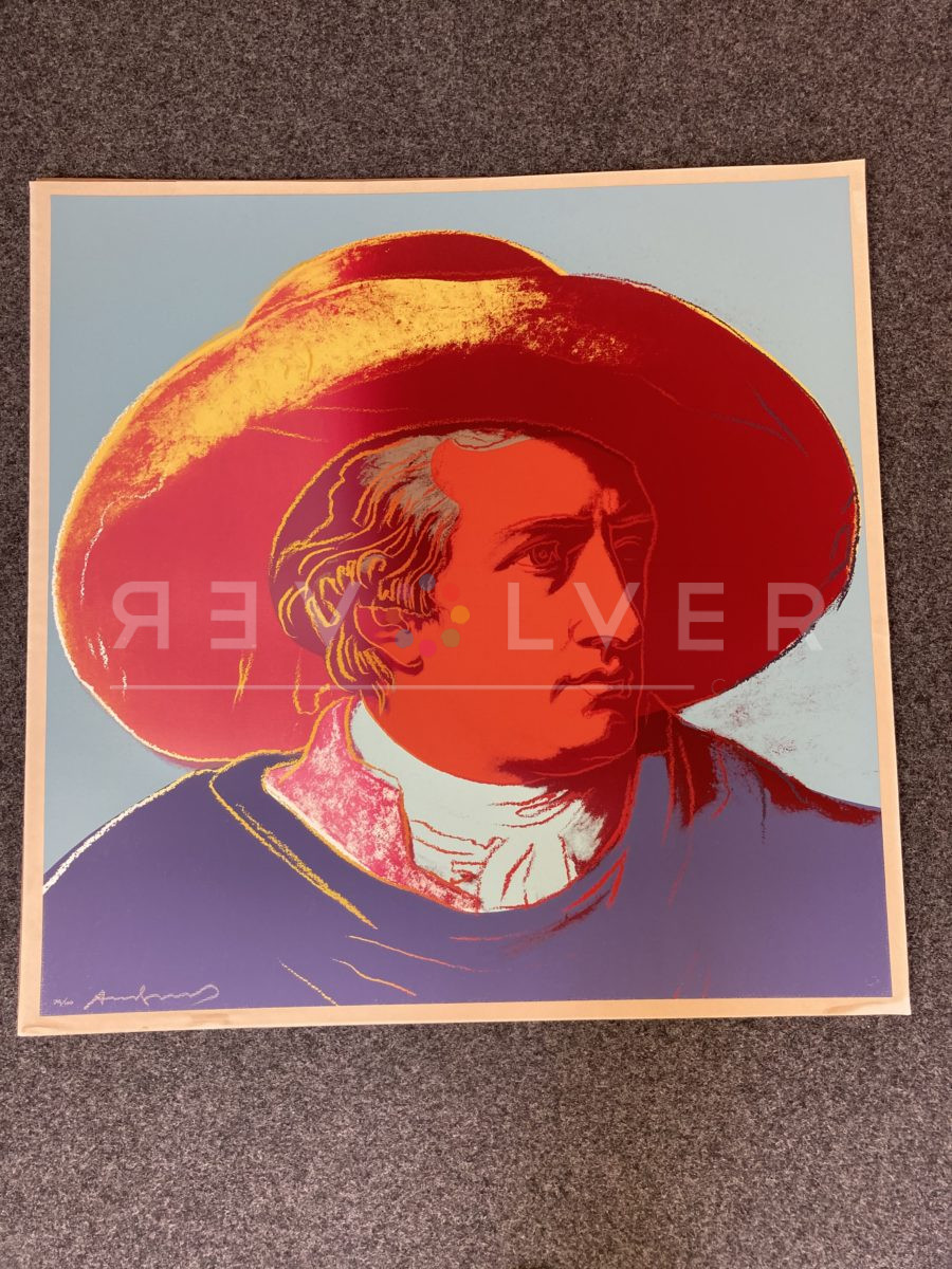
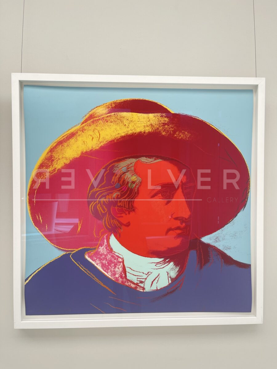
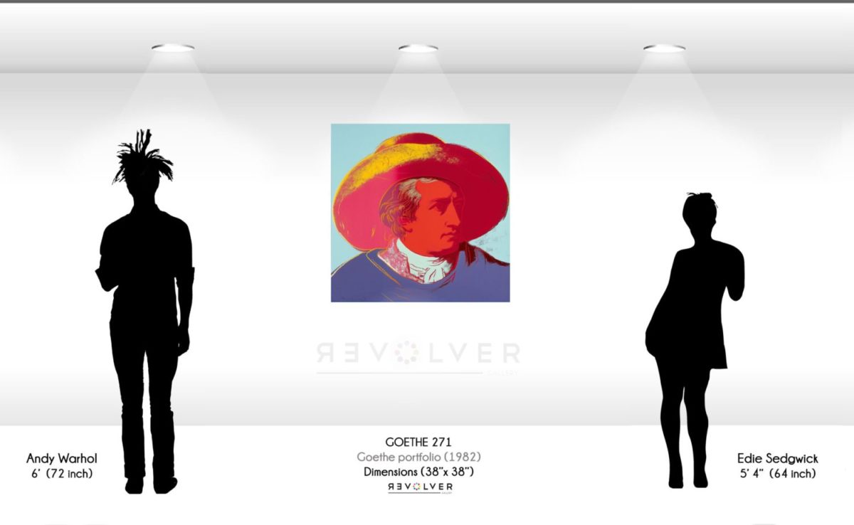
Goethe 271 is a part of Andy Warhol’s Goethe complete portfolio, a 1982 series dedicated to 18th century playwright and novelist, Johan Wolfgang von Goethe. In the series, Warhol gives Goethe the Pop Art treatment via Johann Heinrich Wilhelm Tischbein’s original 1787 portrait of Goethe. Here, Warhol focuses on Goethe’s face alone, leaving out the majority of Tischbein’s painting.
As a part of the portfolio, Goethe 271 sits at an interesting point in the chronology of Warhol’s catalog, arguably being his biggest work after his Myths series. Unlike Myths, where the subjects were primarily American and fictional, Goethe highlights someone who actually existed and whose influence was mostly (but not exclusively) a German phenomenon. However, like Myths, Goethe renders a subject whose legacy eventually transcended the terrestrial and entered the realm of the mythological. This interpretation may be reflected in the piece itself, according to Goethe’s own theory of colors.
Goethe 271 is essentially composed of primary colors: red, blue, and yellow. One shade of red, a dark crimson, marks Goethe’s visage, the wide-brimmed hat that dominates most of the frame, and hand drawn strands of his hair. A light red, closer to pink, covers a smaller portion of the hat and the collar of Goethe’s shirt. Similarly, both a lighter cerulean and a darker royal blue cover the background and Goethe’s cravat, and duster coat, respectively. A vivid yellow accentuates the hat and some of the hand drawn contours.
Goethe’s Theory of Colors, a scientific treatise on the color spectrum, has proven to be influential even long after its 1810 publication. In it, Goethe attempts what some have considered a psychological explanation of the perception of color. To that aim, he ascribed certain aesthetic values to each color. Red, he associated with beauty. Blue was associated with the common. And yellow signified the good. In light of this, Warhol’s portrait looks quite flattering, literally coloring Goethe as an avatar of the beautiful common good, crossing the lines of the terrestrial and moving beyond.
Andy Warhol’s Goethe 271 is a fitting representation of Warhol’s 1980s style. During this late stage of his life and career, Warhol combined high-contrast enamel paint and hand drawn contour lines. The effect of the line work gave Warhol’s later portraits a new depth, imbuing his Pop Art subjects with details that signaled a more realist, human-like depiction.
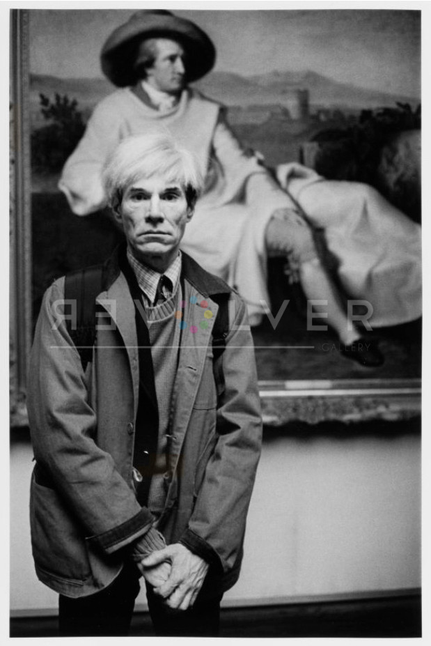
Photo credit: Portrait of Andy Warhol at the Städelmuseum in Frankfurt posing with Johann Tischbein’s Goethe in the Roman Campagna 1786-87.” Photo by Barbara Klemm, 1981.