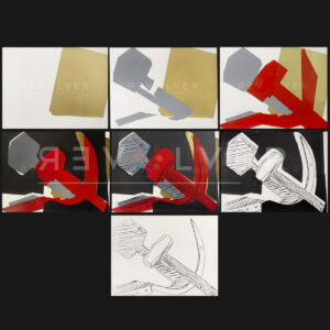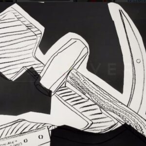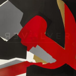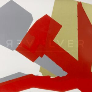
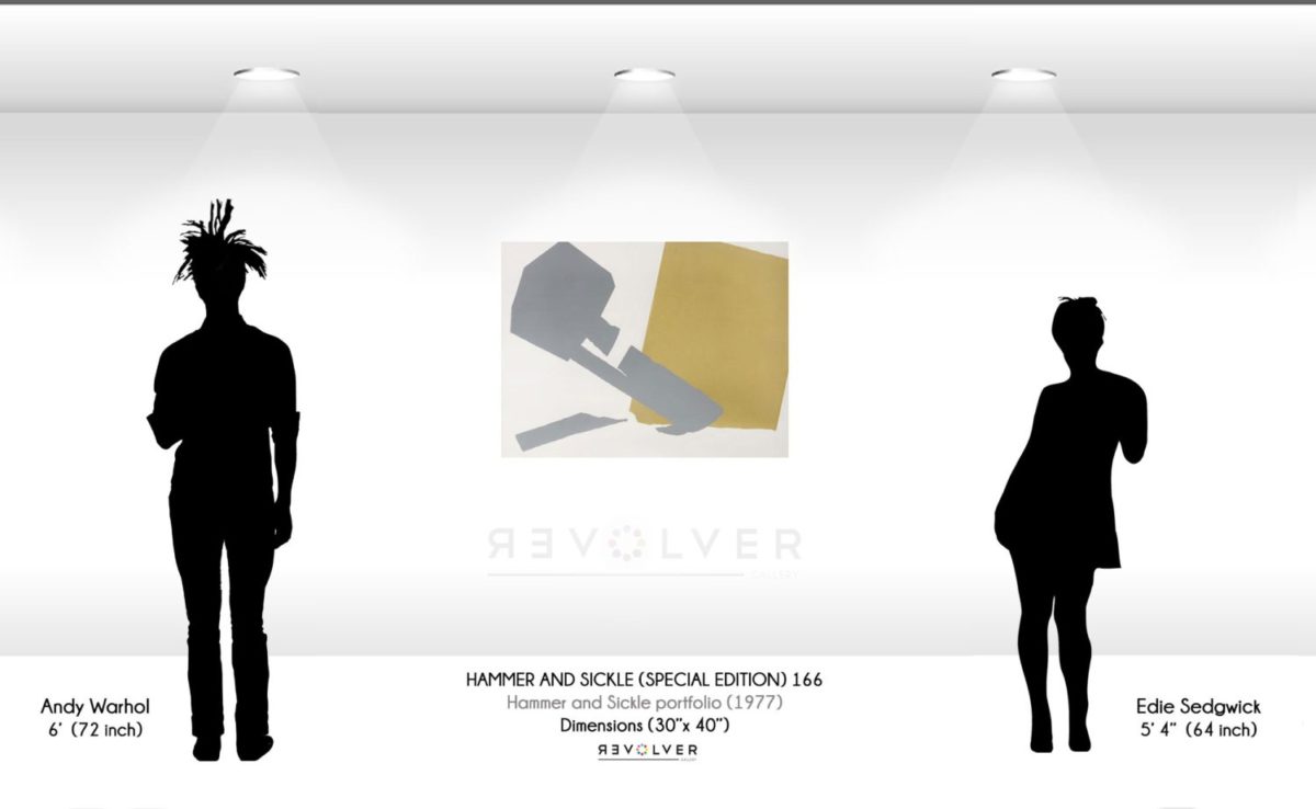
Hammer and Sickle (Special Edition) 166 is a screenprint from Andy Warhol’s Hammer and Sickle (Special Edition) portfolio. Warhol created the special editions in 1977 alongside the standard Hammer and Sickle portfolio. The portfolio came to be when Warhol found inspiration for the series while on vacation in Italy in 1976. During his time in Italy, Warhol came across graffiti that contained imagery of a hammer and sickle, symbolizing the union of agricultural and industrial workers under communist control. While the portfolio received a controversial reaction due to the resemblance of communist iconography, Warhol’s Hammer and Sickle works deliver a unique dismantled rendition of the infamous symbol. Hammer and Sickle (Special Edition) 166, in addition to other screenprints from the series, features a deconstructed depiction of tools that weren’t present in the original edition of the portfolio.
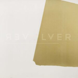
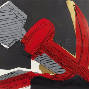
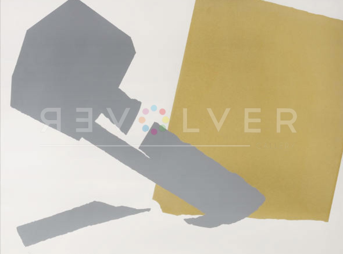
In Hammer and Sickle 166, Warhol depicts the color-blocked shapes of the tools through muted colors. The form of the grey-toned hammer appears with a rigged outline while positioned slanted. Underneath the hammer is the subtle depiction of the sickle, also featured in a grey tone, with the handle being a prominent signifier of the tool. The background of the screenprint maintains the overall theme of the objects, featuring a color-blocked tan square with a ridged outline against a stone-colored background. The screenprint itself departs from primary features in the standard Hammer and Sickle portfolio, making the piece quite unique within the series. It’s muted color palette contrasts against the consistent use of red found in many of the other screenprints within the portfolio.
Though Warhol was primarily interested in the visual appearance and ubiquity of the communist iconography, the piece additionally reflects the tension of the Cold War era. The tension between the United States and the Soviet Union post-WWII generated fear surrounding the idea and increase of communism. However, with the portfolio coincidentally appearing as a form of political commentary, Warhol never intended it to be viewed in such way. Known for his screenprints of celebrities and commercial imagery, a portfolio such as Hammer and Sickle departs from such subject matter. Warhol, faced with questions regarding the political meaning of the series, plainly stated, “we went off to the store and bought a hammer and sickle. Bob (editor of Warhol’s Interview Magazine) has a lawn to cut.”
Overall, the portfolio presents a deconstructed and obscured portrayal of the hammer and sickle as a symbol. Veering away from the politicized presentation of the tools, Warhol presents them in his iconic Pop Art style, re-imagining them as a work of art independent from their original meaning.
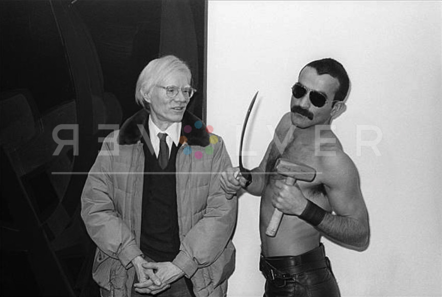
Photo credit: Andy Warhol poses with Victor Hugo, who holds the original hammer and sickle artist used in the works, at the opening of his “Hammer & Sickle” show at the Castelli Gallery, New York, New York, January 11, 1977. Photo by Allan Tannenbaum/Getty Images.