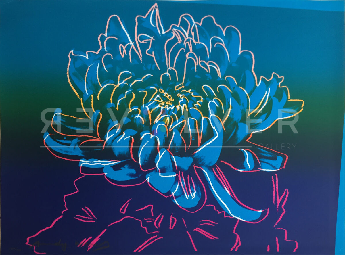
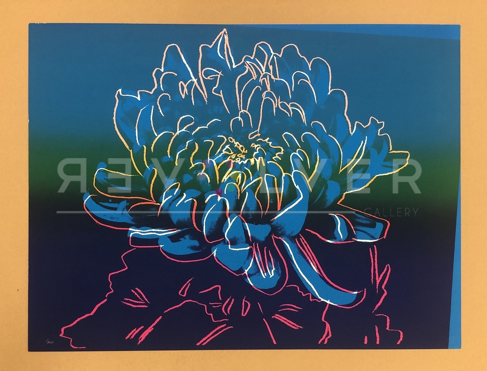

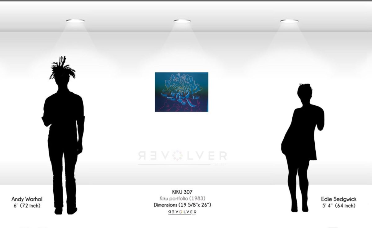
Kiku 307 by Andy Warhol is a floral screenprint from 1983. Artists have looked to still life studies comprised of flowers as a subject matter for paintings and drawings for centuries. Throughout Andy Warhol’s career, he created numerous paintings and screenprints that are based on flowers. In 1983, he created a series based on the Kiku flower. The Kiku, better known as the Chrysanthemum, is a Japanese flower which signifies Autumn in Japan, the time in which it blooms. This print of Kiku 307 emphasizes the beauty of the flower through deep blues that are magnified by Warhol’s use of colorful outlining. Other Kiku prints include Kiku 308 and Kiku 309.
Kiku 307 by Andy Warhol as Part of His Larger Body of Work
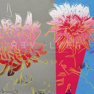
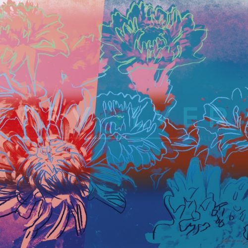
Warhol created numerous paintings that are based on flowers. He did so in a very unique way, by respecting the flower’s natural structure while also adding bright colors and highlights. His Flowers series where Warhol appropriated, arranged and cropped four blossoms in eccentric colors are some of his most famous paintings. While the Flowers (Black and White) and Flowers (Hand-colored) series possess a more gestural quality, and feel more like studies. In the early 1980s, Warhol was approached by the Gendai Hanga Center in Tokyo to produce paintings of flowers. Kiku is the Japanese word for chrysanthemum, a flower that traditionally represents the Japanese emperor and Imperial House. This flower inspired the screenprints Warhol created.