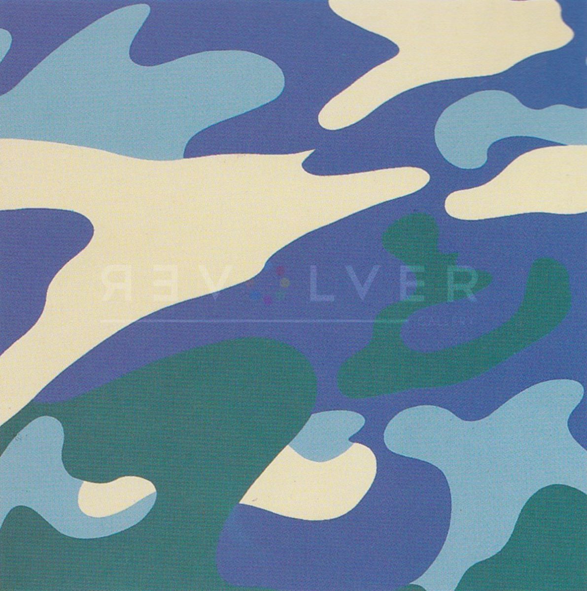
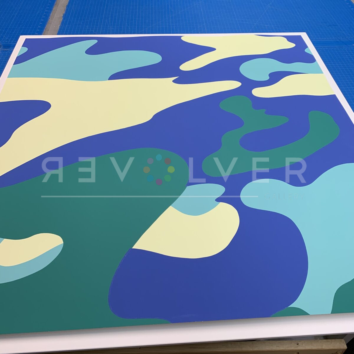
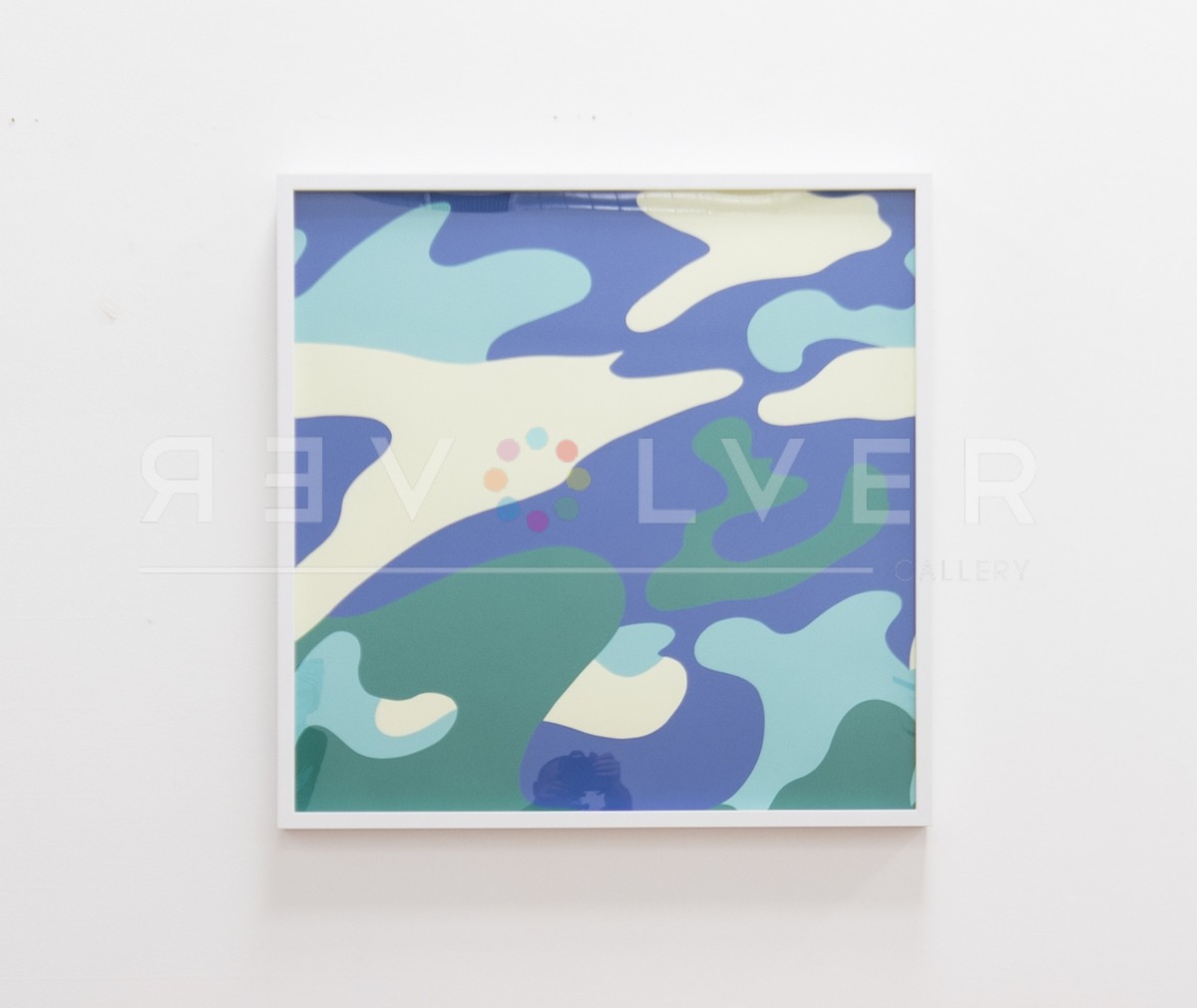
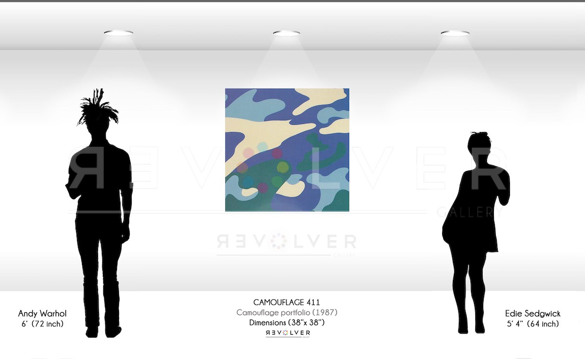
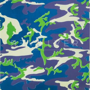
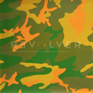
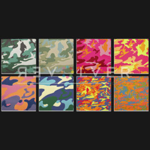
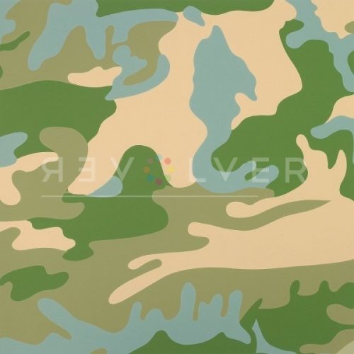
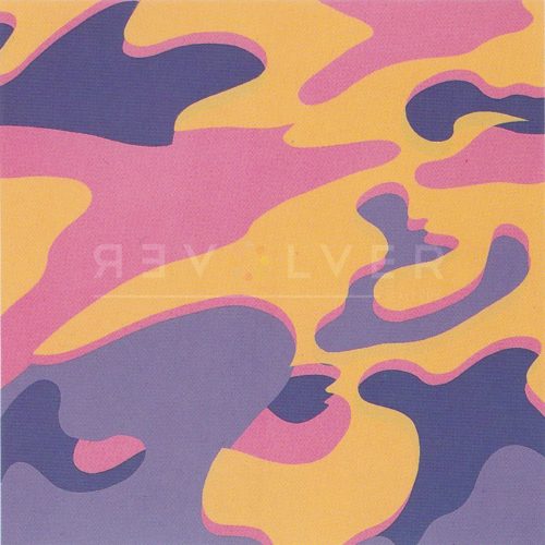
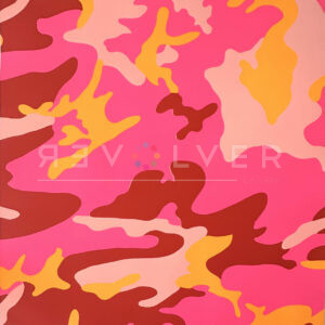
Andy Warhol’s Camouflage 411 is one of the print’s from the artist’s Camouflage portfolio. The Camouflage portfolio of 8 screenprints demonstrates Warhol’s play with the abstract, yet recognizable design in a variety of fluorescent, inorganic colors. Camouflage appealed to Warhol because it held this dual-significance of an abstract form that was familiar to the American population. He also wanted to address America’s continuing military involvement in the Middle East. Therefore, he opted to utilize the camouflage design as a dedication to their efforts in war. However, Warhol added his own Pop Art signature touch by using colors to transform a disguising pattern, into one of high attention. This print features blues and greens with the simple camouflage pattern.
Camouflage 411 by Andy Warhol as Part of His Larger Body of Work
Andy Warhol introduced many dualities with his version of the Camouflage. The use of inorganic, synthetic colors paired with the organic shapes and forms in the abstract design presented juxtapositions between identity and disguise. While militants relied on the traditional camouflage pattern to help conceal them, the fashion industry favored Warhol’s camouflage use to help attract attention in the urban setting. This also paralleled Warhol’s lifelong struggle of finding a balance between the fame he so yearned and the quiet, private life he also wanted to maintain.

