
Andy Warhol’s legacy is one of bold transformations and relentless innovation. Through his use of mass-produced imagery and commercial techniques, Warhol’s paintings blurred the line between high art and popular culture, redefining what art could be in the modern world.
His iconic works on canvas, from Campbell’s Soup Cans to his portraits of Marilyn Monroe and Mao Zedong, all speak to his fascination with fame, consumerism, and the commodification of imagery. Whether exploring the dark undercurrents of media and mortality in his Death and Disaster series or transforming the mundane into the extraordinary through his Brillo Boxes and Dollar Signs, Warhol’s paintings invite us to reconsider the meaning of art in a world driven by consumption.
In this collection of 20 paintings, we explore Warhol’s most significant contributions to art history. Organized by themes and subjects, these original works chart Warhol’s rise from a commercial artist to a cultural icon. Warhol transformed the medium of painting to challenge notions of originality, art’s commercial value, and the philosophical weight of repetition. Each series—whether portraying a can of soup, a Hollywood star, or a common symbol—demonstrates how Warhol transformed the medium of painting to challenge notions of originality, value, and the boundaries of what are can be.
Campbell's Soup Cans (1962)
32 Campbell's Soup Cans (1964)
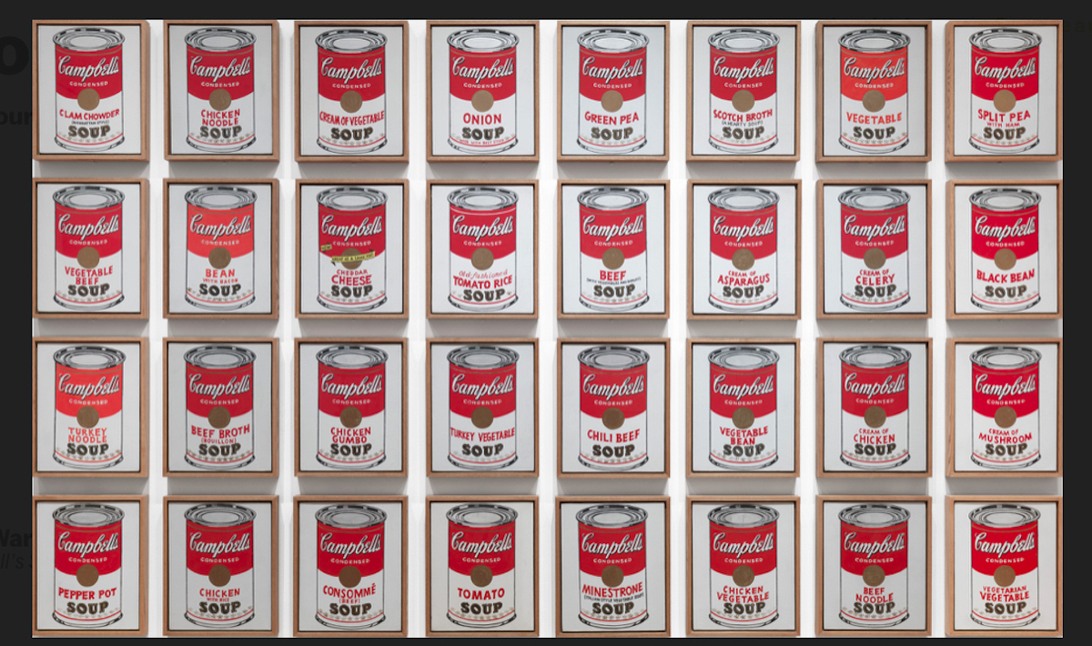
Andy Warhol’s Campbell’s Soup Cans paintings are one of the most iconic and revolutionary contributions to modern and postmodern art, forever reshaping the boundaries between fine art and everyday consumer culture. When Warhol first unveiled his Campbell’s Soup Cans in 1962 at the Ferus Gallery in Los Angeles, audiences were confronted with something unprecedented—32 nearly identical canvases, each depicting a different flavor of Campbell’s Soup. In an era still dominated by Abstract Expressionism, Warhol’s methodical presentation of a mundane grocery item was as much a challenge as it was a declaration of the new art frontier that Pop Art would represent.
At the heart of Warhol’s Campbell’s Soup Cans is a perfect synthesis of consumer culture and artistic experimentation. Each of the 32 paintings, representing every soup flavor Campbell’s offered at the time, was a direct reproduction of the product. Warhol’s use of techniques borrowed from advertising—such as projection and mechanical stamping—broke with the traditional methods of fine art, favoring industrial processes over the expressive brushwork seen in prior movements. His attention to every detail, from the script of the brand name to the fleur-de-lis border pattern on the cans, resulted in a 1:1 copy of Campbell’s products. By putting such mundane images in an art gallery, Warhol urged viewers to pay attention to objects that had never beent he subject of fine art (but perhaps should be).
Warhol once said that he used to drink Campbell’s soup every day for lunch. “I used to have the same lunch every day, for twenty years, I guess, the same thing over and over again.” This grounds the paintings in a real, personal experience while simultaneously speaking to the universality of the product. In this way, Warhol’s Campbell’s Soup Cans offer a profound connection between the artist’s personal life and his commentary on the ubiquity of consumer products in American households. Moreover, Warhol hints at his fascination with repetition in this quote, a theme that would appear in his artworks for years to come.
Though the Soup Cans series did not achieve commercial success immediately, its legacy has only grown over the decades. The paintings are now considered some of the most important works of 20th-century art, permanently housed in the Museum of Modern Art, which acquired the full set in 1996 for $15 million. Warhol’s bold vision and fearless commentary on American consumerism continue to resonate, as contemporary culture grapples with issues of mass production, branding, and the commodification of everyday life.
In many ways, the famous Soups encapsulate Warhol’s genius for blurring the lines between art and life, high culture and low. Through his depiction of a common grocery store item, Warhol challenged viewers to see art not as something rarefied and distant, but as something found in the everyday objects that surround us. This provocative vision forever altered the landscape of contemporary art, cementing Warhol’s status as one of the most influential artists of his time.
Marilyn Monroe (1962-1964)
Shot Sage Blue Marilyn (1964)
Andy Warhol’s Marilyn Monroe paintings stand prominently among his most recognizable works, deeply intertwined with themes of fame, mortality, and the commodification of identity. After Marilyn’s tragic death in 1962, Warhol used a publicity still from her 1953 film Niagara to reproduce her visage in various color schemes with his signature silkscreen method. Screenprinting offered a repetitive, machine-like process that allowed Warhol to mass-produce Monroe’s image, just as Hollywood had commodified her persona during her life. The bright, electric colors Warhol employed highlight Monroe’s glamorous public image, yet the repetition renders her face flat and mask-like, reflecting the tension between her highly-consumable image as a superstar and her inner life as a person overwhelmed by the limelight.
Marilyn Diptych (1962) is one of the most famous pieces depicting the late actress, consisting of 50 images of Monroe arranged in a grid. On the left, the images are brightly colored, while on the right, they gradually fade into monochrome, symbolizing Monroe’s transition from a vibrant starlet to a tragic figure whose life was cut short. The repetitive use of her image can be seen as both a celebration and a critique—Warhol immortalizes her while exposing the emptiness behind her mass-produced image. This duality invites viewers to question the nature of celebrity and the ways in which the media transforms people into commodities.
Other significant pieces in the series include Gold Marilyn (1962) and the Shot Marilyns (1964). In Gold Marilyn, Warhol placed Monroe’s image against a shimmering gold background, evoking religious iconography and positioning her as a modern-day saint of Hollywood. The gold, however, also suggests the superficial glamour that surrounded Monroe, masking the personal struggles behind her radiant exterior. Shot Sage Blue Marilyn, part of the infamous “Shot Marilyns” series, was damaged when a visitor to Warhol’s studio shot through the canvas. Despite the violent act, the painting’s value soared, eventually selling for $195 million in 2022.
Through his Marilyn paintings and subsequent prints, Warhol not only created “an icon of an icon,” but he communicated her existence as a symbol, not a mere person. The series reflects Warhol’s fascination with fame, tragedy, and the mass production of images, themes that resonate as powerfully today as they did during his time.
Elvis (1963)

Triple Elvis (1963)
Andy Warhol’s Elvis series, created in 1963, represents one of the artist’s most significant engagements with celebrity culture. Using a still from the movie Flaming Star (1960), Warhol multiplied and repeated the image of Elvis, transforming the rock ‘n’ roll star into a cultural myth that transcends the individual. The Elvis paintings, such as Triple Elvis (Ferus Type) and Double Elvis (Ferus Type), showcase the King of Rock ‘n’ Roll in his signature cowboy stance, gun in hand, projecting a sense of power and dominance. These works draw on themes of masculinity and myth-making, positioning Elvis as both a product of Hollywood and a symbol of Americana.
As with many of Warhol’s works, his physical technique reflects the philosophy behind the image. By using the silkscreen method to reproduce and multiply Elvis’s image onto the canvas, as with Triple Elvis (1963), Warhol emphasizes Elvis’s omnipresence in American culture. This repetition strips away the individual personality of the subject and turns Elvis into a mass-produced commodity, while the composition of the image evokes the cinematic feel of film strips. Warhol’s use of a silver background—reminiscent of the “silver screen”—further enhances this Hollywood aesthetic, elevating the works into an almost religious veneration of celebrity.
The Elvis paintings were first exhibited in 1963 at Irving Blum’s Ferus Gallery in Los Angeles, where Warhol sent an uncut roll of canvas and allowed the gallery to determine the size and arrangement of the works. This gesture of relinquishing control over the final presentation of his art mirrored the sense of mass production and commercialization that Warhol sought to critique. The exhibition was a major moment in Warhol’s career, setting the stage for his continued exploration of iconic figures and his growing influence on the Pop Art movement.
The enduring power of both Warhol and Presley as cultural icons has led to some record-breaking auction results, highlighting the enduring appeal and market value of the Elvis series. Eight Elvises, a massive canvas with eight overlapping images of the star, was sold in a private auction for $100 million in 2008, making it one of Warhol’s most expensive artworks and one of the most valuable paintings ever sold at the time. Sales of other iconic pieces, such as Double Elvis, which fetched $53 million at auction in 2019, speak not only to the commercial success of Warhol’s work but also to its perpetual cultural relevance.
Death and Disaster (1962-1964)
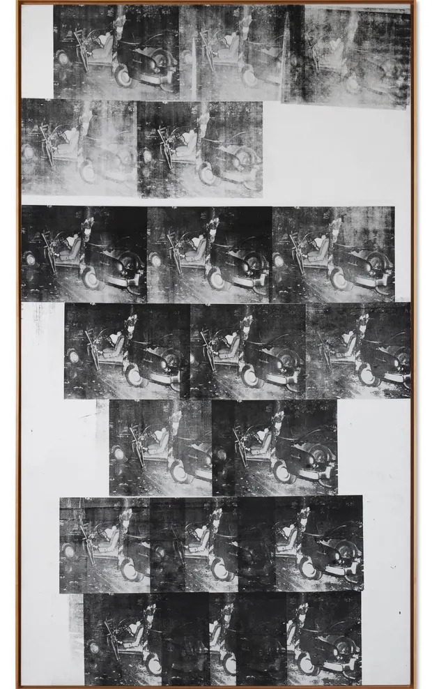
White Disaster (White Car Car Crash 19 Times), 1963
Andy Warhol’s Death and Disaster series represents some of the artist’s most haunting and provocative work, delving into the darker aspects of mass media and American life. Inspired by a conversation with curator Henry Geldzahler, who encouraged Warhol to engage with more serious themes beyond consumer goods, the series began in 1962 with 129 Die in Jet, a painting based on a newspaper report of a plane crash. Over the next few years, Warhol expanded the series to include graphic depictions of car crashes, suicides, and electric chairs, sourced from sensationalized newspaper articles and police photographs. Using his signature silkscreen process, Warhol reproduced these tragic images in repetitive patterns across large canvases, exploring the desensitization that comes from repeated exposure to violence and death in the media.
The Death and Disaster series explores society’s morbid fascination with tragedy through Warhol’s unsettling depictions of violence and death. In the Car Crash paintings, Warhol presents brutal automobile accidents with clinical detachment, creating an emotional void that viewers must confront. Similarly, the Electric Chair series isolates the stark image of the execution device, focusing on its role in state-sanctioned death and underscoring the bureaucratic coldness of such violence. These works amplify the horror of these scenes by stripping away context and human presence, leaving only the stark, unrelenting image of death’s instruments.
Beyond the individual works, Warhol’s larger exploration in the Death and Disaster series is rooted in repetition and the commodification of tragedy. By mechanically reproducing these traumatic images across large canvases—often using bright, incongruous colors—Warhol blurs the line between shock and banality, reflecting how constant exposure to violent imagery dulls its emotional impact. Warhol’s technique both numbs and magnifies the horror, forcing viewers into an uncomfortable reflection on the modern relationship between death, media, and society.
Warhol’s Silver Car Crash (Double Disaster) is one of the most famous works from this series and achieved record-breaking success at auction. In November 2013, the monumental painting was sold at a Sotheby’s auction, attracting intense competition from five bidders. The final hammer price reached an astounding $105 million, setting a new auction record for a Warhol original.
Warhol’s approach to these disturbing themes can be seen as a reflection of his fascination with death and his belief in the power of media to shape public perception. His comment that “the more you look at the same exact thing, the more the meaning goes away” rings especially true in the Death and Disaster series, where repeated exposure to traumatic images gradually strips them of their emotional weight. Yet, even as the individual images lose their immediate impact, the cumulative effect of Warhol’s work invites deeper reflection on mortality, fame, and the voyeuristic nature of modern society’s engagement with death. This exploration remains one of Warhol’s most compelling and unsettling contributions to contemporary art.
Flowers (1964)

Installation view of Flowers by Andy Warhol at Castelli Gallery, November 21 – December 17, 1964
Andy Warhol’s Flowers series, first exhibited at the Leo Castelli Gallery in 1964, marked a significant departure from his previous work, which had largely focused on mass-produced consumer goods and (most recently) violent news imagery. These paintings depict colorful flowers silkscreened over a field of black and green grass, and they reflect a more romantic side of the artist’s oeuvre. Despite the shift in subject matter, Warhol’s typical appropriation technique remained in full force, as the floral images were appropriated from a photograph by Patricia Caulfield that appeared in Modern Photography magazine. Caulfield later sued Warhol for unauthorized use of her image, a lawsuit that not only highlighted the boundaries of artistic appropriation but also forced Warhol to be more cautious in selecting his source material moving forward.
In Flowers, Warhol combined the commercial printing process with elements of nature, turning an ordinary photograph of hibiscus blossoms into a series of psychedelic images. While the floral images are soft and unassuming, the method of their creation—through mechanical reproduction and appropriation—underscores Warhol’s continuing interest in mass culture and the tension between beauty and artifice.
The works are vibrant, using Day-Glo colors and synthetic polymer to create dynamic, almost otherworldly compositions. While the subject matter was far from the soup cans and Hollywood stars that made Warhol famous, Flowers still embodies the artist’s ability to transform simple, everyday imagery into iconic Pop art.
Warhol’s lawsuit with Caulfield brought attention to the broader questions of fair use and intellectual property in the art world. Ironically, while Warhol had appropriated many images throughout his career, it was a photograph of flowers, not the corporate logos or celebrities, that led to one of his most famous legal disputes. This case became a pivotal moment in his career, influencing how Warhol approached the sourcing of images in future works. After the lawsuit, Warhol increasingly used his own photographs, which allowed him to retain control over the imagery he reproduced in his prints and paintings.
Liz Taylor (1963)

Silver Liz, 1963
Andy Warhol’s Liz paintings embody both his fascination with celebrity culture and his innovative use of commercial techniques in fine art. Created in 1963, during a period when Elizabeth Taylor was at the height of both her fame and personal turmoil, these works reflect Warhol’s ability to capture the complexity of public figures whose personal lives were as dramatic as their on-screen personas. Warhol used a publicity still from Cleopatra (1963) as the basis for the series, cropping and enlarging Taylor’s face, emphasizing her famous beauty, and turning her into an enduring icon of glamour, tragedy, and celebrity.
The Liz series was part of a larger body of work where Warhol explored the allure and commodification of female stars, alongside his portraits of Marilyn Monroe and Jackie Kennedy. Warhol was drawn to Taylor not just for her beauty, but also for her very public romantic entanglements and health crises, such as her near-death from pneumonia in 1961. This mix of glamor and vulnerability made her a compelling subject for Warhol, who often explored the intersection of fame and mortality in his works. Like his Marilyn series, the Liz portraits oscillate between celebration and critique, presenting Taylor as both an untouchable star and a product of mass media.
One of the most famous works in this series, Silver Liz (1963), exemplifies Warhol’s use of the silkscreen method, producing multiple versions of the same image with slight color variations (the many works are sometimes referred to individually as “colored Liz“). The silver background not only references the “silver screen” of Hollywood but also creates an ethereal, almost divine atmosphere around Taylor, elevating her to the level of a modern-day saint. The use of bold, contrasting colors on her lips and eyes adds to her iconic power, transforming her face into a mask-like symbol of both beauty and artifice.
Warhol’s relationship with Taylor extended beyond the canvas, as the two became friends later in life. His admiration for her as both a screen goddess and a fearless AIDS activist underscored his lifelong fascination with powerful, larger-than-life women. The Liz series, with its vibrant colors and glamorous depictions, stands as a testament to Warhol’s ability to encapsulate the complex dynamics of fame, beauty, and mortality in a single image, making Taylor an enduring figure in both Hollywood and the art world.
Self Portrait (Fright Wig), 1986

Self-Portrait (Fright Wig), 1986
Andy Warhol’s Self Portrait (Fright Wig) series, created in 1986, marked a culmination of his fascination with fame and identity and a departure from his detached approach to artmaking. These haunting portraits feature Warhol’s gaunt face framed by an oversized, disheveled silver wig, surrounded and marked in different colors. The stark contrast between his ghostly pale visage and the inky black background enhances the sense of isolation and eeriness. Warhol’s hollow cheeks and intense gaze give the portraits a skull-like quality, further evoking the artist’s preoccupation with mortality. The wig, which Warhol had long used to construct his public persona, becomes a central symbol in these works, representing both a mask of identity and the body’s fragility beneath.
At first, self-portraits were a small part of Warhol’s work, but they slowly became more prevalent. Having become famous for creating portraits of celebrities, Warhol started to do the same with his own image. His self-portraits, especially the infamous “Fright Wigs,” add his own identity to his canon of famous figures, positioning himself as an icon as well. Notably, Warhol created the Fright Wig portraits less than a year before his death, in February of 1987.
The Fright Wig portraits were created at a time when Warhol was grappling with his own mortality. Having survived a near-fatal shooting in 1968, Warhol’s outlook on life and death was forever altered. This experience left a lingering imprint on his work, and the Fright Wig series embodies the tension between his public image as a glamorous, iconic figure and his private fears and vulnerabilities. This memento mori theme is seen in other works, like Skulls (1976), Gun (1981), and Death and Disaster. Warhol’s silver wig, originally worn to conceal his thinning hair, had become an essential part of his identity, both in his public appearances and his artwork.
In several variations of the “Fright Wig” self portrait series, Warhol experiments with different color schemes, adding vibrant hues that contrast with the morbid tone of the portraits. This use of color, juxtaposed with the somber expression and skeletal features, underscores Warhol’s trademark ability to blend the celebratory with the macabre. Additionally, Warhol’s inclusion of camouflage patterns in some versions of the portraits adds a layer of complexity, symbolizing both concealment and self-protection.
These portraits are not just meditations on his own mortality but also statements about the broader cultural obsession with fame and image. In turning the camera on himself, Warhol positions his own image within the same framework, elevating his likeness to that of a Pop Art icon while simultaneously confronting the viewer with the inevitable decay of the body. These final self-portraits serve as a haunting reminder of Warhol’s legacy, encapsulating his unique ability to explore the tension between the public and private, life and death, and the human desire for immortality through art.
Brillo Boxes (1964)

Brillo Boxes, photographed by Billy Name in 1964
Andy Warhol’s Brillo Box sculptures are among the artist’s most radical works. Here, Warhol attempts to transform these mundane goods into high art, bypassing the canvas and simply recreating the three-dimensional boxes themselves. Created in 1964, these wooden replicas of product packaging blurred the line between art and commerce. Warhol’s decision to render these familiar items in three-dimensional form, rather than simply paint them, elevated the mundane and mass-produced product packaging into the rarefied space of the gallery. This shift was a provocative challenge to established norms, questioning what “counts” as art when it mimics something so commonplace.
Warhol’s Brillo Boxes were both a tribute to and a satire of consumerism, drawing on his fascination with the branding and repetition found in American supermarkets. By meticulously reproducing these products in wood, Warhol embraced the aesthetics of commercial packaging, while undermining the idea that art must be unique or handmade. His boxes were mechanically precise yet bore the imperfections of quick production, a nod to his playful ambivalence about perfection in art. Warhol’s embrace of the “machine-made” look, coupled with the mass production of his art, made these sculptures a radical departure from the Abstract Expressionism that had dominated the art world before him.
The Box sculptures, which include not just the Brillo Boxes but also Campbell’s Tomato Juice Box and Heinz Tomato Ketchup Box, carry a deeper personal resonance for Warhol. Growing up in a working-class family in Pittsburgh, Warhol was intimately familiar with the consumer products that supported the American working class. Transforming these products into art is not only a comment on art within consumerism but also reflects the role these items played in his own childhood and the lives of millions of Americans. In this sense, the sculptures are both a celebration and a critique.
The Brillo Boxes, with their bold branding and indistinguishable likeness to the real product, asked viewers to reconsider the value of art in a consumer-driven society. Over time, these works have become some of Warhol’s most iconic pieces, representing his mastery of transforming the ordinary into the extraordinary, and solidifying his role in reshaping contemporary art.
Chairman Mao (1972)

Mao, 1972
Andy Warhol’s Mao paintings, created in 1972, were sparked by President Richard Nixon’s landmark trip to China, which signaled a new chapter in international diplomacy. When discussing new projects with gallerist Bruno Bischofberger, Warhol noted that Time Magazine had recently named Mao Zedong the most famous person in the world. Reacting to Mao’s cult-like following, Warhol felt his new paintings should depict none other than the most famous person at the time.
Warhol became fascinated by Mao Zedong’s ubiquitous presence in China, where his image was reproduced on an immense scale, especially in his Little Red Book. By creating multiple paintings of Mao, as well as a large edition size print series using the same photo, Warhol mimicked the pervasive syndication of the leader’s image, turning Mao into a Pop Art icon much like he did with celebrities.
The Mao series marked Warhol’s first significant foray into politically charged art (published the same year as Vote McGovern, another rare political piece). Despite Warhol’s own claims of being politically detached, the Mao portraits blur the line between political power and celebrity, suggesting that Mao’s influence was not unlike that of American movie stars. By painting Mao in flamboyant colors and overlaying his portrait with expressive brushstrokes, Warhol transformed the authoritarian leader into a glamorous and stylized figure, inviting both reverence and critique.
With the Mao paintings, Warhol created a parallel between political propaganda and capitalist advertising, pointing to how mass media can shape public perception. The series, with its bold, bright colors and dynamic designs, challenged the sanctity of Mao’s image, creating an ironic juxtaposition between the seriousness of political leadership and the glitzy, consumable nature of Pop Art. In late 2012, Chinese officials banned the Mao artworks from an exhibition in the country, determining them to be too transgressive, and likening them to an image of Mao wearing makeup.
The Mao portraits have since become some of Warhol’s most iconic works, with several achieving record-breaking auction sales. In 2006, one Mao painting sold for $17.4 million at Christie’s, while another fetched $47.5 million at Sotheby’s in 2017, demonstrating the continued relevance and global appeal of Warhol’s interpretation of the Chinese leader. Through these works, Warhol turned Mao into a paradoxical figure—both a powerful political icon and a product of consumer culture.
The Last Supper (1986)

Sixty Last Suppers, 1986
Near the end of his life, Andy Warhol created over 100 variations of Leonardo da Vinci’s The Last Supper, all commissioned by Milan-based gallerist Alexander Iolas, for a 1986 exhibition held opposite da Vinci’s original at the Santa Maria delle Grazie church in Milan. These works allowed him to revisit a significant piece of religious art that had been a part of his upbringing—reproductions of The Last Supper adorned the Warhol family home, and the image had been embedded in Warhol’s consciousness from a young age.
Among these monumental and profound works from this final series, Sixty Last Suppers and The Last Supper (The Big C) (1986) stand out as deeply personal works, both reflecting his engagement with religious iconography and his relationship with Catholicism.
Warhol’s Sixty Last Suppers consists of 60 identical silk-screened images of Leonardo da Vinci’s masterwork, and spans over 33 feet in length, showcasing Warhol’s signature process of reproduction and repetition. This work presents a meditation on themes of death, faith, and salvation, with 60 silkscreened images of Christ’s final meal emphasizing a sense of communal reflection on mortality. The painting’s scale and repeated imagery also suggest a critique of the commercialization and commodification of sacred symbols. The religious subject matter resonates with Warhol’s Catholic faith, which, despite being largely private, was important to him and central to his identity.
The Last Supper (The Big C), another significant work in this series, combines religious and commercial imagery, intertwining sacred elements with consumer culture. In this piece, Warhol juxtaposes images of Christ with a potato chip logo and the phrase “The Big C,” a phrase commonly associated with cancer. The painting is filled with layers of meaning: the motorcycles evoke rebellion and freedom, while the commercial symbols point to the commodification of religious faith. However, given the context of the AIDS crisis in the 1980s, “The Big C” is also a veiled reference to AIDS, a disease that was ravaging Warhol’s community. Warhol’s use of religious symbolism here takes on new layers of meaning, positioning Christ as a figure of suffering and sacrifice amid a backdrop of fear and societal judgment. The inclusion of commercial logos reflects Warhol’s critique of how both religion and illness were commodified, yet also hints at the personal struggle he faced as a gay man witnessing the toll of AIDS around him.
These works represent Warhol’s final artistic statements, with Sixty Last Suppers selling for $60.9 million at Christie’s in 2017, highlighting their profound cultural and emotional impact. In contrast, The Last Supper (The Big C), part of the founding collection at The Andy Warhol Museum in Pittsburgh, continues to draw attention for its powerful blend of religious and commercial imagery.
Coca-Cola (1962)
![Framed Coca-Cola [3], 1962, by Andy Warhol](https://revolverwarholgallery.com/wp-content/uploads/2021/01/2013_NYR_02791_0027_000andy_warhol_coca-cola_3073156.jpg)
Coca-Cola (3), 1962
Andy Warhol’s Coca-Cola paintings, much like his Campbell’s Soup series, reflected his fascination with mass-produced consumer goods and the juxtaposition of fine art and commercial imagery. The hand-painted Coca-Cola (3) from 1962, a six-foot-tall painting, is a pivotal work in Warhol’s transition from being a commercial illustrator to a fine artist. While it was painted by hand, Warhol deliberately minimized the visibility of the artist’s hand, aiming for a flat, machine-like finish that mimicked commercial printing. This approach symbolized Warhol’s intention to remove the uniqueness traditionally associated with fine art, presenting instead an ordinary object of consumption as a subject worthy of artistic focus.
The Coca-Cola bottle, as Warhol often noted, represented something democratic—everyone, regardless of social class, had access to the same product. As Warhol said, “You can be watching TV and see Coca-Cola, and you know that the President drinks Coke, Liz Taylor drinks Coke, and just think, you can drink Coke, too.” For Warhol, the Coke bottle was a symbol of egalitarianism in America.
In Green Coca-Cola Bottles (1962), Warhol transitioned fully to the silk-screening technique, which allowed him to reproduce images with greater speed and precision. The painting features a grid of 112 Coca-Cola bottles stamped by hand onto a green background. While the image evokes mass production, the irregularities in each bottle—differences in the green underpainting and the clarity of the stamp—highlight the tension between handmade art and mechanical reproduction. The repetition of the image not only references commercial advertising but also invites viewers to see the bottles as both an iconic consumer object and as unique, abstract forms.
Warhol’s Coca-Cola (3) and Green Coca-Cola Bottles have achieved significant recognition both in terms of auction sales and cultural relevance. In November 2013, Coca-Cola (3) was sold at Christie’s for $57.3 million, underscoring its lasting appeal and Warhol’s iconic status in the art world. Green Coca-Cola Bottles was celebrated in 2015 during Coca-Cola’s “An American Icon At 100 exhibition,” which honored the 100th anniversary of the bottle’s design. This work, created in 1962, is currently part of the permanent collection at the Whitney Museum of American Art in New York City. Its presence at the institution reflects its cultural significance as one of Warhol’s pioneering silkscreen works.
Dollar Bills (1962)
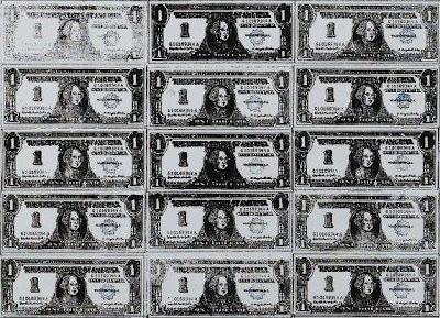
Details of "200 One Dollar Bills," 1962
Andy Warhol’s “Dollar Bill” paintings stand as iconic works in the evolution of his career, marking significant transitions in both style and technique. The first of these works, One Dollar Bill (Silver Certificate) from 1962, was hand-painted and is notable for being the only work in the series where Warhol used traditional painting methods. His choice to focus on the image of a worn dollar bill was emblematic of his fascination with consumer culture, art, and commerce, and would become a recurring theme throughout his career.
In the same year, Warhol made a major leap in his artistic process with the creation of 200 One Dollar Bills. This work, featuring a 20×10 grid of dollars, marked Warhol’s first use of the silk-screening technique. While still reliant on hand-drawn images, this painting set the stage for Warhol’s more refined approach to screenprinting, allowing for mass reproduction of images. Warhol’s transition to silkscreen was a crucial shift in his career, embodying his vision of art as a product that could be replicated and commodified just like the consumer goods he depicted.
In 2009, 200 One Dollar Bills sold at Sotheby’s for a record-breaking $43.7 million, far exceeding its estimated value. This sale exemplified not only the continued strength of his market appeal, even decades after his death. In a 2015 auction, One Dollar Bill (Silver Certificate) achieved a $32.8 million hammer price, a testament to the uniqueness of this hand-painted work in contrast to the mechanically reproduced screenprints for which Warhol became famous.
These “Dollar Bill” paintings reflect Warhol’s obsession with money and commerce, and how they relate to art. By focusing on the image of currency—something both banal and universally recognizable, yet exciting—Warhol challenged the traditional notions of fine art, emphasizing reproducibility and the role of the artist in a consumer-driven society.
Jackie Kennedy (1964)

Nine Jackies, 1964
Andy Warhol’s Jackie Kennedy paintings stand as a powerful and emotionally charged series that blends celebrity portraiture with profound reflections on national tragedy. Created in 1964, shortly after the assassination of President John F. Kennedy, the series captures the public’s mourning through the widowed Jackie Kennedy. Warhol sourced the images from newspaper and magazine photographs, carefully selecting moments that encapsulate the First Lady’s transformation from a smiling, glamorous icon to a grieving widow.
The series juxtaposes images of Jackie before and after the assassination, including moments from her husband’s funeral and the swearing-in of Lyndon B. Johnson. Warhol’s repetition of her image across multiple canvases echoes the media’s relentless coverage of the tragedy, blurring the line between public grief and private sorrow. In these works, Warhol displays Jackie’s personal anguish, yet confronts the idea of her mourning as a spectacle in the media.
Ironically, Warhol’s treatment of Jackie is both compassionate and detached. While he emphasizes her vulnerability and courage, he also participates in the process of symbolizing her grief and turning her into an icon of loss for the entire nation. This duality is reflected in his use of color and composition—cropping Jackie’s face and repeating it in a way that transforms her into a secular saint, an embodiment of grace under pressure.
As with his Marilyn and Liz series, Warhol’s Jackie portraits comment on the cult of celebrity, but in this case, they also resonate with a deeper sense of collective mourning and historical significance. The images serve as a reminder of how media can shape and mediate personal tragedy, turning it into a public narrative that speaks to the cultural consciousness. Through Warhol’s lens, Jackie Kennedy becomes both a personal subject and a universal symbol of grief, forever immortalized in the annals of American history.
Gun (1964)

Gun, 1981-1982
Andy Warhol’s Gun paintings, created between 1981 and 1982, reflect the artist’s fascination with death, violence, and American culture, all recurring themes in his work. Warhol approaches the subject with his signature Pop Art sensibility, using silkscreen techniques and repetition to both distance the viewer and draw attention to the object’s cultural significance. In this case, the object is a revolver—an icon of power, danger, and mortality. The gun appears as both a clinical, impersonal symbol of violence and a commodity in line with Warhol’s commentary on consumerism.
The Gun series can be seen as an extension of Warhol’s earlier Death and Disaster works, where he explored fatal accidents, electric chairs, and suicides. But here, the focus shifts from the outcome of violence to the instrument itself, rendered with an eerie detachment. The absence of a victim or perpetrator allows the gun to function as an abstract object, yet one loaded with societal and psychological meaning.
The Gun series holds an additional layer of significance when considering Warhol’s own experience with violence, specifically the 1968 assassination attempt on his life by Valerie Solanas. Solanas, a radical feminist and occasional actress in Warhol’s films, shot Warhol with a snubnosed revolver in his studio, leaving him physically and psychologically scarred for the rest of his life. Warhol narrowly survived the attack, undergoing emergency surgery and living with the trauma of the event for the rest of his career.
Intended to be exhibited alongside Knives and Dollar Signs, the Gun series elevates everyday objects to the status of modern memento mori. Warhol’s treatment of the gun transforms it into a stark, elegant icon that speaks to both the glamorization and the grim reality of violence in American culture. By repeatedly creating multiple Gun canvases, Warhol dehumanizes the weapon, stripping it of its immediate association with violence while simultaneously reinforcing its omnipresence.
Warhol’s Gun paintings have been displayed in prominent collections such as Tate London and the San Francisco Museum of Modern Art. These works, like his earlier series, use repetition and isolation to explore the commodification of violence, making them not just representations of objects, but reflections on the societal structures that produce and consume them. Warhol’s treatment of the gun, with its polished, seductive surface, invites the viewer to grapple with the paradox of its appeal—both repellent and attractive, violent yet sanitized.
Dollar Sign (1981)

Dollar Sign, 1981
Warhol’s Dollar Sign paintings, created in 1981 and first exhibited at Leo Castelli’s gallery in 1982, are some of his most powerful and iconic works. These paintings continue Warhol’s tradition of blurring the boundaries between art and commerce, positioning the dollar symbol as both the subject of the painting and a metaphor for the commodification of the artwork. Warhol unabashedly acknowledged the close relationship between art and money, once stating, “Making money is art, and good business is the best art.” In this series, he distills the concept, portraying the dollar sign as both a commodity and a work of art.
The Dollar Sign series also represents Warhol’s continued experimentation with silkscreen techniques, which had defined much of his earlier career. Unlike his earlier works that often sourced imagery from advertisements or celebrity photos, the dollar sign in this series was created by Warhol himself, drawn by hand, and then replicated through silkscreen in various colors and sizes. This process, along with the vibrant and flamboyant use of color, imbues the paintings with both a sense of irony and artistic flair. The paintings’ boldness speaks to the pervasive influence of money in society, while simultaneously celebrating the artist’s love for it.
Warhol’s exploration of the dollar sign as a subject speaks to his broader fascination with money, fame, and power. The series emerged during the 1980s, a decade characterized by an economic boom, the rise of Reaganomics, and an increasing obsession with wealth and status in the United States. In this context, the Dollar Sign paintings can be seen as both a reflection of the times and a critique of society’s fixation on money. The imagery of the dollar sign, blown up to monumental proportions and rendered in striking colors, epitomizes Warhol’s propensity for transforming ordinary, everyday symbols into thought-provoking works of art.
The Dollar Sign series continues to resonate with collectors and art enthusiasts. At a 2015 Sotheby’s auction in London, one of Warhol’s Dollar Sign paintings from 1981 sold for £9.9 million (roughly $13.2 million). This international demand was further demonstrated at a 2020 Christie’s auction in Hong Kong, where another Dollar Sign painting fetched over 50 million HKD (approximately $6.5 million). These impressive sales highlight the universal nature of the work, capturing the intersection of art and commerce in a way that only Warhol could.
Celebrity Portraits (1970s-1986)

Debbie Harry, 1980
In the 1970s and 1980s, Andy Warhol’s approach to celebrity portraiture took a more personal and intimate turn, shaped by his own growing fame and deepening connections with the social elite. Unlike his earlier portraits of iconic stars like Marilyn Monroe, Elvis Presley, and Elizabeth Taylor—figures he admired from a distance—his later works often depicted individuals he interacted with, bringing a distinctly human touch to his mechanical silk-screening process. These later portraits, frequently based on Polaroids Warhol took himself, captured a wide range of subjects, from stars like Mick Jagger, Debbie Harry, and Farrah Fawcett, to athletes and socialites, reflecting Warhol’s fascination with fame but also showing an evolution in his relationship with his subjects.
Warhol’s use of Polaroids for these portraits added an element of spontaneity and intimacy to his work. He called his Polaroid camera his “pencil and paper,” using it to capture the essence of his subjects in a way that felt immediate and authentic. This method also aligned with his ongoing exploration of the tension between public image and private reality. By taking his own photographs, Warhol had more control over the portrayal of his subjects, allowing him to convey not just their celebrity status but also a more nuanced view of their personalities. This approach is especially evident in his Athletes series, commissioned by Richard Weismann in 1977, which featured prominent sports figures like Muhammad Ali and O.J. Simpson. The portraits in this series, though bold and colorful, reveal a sense of vulnerability as Warhol captured these icons outside their usual context, offering glimpses into their identities beyond their public personas.
By the time Warhol painted Prince in 1984, his celebrity portraits had become highly sought after. The Prince series marked a return to the simplicity of Warhol’s 1960s works, echoing the vibrant and iconic nature of his early portraits of Marilyn Monroe and Liz Taylor. Using a photograph by Lynn Goldsmith as source material, Warhol applied the same bold colors and sharp contrasts that characterized his earlier pieces, celebrating Prince’s larger-than-life persona. However, like his use of Patricia Caufield’s image for the Flowers series, this source material resulted in legal disputes for Warhol’s estate, highlighting ongoing questions about appropriation.
While his early portraits dealt with the glamor and tragedy of Hollywood stars, his later celebrity works reflect a broader spectrum of fame. Warhol’s connections with many of his subjects in this period made these portraits more than just reproductions of media images—they became collaborations, often shaped by Warhol’s interactions with his sitters. Yet, despite the more intimate nature of these works, Warhol’s fascination with the surface image—the public mask—remained central to his practice. In these later portraits, we see Warhol grappling with the same themes of identity, fame, and commodification that had defined his work from the beginning, but with a deeper personal investment that adds complexity to his exploration of celebrity.
Camouflage (1986)

Camouflage Paintings (1986), installed in Gagosian gallery, 1998.
Andy Warhol’s Camouflage series, completed in 1986, was one of the last major works of his career. Inspired by the military motif of camouflage, Warhol took a design traditionally used for concealment and subverted it into something bold and eye-catching, applying vivid, Day-Glo colors to patterns meant to blend into nature. Warhol’s treatment of this pattern placed the concept of camouflage in a brand new social context—far removed from its utilitarian origins. Art historian Thomas Kellein noted that the Camouflage series draws parallels to Claude Monet’s Water Lilies, where the dense, repetitive patterns invite the viewer to lose themselves in the surface.
The inspiration for the Camouflage series came from a chance encounter Warhol had with his assistant, Jay Shriver, who was experimenting with abstract paintings by pushing paint through pieces of camouflage-patterned fabric. Intrigued by the process, Warhol purchased more fabric and began creating the works that now form this series. Unlike military camouflage, Warhol’s works featured bright, fluorescent colors that demanded attention, turning a tool of concealment into a Pop Art statement. This transformation of camouflage from military function to high art reflected Warhol’s continued interest in the intersection of mass-produced imagery and artistic abstraction.
The Camouflage series also had deeper personal significance for Warhol, particularly in his self-portraits from the same period, where he layered camouflage patterns over his own image. These works emphasize the paradox of fame and visibility that Warhol had long grappled with. The camo pattern both masked and revealed Warhol, suggesting the complexities of public persona versus private self—an issue Warhol knew well as both a celebrity artist and someone who valued anonymity in his personal life. The layering of camouflage over his face in the Camouflage Self-Portrait (1986) highlights this tension, with the military pattern obscuring Warhol’s features while simultaneously making him more iconic.
The use of camouflage in Warhol’s art may also point to a broader commentary on society. By taking a pattern intended to hide and recontextualizing it in vivid, conspicuous colors, Warhol seems to challenge ideas of conformity and individualism. In a world where people increasingly blend into the mass-produced culture around them, Warhol’s Camouflage Self-Portraits question what it means to stand out, or to remain hidden, in a society obsessed with visibility.
While the Camouflage series did not garner significant attention during Warhol’s life, it has since become more popular. These works have found success in the art market, as when one Camouflage painting sold for over $7 million at a Sotheby’s auction. The market’s appreciation reflects not only the rarity of Warhol’s exploration into abstract patterns but also the continuing relevance of his subject matter. Today, the Camouflage series is seen as a unique fusion of abstraction and Pop Art, solidifying its place in the final chapter of Warhol’s groundbreaking career.
Mona Lisa (1963, 1973-1980)

Colored Mona Lisa, 1963
Andy Warhol’s Mona Lisa paintings, created between 1963 and the late 1970s, express his fascination with the spectacle of cultural icons. Using Leonardo da Vinci’s renowned artwork as his subject, Warhol reinterpreted this classical image in various forms, from vibrant multi-colored renditions to ghostly monochrome versions. Warhol’s Colored Mona Lisa (1963), a notable piece within this series, transforms da Vinci’s masterpiece into a Pop Art icon by reproducing it in a grid-like pattern with each iteration uniquely colored, echoing earlier works like Marilyn Diptych and Triple Elvis.
Warhol’s decision to focus on the Mona Lisa coincided with the painting’s brief 1963 exhibition at the Metropolitan Museum of Art in New York, a momentous occasion that captured the public’s attention. For Warhol, this event was not just a display of historical art, but a pop culture moment, similar to the widespread attention garnered by Hollywood celebrities. In his artwork Thirty Are Better Than One (1963), depicting thirty Mona Lisas, Warhol presents a commentary on how even high art can be subject to the forces of mass consumption and media saturation.
Warhol revisited the Mona Lisa motif later in his career, producing works such as Mona Lisa Four Times (1973) and Four Mona Lisas (1978). Much like Thirty Are Better Than One, these paintings demonstrate Warhol’s fascination with seriality and repetition. By presenting the Mona Lisa multiple times in varying shades or tones, Warhol invites viewers to consider how overexposure to an image can simultaneously elevate and strip it of its meaning.
The Mona Lisa series also references the work of Marcel Duchamp, whose famous 1919 piece L.H.O.O.Q.—a parody of the Mona Lisa with added facial hair—challenged traditional perceptions of fine art. Warhol’s Mona Lisa works, while less overtly humorous, similarly question the commodification and reproduction of revered cultural symbols. In Four White on White Mona Lisas (1980), Warhol revisits the Renaissance icon, this time transforming her into a spectral figure, with light tones fading into the background, reflecting Warhol’s growing preoccupation with mortality in his later works.
In terms of market value, Warhol’s Mona Lisa paintings have performed remarkably well, with Colored Mona Lisa selling for $56,165,000 at Christie’s in 2015. This sale is among the top ten highest prices achieved for Warhol’s works, cementing the Mona Lisa series as a crucial part of Warhol’s exploration of pop culture, consumerism, and high art. Through these works, Warhol not only pays homage to one of the most famous paintings in history but also reinvents it for the modern era.
Shoes (1980)

Colored Mona Lisa, 1963
Andy Warhol’s Shoes series marks a significant return to the early roots of his career as a commercial illustrator, where shoes were among the first subjects he drew for major brands like I. Miller and Sons. First explored in the 1950s, Warhol’s fascination with shoes continued into the 1980s, when he revisited the subject through his flashy Pop Art lens. These works highlight not only Warhol’s love for fashion but also his mastery of transforming mundane objects into symbols of cultural commentary.
In these paintings, Warhol used a combination of synthetic polymer paint, screen printing techniques, and ground-up glass (referred to as “diamond dust”) to give them a sparkling, textured surface. This added a literal and figurative layer of glamour to the shoes, linking them to the glitz and materialism of 1980s New York. Each shoe in the series radiates an aura of luxury, representing the consumerist ideals that dominated American society at the time. The repetitive nature of the compositions, showing multiple shoes scattered across a single canvas, recalls Warhol’s earlier works where he immortalized commercial products and celebrities.
The Shoes series captures the spontaneity and glamour of Warhol’s world, particularly in the era of Studio 54. These paintings evoke a sense of the unattainable and fetishistic, emphasizing the role of shoes as status symbols.
In many ways, these paintings serve as a bridge between Warhol’s early career as a commercial artist and his later status as an art-world icon. The shoes, once whimsical and illustrative in his early work, now take on a more abstract, almost monumental role in his Shoes series, demonstrating Warhol’s ability to transform everyday objects into potent symbols of beauty, power, and commercial culture.
Rorschach (1984)

Rorschach, 1984
Andy Warhol’s Rorschach series, created in 1984, is perhaps the most striking departure from the consumerist imagery and celebrity portraiture for which the artist is most famous. These large-scale abstract works are based on the inkblot tests developed by Swiss psychiatrist Hermann Rorschach in the early 20th century (though Warhol misunderstood the nature of the tests, believing patients themselves created the inkblots). This misinterpretation led Warhol to invent his own mirrored inkblot paintings by pouring paint onto one side of a canvas, folding it over, and imprinting the other half.
Standing over 13 feet tall, the monumental scale of Warhol’s Rorschach paintings magnifies their abstract, amorphous forms, drawing viewers into a deeply personal experience. The sheer size of the canvases amplifies the psychological impact, encouraging viewers to project their own subconscious thoughts and interpretations onto the sprawling, symmetrical shapes, akin to a psychological test. This interaction between the vast forms and the observer evokes the original intent of Rorschach’s inkblots while allowing each person’s perception to vary with every viewing, making the artwork truly subjective—an absolute rarity in Warhol’s oeuvre..
Warhol acknowledged the ambiguity of these forms, remarking that he initially intended to hire someone to write interpretations of the paintings, as he only saw simple shapes like dogs or flowers. This interaction between the artist, artwork, and viewer positions the observer as both the patient and analyst, engaging in a process of self-reflection and projection.
The Rorschach series also engages with Abstract Expressionism, a movement Warhol had long admired but also challenged with his artwork. Much like his earlier Oxidation paintings, the Rorschachs mimic the spontaneity and physicality of works by Jackson Pollock, while simultaneously parodying the genre’s grandiosity. Through his mechanized process of folding and pressing the canvases, Warhol transforms the abstract form into something more deliberate and structured, emphasizing the tension between chance and control in his work, and leaving the final meaning entirely in the hands of the viewer.
Ultimately, Rorschach tests are mass-produced images, staying true to the themes that form the heartbeat of Warhol’s work. Not only that, but they are images used in psychiatry as tools to analyze, define, and re-order individuals who seem to deviate from established norms. Considering this, the Rorschach paintings are not the far cry from Warhol’s massive catalog of paintings they seem to be. Rather, they are right at home alongside his canon of reproducible objects, images, and faces.
The Rorschach series holds a unique place in Warhol’s later career, reflecting his ongoing experimentation with new forms and techniques while continuing to challenge the boundaries of art, interpretation, and meaning.
In Conclusion
Warhol’s body of work remains as relevant today as it was during his lifetime, continuing to challenge and inspire artists and audiences alike. His exploration of themes ranging from fame, death, commodification, and mass production speaks to the very core of the human experience in the 20th and 21st centuries.
From the vivid colors and repetition of his Marilyn and Elvis portraits to the macabre depictions of Death and Disaster, Warhol’s art transcends its time, offering a profound commentary on society’s fascination with image, iconography, and the overwhelming visibility of common things.
These 20 works represent the breadth of Warhol’s vision—an artist who masterfully navigated the intersection of popular culture and high art, leaving behind a legacy that forever altered the way we think about art.