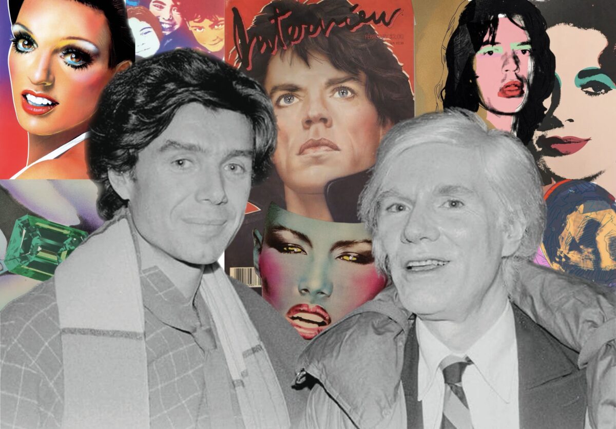
The covers of Interview magazine in the seventies and eighties are as recognizable and iconic as anything Andy Warhol produced during his career. This often led to the misconception that Warhol himself designed these covers, and while the pop-art aesthetic is undeniable, Warhol admitted that he simply didn’t have the time. Instead, he gave this job to another artist who shaped the magazine’s look for over fifteen years. “Richard Bernstein is my favourite artist,” Warhol wrote in his diaries, “He makes everyone look so famous.”
Bernstein’s fame primarily came from these covers, which makes it easy to overlook his broader contributions to the art and culture of his times. In this newsletter, we aim to dive deeper into his career, his art, and how he showed us another face of pop art and the era he lived in. Bernstein, a fixture of New York’s art and fashion scene since the late sixties, was deeply influenced by Warhol both artistically and personally. Understanding Bernstein, whose art and career paralleled Warhol’s in many ways, reveals how he was both enabled and overshadowed by Warhol, yet significant in his own right.
Warhol’s influence and market value remain robust and ever-expanding. His works consistently surpass auction estimates and set new records, reaffirming his pivotal role in contemporary art. Posthumous collaborations between the Andy Warhol Foundation and fashion brands, highlighted in our December 2023 newsletter, demonstrate Warhol’s enduring impact on both art and pop culture.
In contrast, Richard Bernstein’s legacy, though influential, often flares up and then fades from the spotlight. Recent events, such as an exhibition at NeueHouse in New York City showcasing Bernstein’s iconic Interview magazine portraits, exemplify such resurrections of interest in his work. A 2019 fashion collaboration between the Estate of Richard Bernstein and Coach brought his vivid portraits back into the cultural conversation, featuring his works on clothing and accessories. This followed a significant surge in attention in 2018, when Roger and Mauricio Padilha published Richard Bernstein Starmaker: Andy Warhol’s Cover Artist coinciding with a major retrospective presented by Jeffrey Deitch. The exhibition featured sixty-nine original cover paintings and a selection of Bernstein’s lesser-known works.
These periodic revivals highlight the particular challenge of Bernstein’s posthumous recognition, oscillating between intense interest and relative obscurity. While Warhol’s legacy continues to evolve and thrive within the art market and popular culture, Bernstein’s contributions, particularly works beyond his vibrant, hyper-glamorous celebrity portraits, warrant deeper appreciation.
For instance, the gemstone artworks by Warhol and Bernstein provide a rich ground for exploring themes of wealth, beauty, and materialism. Warhol’s abstract, symbolically rich prints contrast with Bernstein’s detailed, photorealistic depictions, offering a comprehensive view of the allure and impact of luxury in modern art. Comparing their works across various themes – from early Pop Art and celebrity portraits to their approaches to gems and their UN stamp commissions – not only celebrates Bernstein’s artistry but also underscores the broader cultural and artistic impacts of these two remarkable figures.
Recognizing the potential influence between Warhol and Bernstein also enriches our understanding of their respective works. Warhol’s fame has often overshadowed Bernstein’s contributions, but acknowledging Bernstein’s influence and artistic vision highlights his significance within the same cultural milieu.
1965: When Andy Met Richard
Bronx-born Richard Bernstein earned a BFA from the Pratt Institute and an MFA from Columbia University in the early sixties. After a successful solo show in 1965, he was invited to participate in a prestigious group show alongside Andy Warhol, Sol Lewitt, and Robert Rauschenberg. This exposure led to international exhibitions and a productive period in London and Paris, where he showcased his Pilules series at the Clert Gallery. Bernstein returned to New York in 1968 and took up residence in the legendary Chelsea Hotel, converting its grand ballroom into his studio. Charismatic, talented and remarkably handsome, Bernstein became a fixture in the Factory art scene and a regular at clubs like Max’s Kansas City and Studio 54.
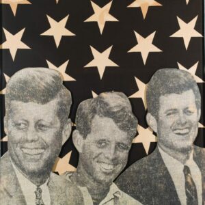

Bernstein’s early work drew heavily from the burgeoning pop art movement, portraying Hollywood and media icons. His pieces on the Kennedys and the Tin Man from The Wizard of Oz featured stylized American flags as backdrops, exploring the impact of these figures on the cultural imagination. Notably, his large, circular portrait of Greta Garbo, displayed in the 1965 exhibition where he met Warhol, exemplifies his ability to capture the ethereal beauty and enigmatic presence of classic Hollywood stars.
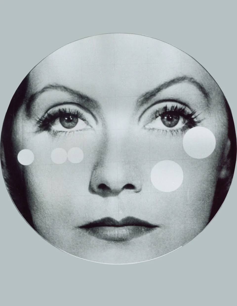
This close-up portrait emphasizes Garbo’s iconic status, presenting her visage as a self-contained, almost divine entity. Roland Barthes, a renowned French literary theorist and philosopher, described Garbo as a pure image of cinematic power in his book Mythologies (1957). Bernstein’s reverent depiction aligns with Barthes’ notion, evoking a romanticized view of timeless beauty and mystery that underscores Garbo’s cinematic ideal. Barthes describes Garbo’s face as an “admirable face-object,” representing a “Platonic Idea of the human creature”—an archetype of beauty that transcends the ordinary. Bernstein’s use of the circular frame and the added graphic circles emphasizes this idea, framing Garbo not just as a person but as a celestial being, almost deified in her perfection. The graphical elements also suggest a kind of timelessness and universality, aligning with Barthes’ idea that Garbo’s beauty is “descended from heaven where all things are formed and perfected in the clearest light.” By incorporating these abstract circles, Bernstein underscores the concept of Garbo’s face as a pure, almost divine essence, unmarred by the passage of time or the imperfections of reality.
Just as he did with Garbo, his future celebrity portraits, characterized by airbrushed, dewy perfection, offer a timeless quality that elevates his subjects beyond the constraints of their mortal existence. Bernstein’s portraits strive to present celebrities in a superlative state of beauty that transcends the passage of time, creating an illusion of eternal youth and flawlessness. In a manner that echoed Barthes’ idea of extracting existential beauty from essential beauty, he made each portrait a visual homage to their iconic status and timeless allure. This treatment imbues each figure with a sense of heavenly clarity, portraying them not just as famous individuals but as idealized embodiments of beauty and grace.
Bernstein was undoubtedly influenced by Warhol, yet his approach to the celebrity portrait differed significantly. Andy Warhol’s famous portraits of Marilyn Monroe, created using square or rectangular formats, filled the frame with Monroe’s entire head and employed bold, repetitive colors through silkscreen printing. Warhol’s technique emphasized the artificiality and commodification of Monroe’s image, transforming her into a pop culture icon. These works, pioneering the burgeoning pop art movement of the 1960s, critiqued consumer culture by presenting Monroe not as an alluring screen goddess but as a mass-produced image. Warhol’s portraits highlighted the disposable nature of modern celebrity, focusing on the construction and consumption of star images by the public.
Warhol’s treatment of celebrity, while also fixated on beauty and fame, incorporates a more nuanced commentary on mortality and the ephemeral nature of stardom. His iconic portraits of figures like Marilyn Monroe and Elizabeth Taylor are tinged with a sense of impermanence. Warhol’s use of bold colors and repetitive patterns abstracts these figures, reducing them to commodified images while simultaneously highlighting their vulnerability. For instance, his portrait of Liz Taylor, created during a time when she was reported to be fatally ill, juxtaposes her glamour with an underlying awareness of her mortality. This duality in Warhol’s work reflects his broader critique of consumer culture and the fleeting nature of fame.
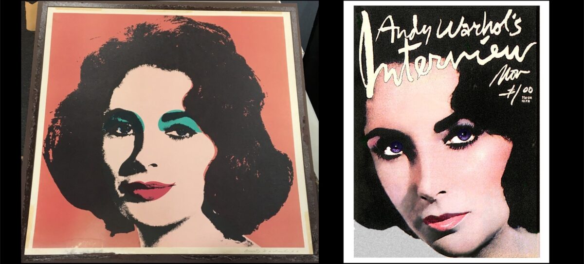
Bernstein, drawing from Barthes’ notion of Garbo’s existential beauty, aims to capture the immortal essence of his subjects, presenting them as paragons of timeless allure. His later portrayal of Elizabeth Taylor for the cover of Interview magazine clearly shows the influence of Warhol’s depiction, with Taylor’s hair falling in a similar pattern. However, Bernstein’s portrayal contrasts sharply in its suggestion of freshness and health, countering the fragility suggested by Warhol. Warhol’s early celebrity portraits serve as a reminder of the impermanence and commodification inherent in fame, whereas Bernstein offers an idealized, almost celestial representation of celebrity.
Portraits of Mick Jagger by Warhol and Bernstein further illustrate their differing artistic visions. Warhol’s 1975 portfolio Mick Jagger is characterized by abstract color blocks and sketchy black lines, reflecting his shift from using stock photography to Polaroids he took himself. The vibrant application of color underscores Jagger’s rockstar persona, while the roughness of the lines adds an edgy, raw quality that mirrors the rebellious spirit of the 1970s. Warhol’s work abstracts Jagger’s image, emphasizing the mythos of his celebrity and the allure of fame.
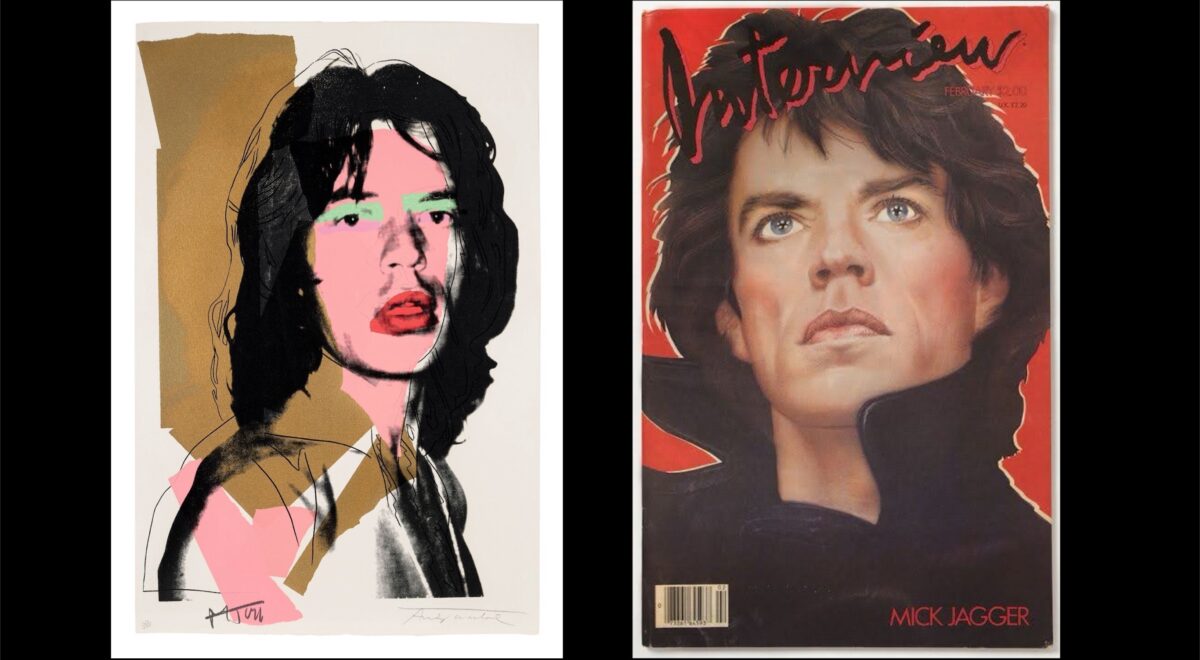
In contrast, Bernstein’s 1985 portrait of Jagger for Interview captures the rock legend through a combination of traditional and inventive methods, transforming Jagger into a heroic figure. Bernstein’s soft, airbrushed technique enhances Jagger’s natural features, giving him a larger-than-life presence. Unlike Warhol’s portrait, where Jagger engages directly with the viewer, Bernstein’s version shows Jagger with a far-off gaze, adding a visionary quality, suggesting a mature, forward-looking perspective. While both portraits capture Jagger’s charisma and status as a cultural icon, Bernstein meticulously crafts his image to radiate an aura of fame, freshness, and desirability, a style that came to be known as the “Bernstein look.” The soft, airbrushed technique creates an idealized image, one that enhances the celebrity’s allure without diminishing their recognizable features. Bernstein’s work is imbued with a sense of reverence for his subjects, transforming them into icons of perfection.
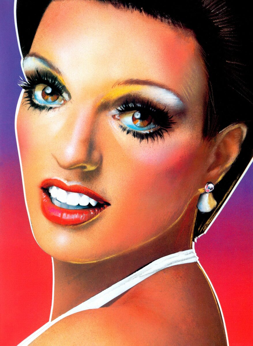
Richard Bernstein’s 1969 portrait of Barbra Streisand is a captivating example of his ability to blend realism with idealization, creating a powerful and memorable image. It is especially noteworthy, since it not only serves as a powerful precursor to the style he would later use in Interview magazine, but reemerged recently as a highly coveted fashion item. Released after Streisand’s star turn in the film Funny Girl, the portrait captures the elegance of her features and her youthful complexion, enhanced by a blush. The use of sparkling “diamond dust” further elevates the image, giving it a luminous quality that highlights the young star’s radiance.
View this post on Instagram
Bernstein’s meticulous technique is evident in the soft, almost airbrushed quality of the skin, which appears smooth and flawless, lending a dreamy, ethereal quality to Streisand’s visage. Bernstein’s use of texture is particularly notable, especially in the shimmering blue eyeshadow that the artist uses to adorn her eyes. The speckled, almost glittery finish achieved through the use of “diamond dust,” adds a layer of glamour and sophistication to the portrait. This texture, combined with the careful shading and highlighting, gives the portrait a three-dimensional quality, making Streisand’s face appear almost lifelike. The glitter effect also enhances the overall sense of luxury and opulence. The combination of detailed realism, soft airbrushing, and glamorous textures creates a timeless and captivating image that encapsulates Streisand’s allure and charisma, exemplifying Bernstein’s ability to elevate his subjects to an idealized, almost divine status, in line with his broader body of work.
The contrasting styles of Warhol and Bernstein highlight their distinct approaches to celebrity portraiture. Warhol’s work, with its bold colors and abstract elements, invites viewers to engage with the mythos of celebrity. His portraits often blur the line between the personal and the public, reflecting his fascination with the commodification of fame. The use of his own Polaroids for portraits marked a more intimate involvement in the creation process, yet the end result remains an exploration of the public image. Bernstein, in contrast, embraced an intimate and detailed hyper-realism, celebrating the beauty and charisma of his subjects. The soft, airbrushed technique creates an idealized image, one that enhances the celebrity’s allure without diminishing their recognizable features. Bernstein’s work is imbued with a sense of reverence for his subjects, transforming them into icons of perfection.
Both artists, through their unique styles, have immortalized celebrities in ways that go beyond mere likeness. Warhol’s portrait emphasizes the constructed nature of celebrity, presenting them as a symbol of an era. Bernstein’s portrayal, meanwhile, focuses on the inherent glamour of his subject, making them appear almost ethereal. Together, these portraits offer a rich dialogue on the nature of fame, beauty, and the role of the artist in shaping and reflecting cultural icons. In exploring these works, one gains a deeper understanding of how Warhol and Bernstein each contributed to the visual language of celebrity in the late 20th century, yet it was in their collaboration on Interview magazine that the synergy between the two artists was consolidated.
Defining Celebrity: The Impact of Interview Magazine
By the early seventies, Bernstein had already made a name for himself with his paintings, but his role at Interview catapulted him to fame as a star illustrator and art director, as well as one of Warhol’s close collaborators. Each month, Bernstein created vibrant covers featuring the magazine’s interviewees, from rising athletes and actors to new socialites on the disco scene. His work not only highlighted their best features but often seemed to predict their future stardom, giving significant weight to the magazine’s nickname as the “Crystal Ball of Pop.”
In the early 1970s, Andy Warhol was in the process of rebranding his avant-garde film magazine, inter/VIEW, into a more lively and less intellectual publication. To achieve this transformation, Warhol needed an artist who could infuse the magazine with bold imagery and a sense of glamour. Richard Bernstein, known for his ability to capture the essence of American pop culture and glamour, was the perfect fit. Warhol, himself a renowned illustrator, soon entrusted Bernstein with designing Interview‘s new logo and covers. His adaptability to the numerous revisions requested by Warhol and his team made him an indispensable part of the magazine’s production process. The covers he designed were not only visually striking but also embodied the glamorous, vibrant spirit of the magazine’s content.
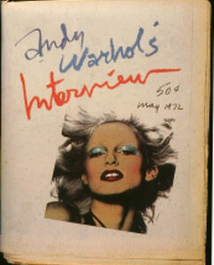
Richard Bernstein’s arrival at Interview magazine marked the beginning of a transformative era in print media, one that blended the grandeur of Hollywood, the sophistication of fine art, and the playful allure of fashion. His portraits, which adorned the magazine’s covers every month, quickly became iconic, starting with his debut on the May 1972 issue. The significant shift in the magazine’s aesthetic was marked by a completely new look, with its first color cover, replacing the old Art Deco logo and tagline with the vibrant, handwritten “Andy Warhol’s Interview.”
The cover photo, airbrushed by Bernstein, featured Donna Jordan with striking red lips, turquoise eye shadow, and yellow hair. This colorful and bold style, reminiscent of an Andy Warhol portrait, became the hallmark of Interview covers for the next fifteen years. Bernstein collaborated closely with editor Bob Colacello, art director Marc Balet, and renowned photographers like Bill King, Francesco Scavullo, Albert Watson, Greg Gorman, and Matthew Rolston, who would visit Bernstein at his Chelsea Hotel studio to work out the subject of the next month’s cover. Through these collaborations, Bernstein took classic silver gelatin prints and transformed them into masterpieces using paint, airbrush, gouache, and collage.
The impact of Bernstein’s covers was so profound that many assumed Warhol himself created them. However, it was Bernstein’s unique touch that defined Interview’s visual identity during its most iconic years. His ability to blend neon paints and makeup with a hyperkinetic, handwritten logo made the stars on the covers appear almost three-dimensional. This dynamic style, later echoed by artists like Richard Phillips, cemented Bernstein’s role as a pivotal figure in the visual narrative of celebrity culture.
Bernstein’s portrait of Liza Minnelli for the 1979 issue of Interview exemplifies his aesthetic approach towards celebrity. Warhol, recognizing Bernstein’s unique talent, often relied on him to elevate and perfect the images used for the magazine’s covers. In the case of Minnelli’s portrait, Warhol’s dissatisfaction with the initial photographs highlighted the need for Bernstein’s creative intervention. The original images, though clear and sharp, did not capture Minnelli’s true essence and instead made her appear unflattering. Warhol noted in his diaries that Bernstein would have to perform a significant creative overhaul to make the images suitable for the cover.
The resulting portrait of Liza Minnelli showcases Bernstein’s ability to enhance and immortalize his subjects. Minnelli is depicted with flawless, luminous skin and dramatic makeup that highlights her expressive eyes and iconic features. The airbrushed effect gives her a youthful, almost otherworldly glow, while the rich, vibrant colors and meticulous detailing elevate her to a state of superlative beauty. The eyes and teeth appear as jewels, with as much lustre as her earrings. Bernstein’s techniques—layering paint, airbrush, and gouache over the photograph—create a sense of depth and texture that brings the image to life. This approach not only corrects any perceived flaws in the original photograph but also amplifies Minnelli’s star quality, presenting her as an ethereal icon of glamour and sophistication.
Warhol’s acknowledgment of Bernstein’s work in his diaries highlights their symbiotic yet complex relationship, influenced by the power dynamic between Warhol as the employer and Bernstein as the employee. Warhol admired Bernstein’s talent but frequently requested revisions to his covers, as Bob Colacello notes in his biography Holy Terror. Colacello recalls, “When Richard Bernstein brought a cover in, I’d look at it quickly and then take it over to the Factory side to show Andy. His most consistent comment was, ‘Can’t Richard retouch it more?’” Warhol even considered giving the cover commissions to his assistant Victor Hugo, a personal friend who brought in advertising commissions, but Colacello and Fred Hughes convinced him otherwise.
By the mid-seventies, Bernstein’s relationship with Interview had become strained due to numerous editorial revisions that diluted his original artistry. During this period, Grace Jones, who had befriended Bernstein, began accompanying him to meetings. Her presence helped reduce the criticism he faced. Eventually, Jones persuaded Warhol to stop editing Bernstein’s work and grant him creative freedom. The first cover Bernstein designed under this new arrangement, for the September 1976 issue featuring Diana Ross, became Interview’s best-selling issue to date.


While Warhol’s portraits often embraced the commodification and impermanence of celebrity, Bernstein’s works aimed to capture an idealized, almost divine essence of his subjects. This difference in approach speaks to the broader cultural context of the time, providing a comprehensive commentary on fame, beauty, and the media’s role in shaping public perceptions of stardom. Editors like Bob Colacello and Fred Hughes, along with influential friends like Grace Jones, played crucial roles in this creative synergy, helping to shape the portrayal of celebrity in a way that resonated with the public and defined the magazine’s legacy.
The dynamic between Warhol and Bernstein extended beyond their individual artistic styles to the very process of creating icons out of people while the collaborative and sometimes contentious environment that ultimately shaped the magazine’s distinctive aesthetic. Warhol and Bernstein’s contributions can be seen not only as individual artistic achievements but as part of a larger, collaborative effort to capture and define the essence of celebrity in their time. Their combined influence provided a nuanced and multifaceted commentary on the nature of fame, blending critique with celebration, and leaving an indelible mark on the art and media landscapes of the seventies.
Gems and Jewel Paintings: A Parallel Exploration
In 1978, Andy Warhol produced a striking series of prints depicting gemstones that reveal much about his fascination with wealth and glamour. Known for his exploration of consumerism and celebrity culture, Warhol was a central figure in the Pop Art movement. However, less widely known was his secret collection of jewelry and gemstones, often worn discreetly beneath his clothing. This hidden passion for opulence adds a deeply personal dimension to his Gems portfolio.
Warhol’s approach to these prints is characterized by geometric abstraction and bold color palettes. The central forms in his works are defined by sketchy black lines overlaid on vibrant, flat color blocks, creating a dynamic tension that draws attention to the gemstones’ symbolic value rather than their physical properties. This abstraction was a hallmark of Warhol’s approach to the still-life genre, which he explored in other portfolios of the time, such as Skulls, Space Fruit, and Hammer and Sickle. The vibrant colors and striking compositions of the Gems prints encapsulate Warhol’s complex relationship with opulence, highlighting his obsession with the superficial allure of wealth.

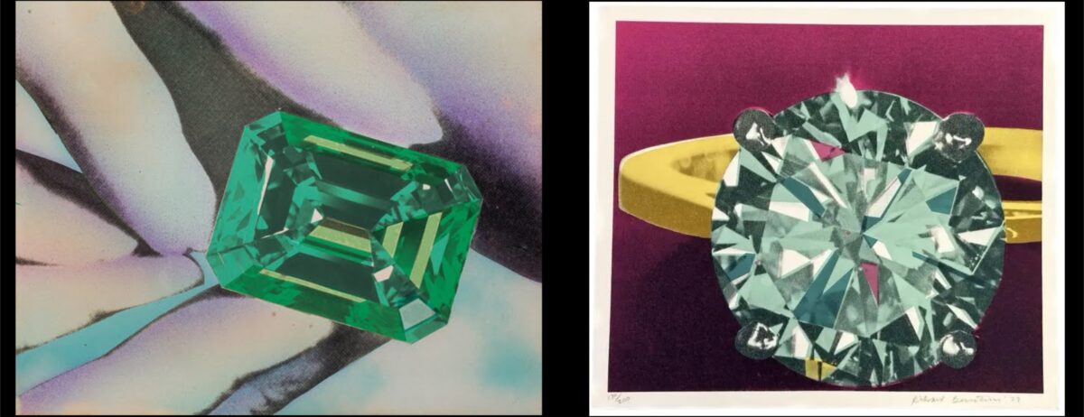
Richard Bernstein created his own gemstone series between 1968 and 1978, predating Warhol’s similar works. Unlike Warhol’s works, his gemstone paintings show meticulous attention to detail, light, and texture. The gemstones in Bernstein’s works are depicted with intricate facets and reflective surfaces, capturing their brilliance and clarity. The backgrounds, ranging from soft gradients to ornate settings, enhance the luxurious feel of his compositions. Bernstein’s idealized portrayal emphasizes the tangible beauty and craftsmanship of these objects, reflecting a deep appreciation for the artistry involved in gemstone cutting. This fascination with the intricate details of gemstones underscores a personal intrigue with the opulence that contrasted his everyday life.
Contemplating a possible exchange of ideas between Warhol and Bernstein enriches our understanding of their artworks. If Warhol was indeed influenced by Bernstein’s earlier work, it suggests a creative dialogue where ideas about wealth, beauty, and materialism were shared and explored. Warhol’s abstract interpretation and Bernstein’s realistic depiction offer complementary perspectives on the same theme, enhancing the viewer’s appreciation of each artist’s unique approach. Warhol’s gemstones, abstract and stylized, suggest a critical dimension that plays with the symbolism of material wealth. In contrast, Bernstein’s lifelike portrayals celebrate the craftsmanship and physical beauty of these gems, offering a more sensual appreciation of their luxurious appeal.
Warhol’s gemstones, with their bold colors and abstract forms, symbolize the allure and superficiality of wealth, inviting viewers to question their own perceptions of beauty and luxury. The autobiographical layer in Warhol’s work, stemming from his secret love of feminine adornments, adds depth to his exploration of opulence. Bernstein’s realistic depictions, however, emphasize the physical allure of gemstones, reflecting his appreciation for the intricate beauty and artistry of these objects. The detailed and luxurious settings in Bernstein’s works highlight his fascination with the precision and craftsmanship involved in jewelry design, offering a counterpoint to Warhol’s more conceptual approach. Speculating on their interaction adds a layer of complexity to this artistic dialogue, underscoring the interconnectedness of their creative journeys and the mutual influence that may have shaped their unique perspectives on the captivating theme of gemstones.
On Pop Music and Muses: Album Covers and Iconic Imagery
Andy Warhol’s formidable presence in the music scene is exemplified by his work with the Velvet Underground and the Rolling Stones. As the manager of the Velvet Underground, he produced the iconic album cover for their debut album, The Velvet Underground & Nico, released in March 1967. The cover features Warhol’s infamous design of a yellow banana with a functional peel that, when removed, reveals a pink, flesh-toned banana underneath. The original edition, with instructions to “peel slowly and see,” caused quite a stir due to its phallic symbolism.
In 1971, Warhol created another iconic album cover for the Rolling Stones’ Sticky Fingers. This controversial cover features a close-up of a man’s crotch in tight jeans, complete with a functional zipper that, when pulled down, reveals the model’s underwear. This bold and provocative design has since been recognized as one of the greatest album covers of all time. Warhol’s close friendship with Jagger, who became an active member of the Factory scene, further deepened their collaborative relationship. Warhol also designed covers for other prominent artists like Liza Minnelli, whose 1981 album At Carnegie Hall features a simplified yet bold portrait of the singer, and Diana Ross, whose 1982 album Silk Electric showcases her striking features with Warhol’s characteristic use of vibrant colors.
Interestingly, Richard Bernstein created Interview magazine covers for each of these artists, echoing their collaboration with Warhol and underscoring the interconnectedness of their artistic contributions with the world of celebrity and fame. While Bernstein is best known for his Interview magazine covers, his work on album covers is also notable. He created covers for stars such as Cher, Loleatta Holloway, Madonna, and New Order. Many of these covers, like Cher’s 1975 album Stars, employed the ultra-glamorous style he was known for, though there were some exceptions, such as the cover for New Order’s 1988 single Fine Time, which reproduces one of his early Pilules paintings.


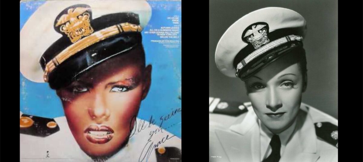
One singer became a recurring subject and muse for Bernstein – quite literally, as one of the albums is titled Muse. This muse was Grace Jones, for whom Bernstein created the cover art for her debut album Portfolio in 1977, followed by Fame in 1978, and Muse in 1979. Notably, on the back cover of Fame, Bernstein painted Jones referencing Marlene Dietrich in drag, wearing a sailor suit with a hat tipped rakishly to the side in Seven Sinners (1940). This connection to classic Hollywood glamour seems to invoke Roland Barthes’s comments on the face of Garbo, suggesting that Bernstein saw a similar timeless quality in Jones as well. Additionally, it foreshadowed the androgynous image that Jones would later cultivate in her singing and acting career, highlighting Bernstein’s ability to capture and anticipate the evolving personas of his subjects.
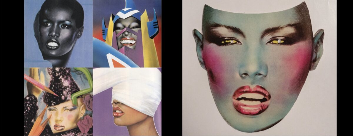
Bernstein played a significant role in Jones’s evolving image in another way. He introduced her to his good friend, the French artist and designer Jean-Paul Goude, who would not only enter into a long and tumultuous relationship with Jones but also take over the artistic direction for her albums, concerts, and music videos. Goude’s influence ushered in Jones’s metamorphosis from disco diva to avant-garde chanteuse and art icon. Despite this shift, he continued collaborating with the couple. At the Studio 54 launch for Jones’s 1980 album Warm Leatherette, he crafted paper masks of her airbrushed visage for attendees, allowing them to look like her. Bernstein eventually returned to design the artwork for her 1986 album Inside Story, bringing a futuristic aesthetic through the pioneering use of computer painting techniques.

Bernstein’s use of the Quantel Paintbox for this album cover parallels Warhol’s own experiments with computer-generated graphics in the mid-80s. Warhol, who began with an Apple computer and later used the Commodore Amiga, found new ways to blend technology and art, much like Bernstein. However, for Warhol, the medium remained a novelty, whereas it became a defining medium for Bernstein’s post-Interview art.
Grace Jones maintained friendships with both Warhol and Bernstein, often accompanying them to parties and events. Jones, a self-confessed “Art groupie” as professed in a song of that name from the album Nightclubbing (1981), was connected to many artists of the time. Warhol and Keith Haring appeared in her music video for “I’m Not Perfect (But I’m Perfect for You).” Warhol appears briefly, stating “Grace is perfect,” and Haring is seen painting a large, round canvas that transforms into a towering dress worn by the singer. Haring also painted costumes and set pieces for the film Vamp (1980), which starred Jones. Bernstein, though not appearing in the video, had his artwork for Inside Story animated in color and motion, further cementing his artistic influence on her visual presentation.
Art for a Cause: Warhol and Bernstein’s U.N. Stamp Commissions
Along with famous artists such as Picasso, Al Hirschfeld and Salvador Dali, Andy Warhol and Richard Bernstein were both commissioned to create postage stamps for the United Nations in 1979 and in 1990 respectively. Both stamps, though created over a decade apart, highlight the enduring impact of these artists and their ability to convey powerful messages through their work.
Warhol’s contribution to this series of UN stamps is a vibrant, abstract composition that showcases his mastery of color and form. The design features bold, geometric shapes in bright hues of blue, orange, and purple, interspersed with black sketch-like lines that add a dynamic, almost kinetic energy to the piece. The abstraction is striking, diverging from the more figurative and realistic styles often seen in postage stamps. The year 1979 was significant for Warhol as it marked a period where he was deeply engaged with themes of wealth and consumerism, and this commission reflects his ability to bring high art into popular culture.

Bernstein’s approach, while rooted in his characteristic glamorization and idealization, is notably more figurative than Warhol’s abstract design. The stamp features a vibrant collage of children’s faces, rendered in a spectrum of colors that create a warm, joyous atmosphere. The use of bright, overlapping colors and the close-up framing of the children’s faces evoke a sense of unity and diversity, resonating with the ideals of the United Nations. Bernstein’s use of color and light gives the children an almost ethereal glow, emphasizing their innocence and the hopeful future they represent. The stamp embodies Bernstein’s talent for enhancing the best qualities of his subjects, creating a portrait that is both idealized and deeply human.
The styles of Warhol and Bernstein, while both vibrant and colorful, differ significantly in their approach. Warhol’s abstract, geometric design focuses on form and color as primary elements, stripping away figurative representation to create a bold visual impact. His use of abstraction challenges the conventional expectations of postage stamp design, making a statement about the intersection of art and everyday objects. In contrast, Bernstein’s stamp is more figurative and narrative, using the faces of children to convey a message of hope and unity. His approach is more emotive, aiming to connect with the viewer on a personal level through the representation of human subjects.
The years in which these stamps were made are also significant. Warhol’s 1979 stamp came at a time when his exploration of consumerism and commodification was at its peak. His work during this period often focused on transforming mundane objects into art, a theme that is reflected in his approach to the postage stamp. Bernstein’s 1990 stamp, on the other hand, emerged in a period marked by a renewed focus on global unity and the rights of children, following the adoption of the United Nations Convention on the Rights of the Child in 1989. Bernstein’s stamp, with its emphasis on the faces of children from diverse backgrounds, reflects this global shift towards inclusivity and hope for the future. Together, these stamps by Warhol and Bernstein showcase their unique artistic visions while also reflecting the cultural and historical contexts of their respective times.
Posthumous Legacies and Brand Collaborations
Andy Warhol’s sudden death after surgery in 1987 marked the end of a significant chapter in the art world. A year later, a shift in leadership at Interview in 1988 concluded Richard Bernstein’s long-standing role with the magazine. Known primarily for his magazine portraits, Bernstein struggled to find his footing in the years that followed. As the late 1980s progressed, Bernstein’s personal life became increasingly troubled. He fell deeper into drug use, eventually developing a heroin addiction, and contracted HIV. By the time he died at 62 in 2002, complications from AIDS had taken their toll.
Despite their tragic ends, both artists have left enduring legacies. Their works are held in the collections of the world’s most prestigious museums and are highly valued by collectors, although Warhol’s posthumous fame has significantly outpaced that of Bernstein. Warhol’s influence continues to be celebrated and expanded through various initiatives.
The Andy Warhol Foundation, established in his honor, has engaged in numerous collaborations with major fashion brands such as Tiffany’s, Converse, Uniqlo, Supreme, and Dior. These partnerships have helped keep Warhol’s work at the forefront of contemporary art and fashion, blending his iconic imagery with modern design to reach new audiences.
Similarly, the Estate of Richard Bernstein has worked to keep his vibrant legacy alive. In 2019, a notable collaboration with Coach reintroduced Bernstein’s artwork into the cultural conversation. This collection fused Coach’s bold New York attitude with Bernstein’s unique pop art and portraiture.


Coach Spring/Summer 2020. Courtesy of Coach
British designer Stuart Vevers paid homage to Bernstein in this collection, prominently featuring Interview covers such as Rob Lowe’s May 1984 cover and Michael J. Fox’s trippy 1988 cover. Highlights included a classic-fit T-shirt featuring Bernstein’s 1969 portrait of Barbra Streisand, showcasing his distinctive use of airbrush and glitter that captured the electric glamour of the 1970s and 80s. The collection, set against the backdrop of New York City’s High Line park, made a strong impression during fashion week, prominently displaying Bernstein’s iconic artwork.

“Andy Warhol originated the marriage of art, fashion, and print in New York City,” says Paige Gamble, designer of her eponymous line of luxury leather goods. Inspired by one of Bernstein’s covers, Gamble conceptualized a custom tote for Interview. “His pastel portraits of actors, rock stars, and fashion icons perfectly captured the spirit of the ’80s,” she remarks.
These collaborations between the Warhol Foundation and Bernstein Estate with various fashion brands highlight the lasting impact of both artists. Warhol’s vast and iconic body of work and Bernstein’s vibrant, idealized portraits continue to resonate, blending the past’s artistic achievements with contemporary design.
Both artists, through their distinctive styles, immortalized celebrities and shaped glamour in ways that transcend mere likeness. Warhol’s portraits emphasize the constructed nature of celebrity, presenting them as symbols of their era. Bernstein’s portrayals, meanwhile, focus on the inherent glamour of his subjects, making them appear almost ethereal. Together, their portraits and paintings of opulent themes offer a rich dialogue on the nature of fame, beauty, and the role of the artist in shaping and reflecting cultural icons.
Warhol and Bernstein were not just artists but also integral figures in the vibrant New York art scene of the 1960s, 70s, and 80s. Their collaborations and parallel social lives, frequenting iconic venues like Studio 54 and Max’s Kansas City, underscore the interconnectedness of their artistic and personal worlds. This immersion in the cultural epicenter of New York allowed them to draw inspiration from the same milieu of celebrities, socialites, and fellow artists, enriching their work and solidifying their statuses as cultural icons.
Their legacies, preserved and celebrated not only through exhibitions and revivals, but also through brand partnerships, provide a nuanced commentary on fame, beauty, and the enduring allure of their unique artistic visions. By exploring these works, one gains a deeper understanding of how Warhol and Bernstein each contributed to the visual language of celebrity in the late 20th century.