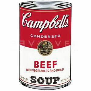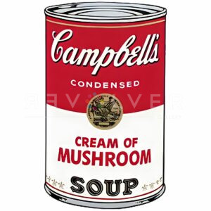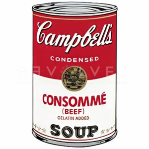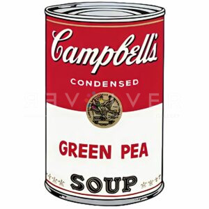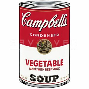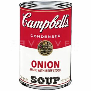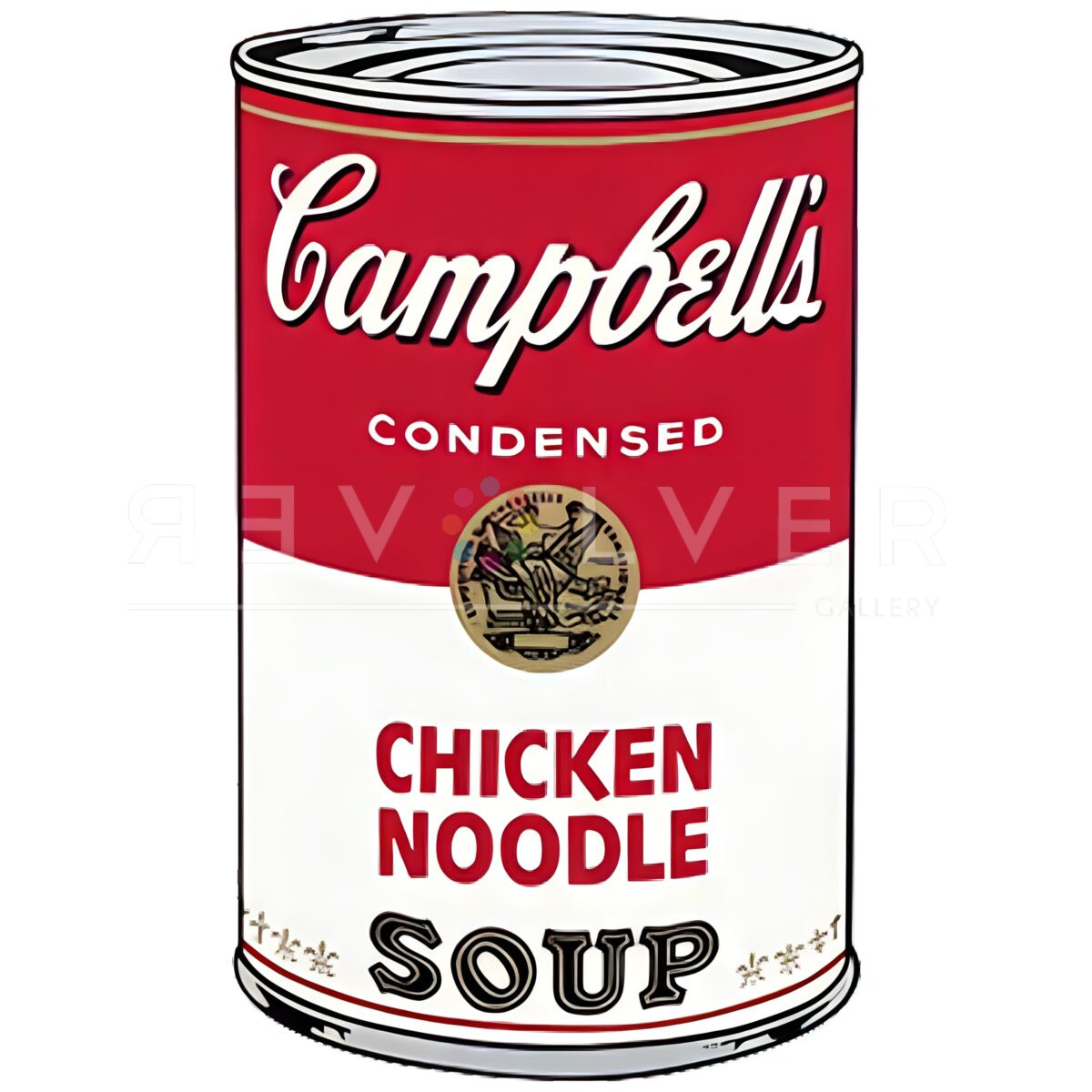

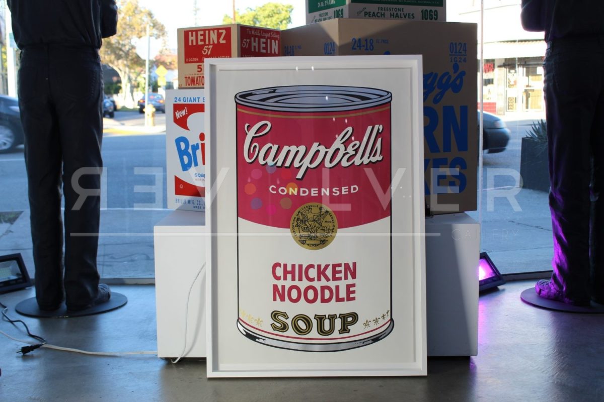

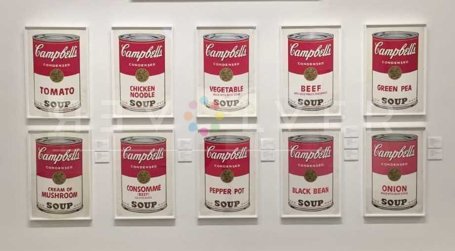
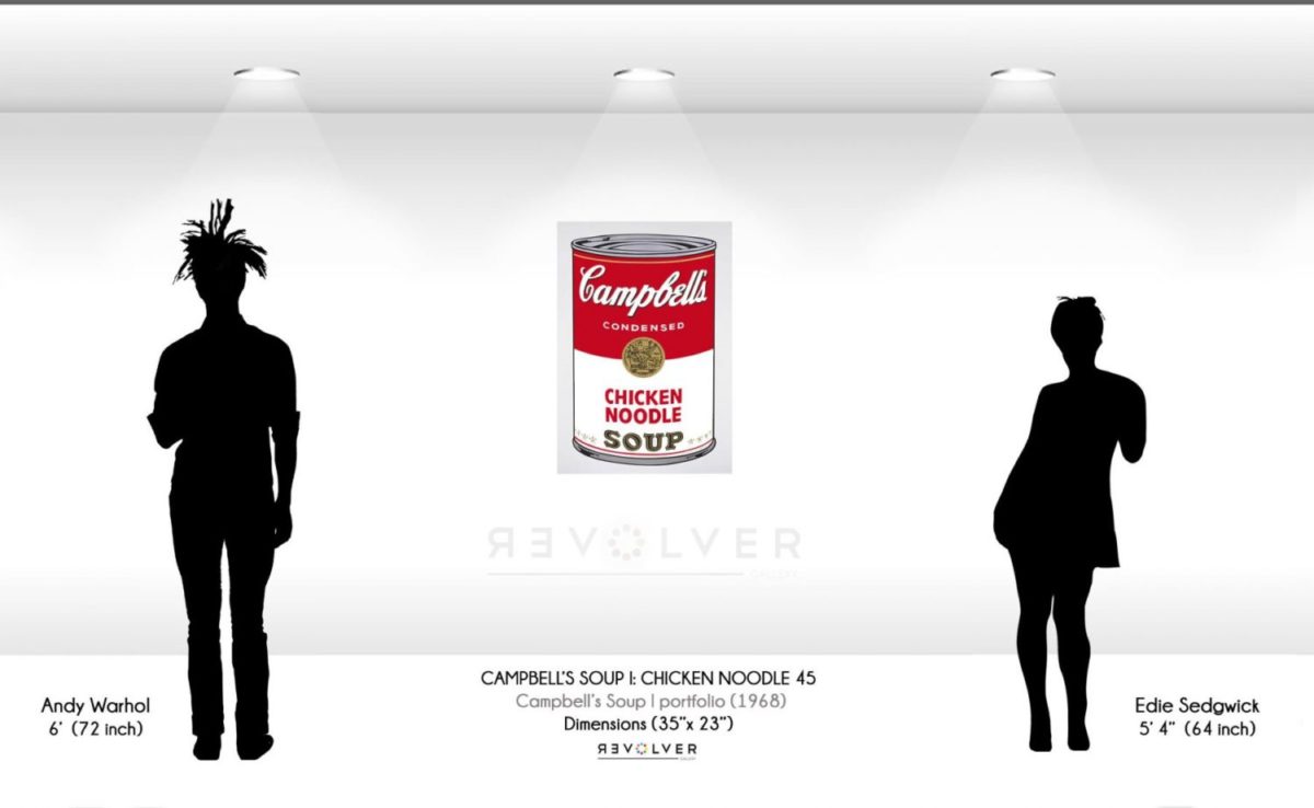
Campbell’s Soup Cans I: Chicken Noodle 45 is one of ten prints included in Warhol’s Campbell’s Soup Cans I portfolio. Created in 1968, the portfolio was inspired by his original paintings of the iconic soup cans, 32 Campbell’s Soup Cans, from 1962, which was both controversial and successful. A year after this portfolio’s completion, Andy printed the soups again in Campbell’s Soup Cans II. In the second portfolio, Andy strayed from the cans’ original design, adding his own illustrations. For this reason, the Campbell’s Soup Cans I prints are the most valuable of the two, as a direct homage to the original brand. Both Campbell’s Soup Cans I and II comprise some of Warhol’s most recognizable and valuable prints.
Warhol’s soup cans are known for accelerating the emergence of Pop Art, and are arguably his most familiar works. Inspired by contemporaries like Robert Rauschenberg, Jasper Johns, and Roy Lichtenstein, Warhol’s Campbell’s concept was perhaps his most significant contribution to the new movement. Moreover, the work perfectly represents the movement’s themes and ambitions, and ultimately allowed him to champion the Pop Art genre.
As a response to the overwhelming popularity of abstract expressionism, Warhol sought to redirect common perceptions of artistic subject matter. Concepts like natural beauty and emotion had long been a focal-point for expressionist art, but Warhol found inspiration in other venues of life. Mainly, he wanted to emphasize the products of 20th century industry, and draw attention to commerce and mass-production. This motif can be seen in Warhol’s Ads portfolio, and his 1964 Tomato Juice Box sculpture.
Common commercial objects fascinated Warhol for various reasons. Specifically, he saw them as humble miracles of modern society, appearing the exact same everywhere you go. Thus, in Andy’s mind, items like Coca-Cola or Chanel perfume were authentic reflections of human culture, and a legitimate source of artistic value. In particular, Campbell’s Soup cans stood out as an interesting subject. Warhol liked them for their commercial success and iconic design, which had stayed the same for decades. Not to mention, he claimed to have eaten the soup almost everyday for twenty years.
Ultimately, Warhol’s Campbell’s Soup cans challenged notions of what “counted” as art, and offered a fresh perspective on artistic ideas in general. Initially, the soup cans’ debut in 1962 surprised the audience and offended some mainstream artists. No one expected the strictly commercial style. Rather than the complex abstractions of popular art, the work seemed to resemble a grocery store aisle. Surely, works like “Campbell’s Soup Cans I: Chicken Noodle 45” confused many people. But this is in fact a large part of the work’s meaning. With the soup cans, Warhol caused people to consider the artistic value of what they were viewing, leading towards a fundamental shift in society’s understanding of what art could be. Campbell’s Soup Cans I: Chicken Noodle 45 is one of Andy Warhol’s greatest accomplishments, and a highly cherished piece of modern art.
Photo Credits:
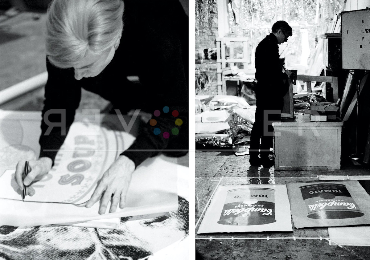
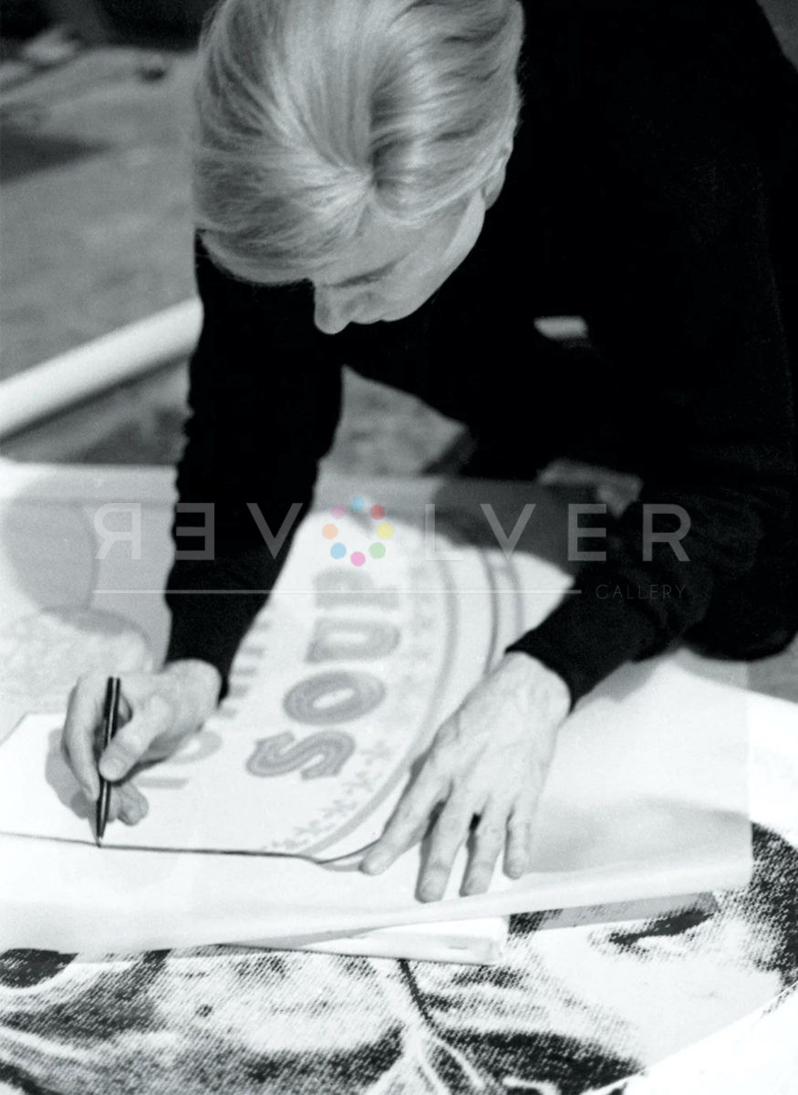
- Andy Warhol tracing Campbell’s Soup silkscreen, The Factory, New York City, circa 1965 © Estate of Nat Finkelstein © 2021 The Andy Warhol Foundation for the Visual Arts, Inc. / Licensed by DACS, London
- Andy Warhol and Gerard Malanga make a painting, 1964. Vintage gelatin silver print, 10¼ × 14¾ inches; 26 × 38 cm. Photo by Matthew Marks.
- Andy Warhol, 1964. Vintage gelatin silver print, 10¼ × 14¾ inches; 26 × 38 cm. Photo by Matthew Marks.