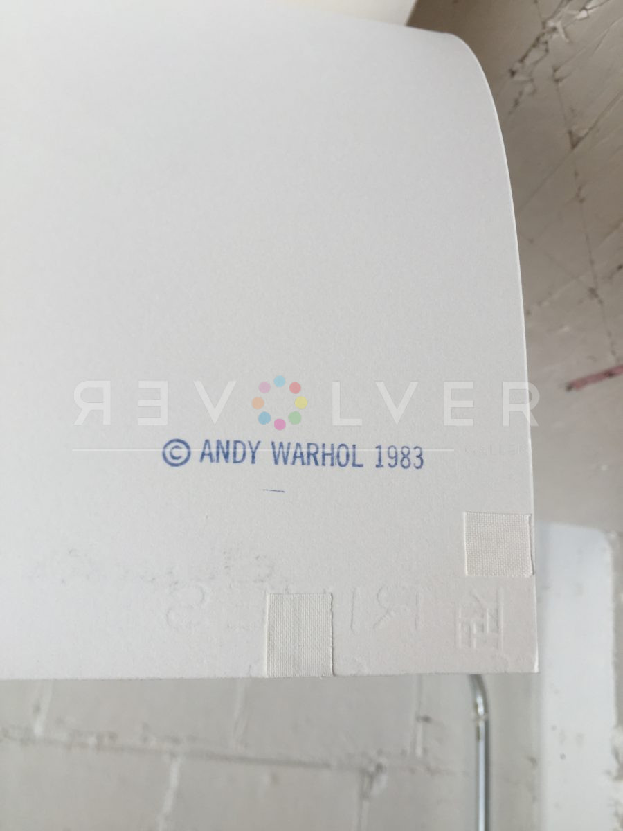
Andy Warhol’s Kiku portfolio is a testament to his experimental artistry and deep engagement with cultural iconography. Commissioned in 1983 by the Gendai Hanga Center in Tokyo, the series is one of only two Warhol projects published in Japan, the other being the Love series. The portfolio derives its name from the Japanese word for Chrysanthemum, a flower deeply associated with the Japanese emperor and the Imperial House, symbolizing longevity, rejuvenation, and nobility.
Warhol’s fascination with floral subjects is well-documented, notably in his famous 1964 Flowers series, which was based on a photograph of hibiscus flowers by Patricia Caulfield. In these works, Warhol arranged and cropped blossoms in unconventional colors, creating a vibrant tableau. The Flowers (Black and White) and Flowers (Hand-colored) series exhibit a more gestural quality, akin to studies, and highlight the transient beauty of flowers—a symbol of impermanence that Warhol sought to immortalize through his art.
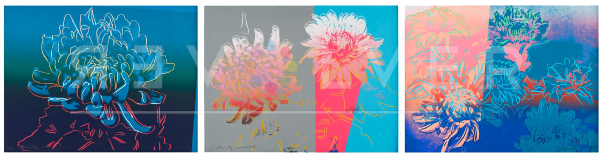
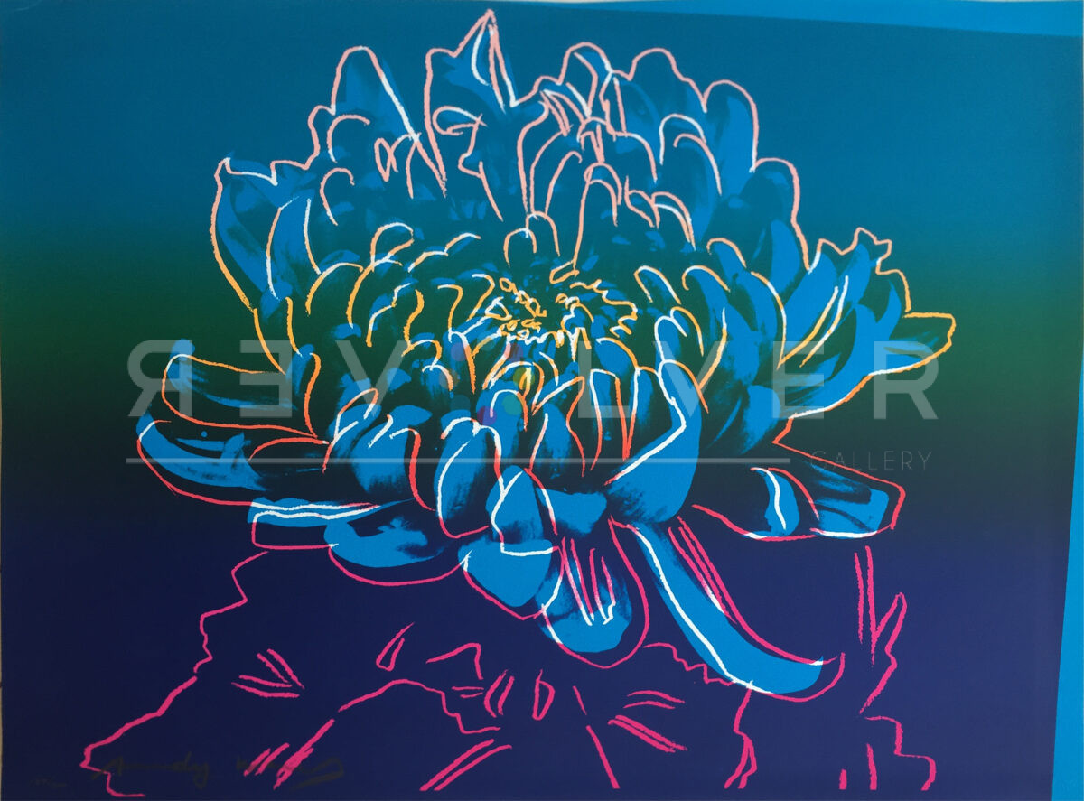
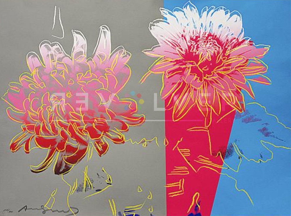
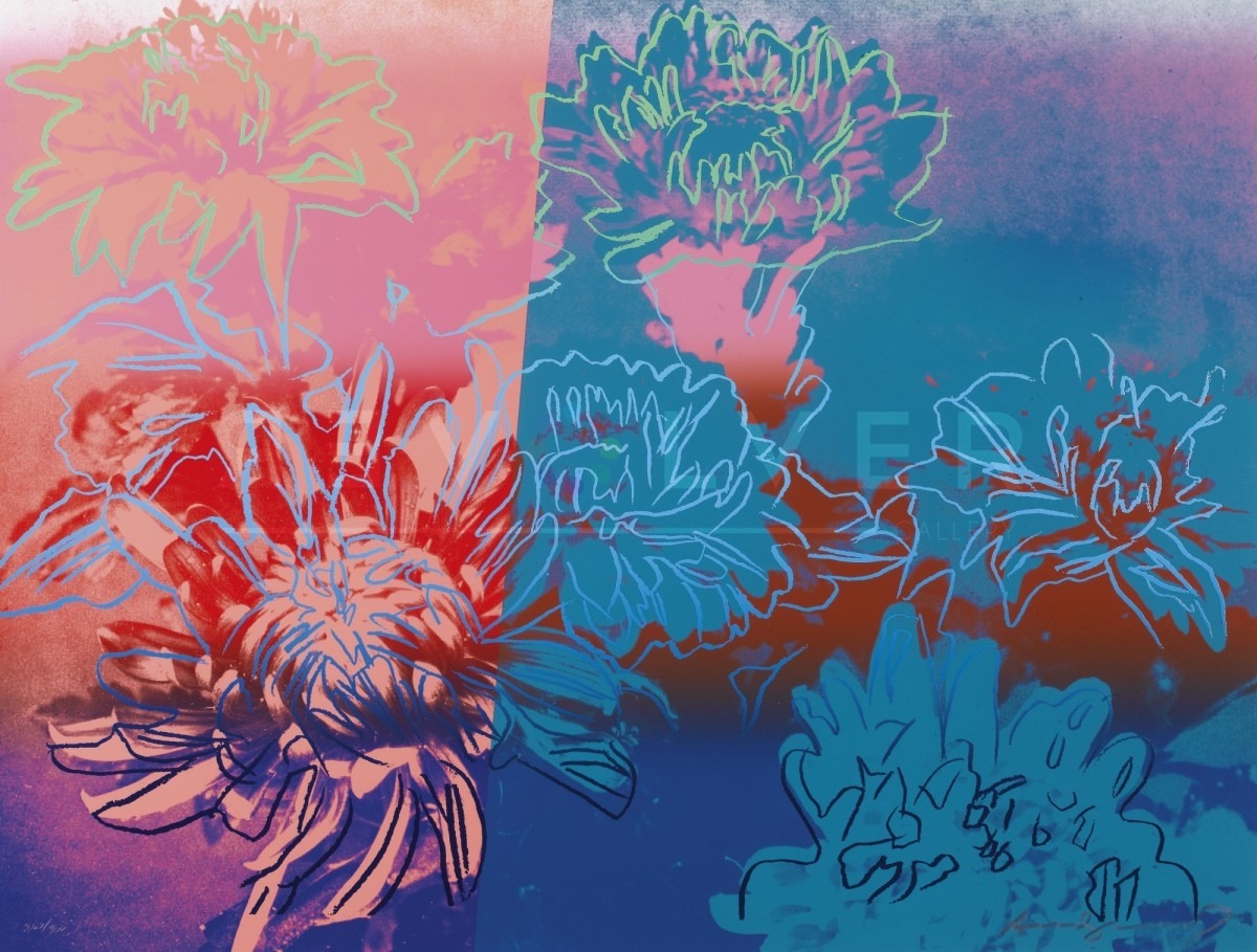
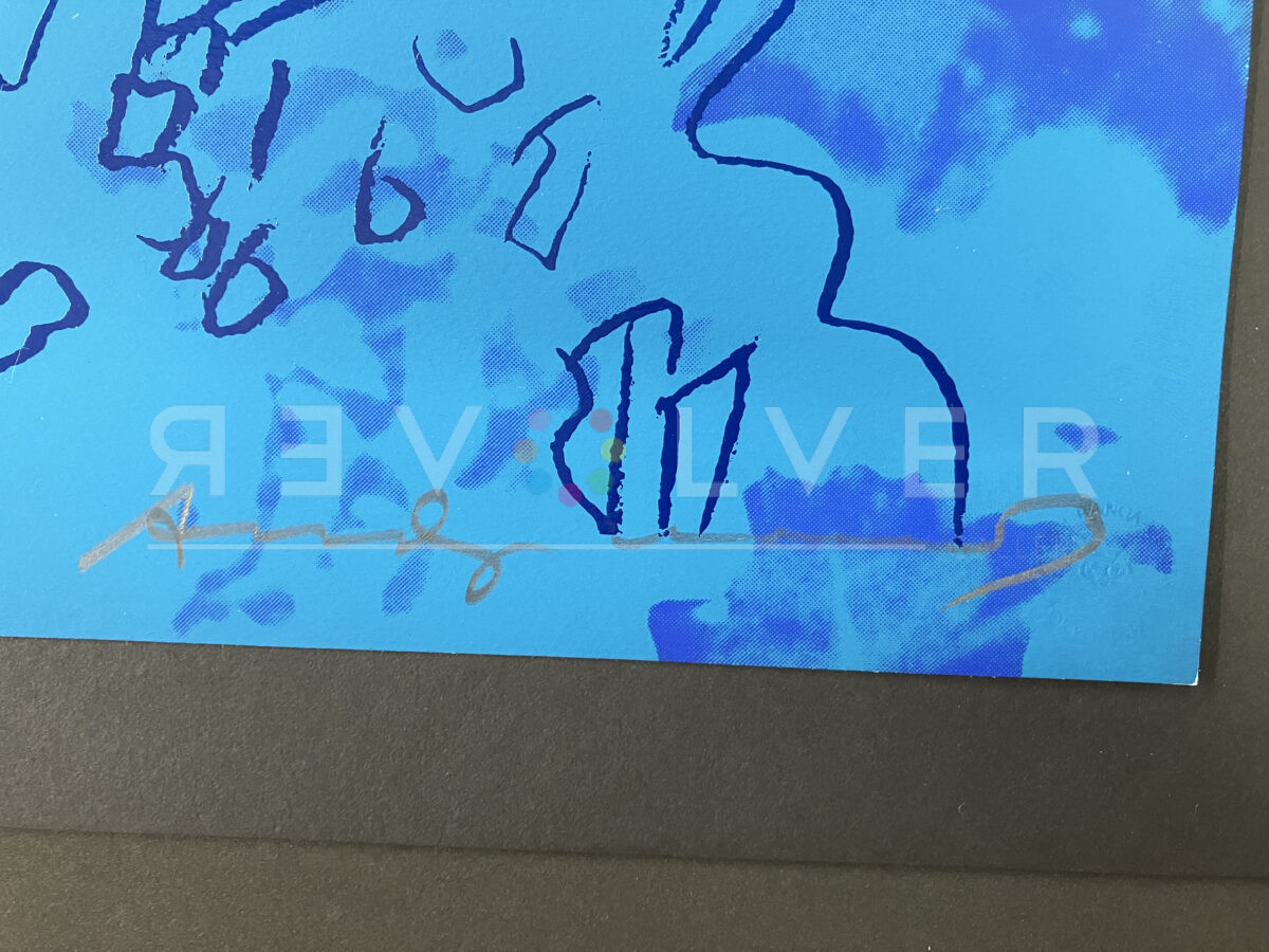
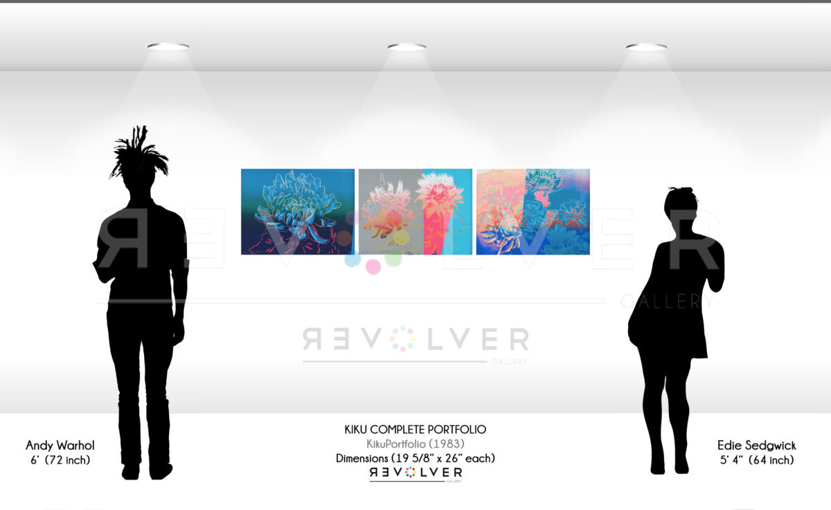
However, the three Kiku compositions stand apart for their unique color explorations and the way they echo the traditional symbolism of the chrysanthemum in Japanese culture. Kiku 307 and Kiku 308 use deep blues and vibrant outlines to accentuate the beauty of the flower, while Kiku 309 employs split background colors to highlight the flower’s delicate nature.
The chrysanthemum’s significance in Japan extends beyond its royal connotations; it is also a symbol of autumn, harvest, and goodwill, frequently appearing in a wide array of Japanese art and decoration. Warhol’s interpretation in the Kiku series respects this tradition while showcasing his signature pop art style—bold colors and outlines that transform the familiar into something extraordinary.
This portfolio not only exemplifies Warhol’s confident use of color but also reflects his ability to intertwine contemporary art with traditional themes. The Kiku series is a culturally rich body of work that offers a pop art perspective on a classical subject, making it a coveted collection for connoisseurs of Warhol’s art and admirers of cultural history alike.