


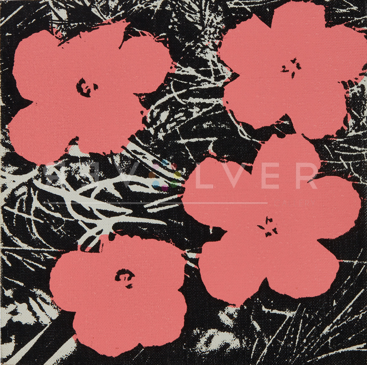
The shift to florals came at a pivotal moment in Warhol’s career. He was preparing for his first solo show at Leo Castelli, the most influential dealer of the Pop era. At the time, Warhol was deep into his Death and Disaster series. These artworks lifted grisly scenes of car crashes, electric chairs, and race riots directly from news clippings and looped through silkscreens with a deadpan glare. But Castelli wanted something different, and so did curator Henry Geldzahler, who—over lunch with Warhol—flipped open the pages of Modern Photography and pointed to the hibiscus image. Warhol took the cue and began churning out his first series of Flowers paintings in multiple sizes. The works ranged from small canvases to towering 82-inch squares. He then arranged them in immersive grids, covering the gallery walls like wallpaper. The entire 1964 Castelli show sold out.

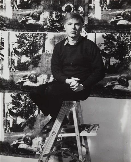
But the real hothouse for these blooms wasn’t the gallery—it was The Factory. Warhol’s infamous studio and social experiment in art, celebrity and mass production. It was the most unnatural of places—encased in silver foil and buzzing with the frenetic energy of avant-garde actors, drag queens, rock stars, and socialites. The Factory was a collision of speed, artifice, and ceaseless production. Warhol oversaw the production of art like an assembly line and remade socialites and Superstars into icons.

In this metallic, industrial playground, Warhol’s floral works were uncanny guests—flashes of nature and beauty within a synthetic landscape. Flowers, by their very essence, are transient, organic, fleeting. Warhol’s versions? Flat, reproducible, immune to decay. Were they an homage to nature’s beauty, or a sly commentary on how even the most delicate subjects could be sucked into the whirlpool of mass production? Perhaps both. They hovered in anonymous space, severed from roots and context—beautiful, yes, but eerily devoid of life. In a studio that celebrated the mechanical, they were the perfect symbol of nature reimagined by mass production.
Despite their bright palette, Flowers carried a shadow. As Warhol’s assistant Ronnie Cutrone later recalled, “Don’t forget, at that time, there was flower power and flower children. We were the roots—the dark roots—of that whole movement… When Warhol made Flowers, it reflected the urban, dark, death side of that whole thing.”
At the Factory, death and flowers shared the same wallspace. If the Death and Disaster series forced viewers to stare mortality in the face, Flowers offered a counterpoint. It was an artificial paradise—a pixelated Garden of Eden where nothing ever wilts.
Placed side by side, the two bodies of work reveal Warhol’s central paradox: beauty and horror, life and death, each rendered with the same disinterested gaze. The flowers don’t redeem the tragedies. They don’t even comment on them directly. They simply coexisted with them. But their presence suggests something—maybe escapism, maybe mockery, maybe the absurdity of aestheticizing everything, even grief.


Warhol returned to the image again in 1970 for his Flowers print portfolio. Now screen-printed on paper, the ten prints pushed the psychedelic palette even further, with vibrant Day-Glo hues that gave the blooms an almost radioactive glow. Though the prints were easier to collect than the paintings, they retained the same conceptual bite: repetition, commodification, and a pop-ified twist on nature itself.

Like his Marilyn Monroe print portfolio—also based on mass-media images and produced in multiple colorways—Warhol’s Flowers are surface-level spectacles that continue to provoke deeper questions: about originality, about beauty, and about how meaning mutates in the age of reproduction. By the time he produced the print portfolio, the way he approached this subject had become more self-aware, even cautious—a subtle pivot tempered by questions not just of aesthetics, but of ownership.
Flowers, Copyright, and the Art of Appropriation
When Warhol created the Flowers portfolio, appropriating imagery from mass media was already standard practice for him. His portraits of Marilyn Monroe, Elizabeth Taylor and Elvis Presley came from film stills and publicity photos. His Death and Disaster series sourced harrowing new photographs of car crashes and suicides. Ads, press clippings and commercial graphics were all fair game. But Flowers marked the first time he was sued for it.

When Patricia Caulfield recognized her photograph in Warhol’s work, she sued him for unauthorized use. As a result, the lawsuit nudged Warhol into new territory. It pushed him away from lifting source material directly from magazines and toward using his own photography. That shift shaped entire bodies of later work, from the pop portraits of Ladies and Gentlemen and Mick Jagger to the still life experimentations of Skulls, Hammer and Sickle and Space Fruit.
More importantly. it also redefined the stakes of appropriation. Warhol wasn’t just copying—he was transforming, recontextualizing, mechanizing. But in a world increasingly attentive to authorship and intellectual property, even Warhol’s artistic license was vulnerable to litigation. The legal questions raised by Flowers—about originality, authorship, and art as repetition—would come roaring back into the spotlight decades later, in the Lynn Goldsmith case. This lawsuit, settled by the Supreme Court in 2023, involved Warhol’s silkscreen portraits of Prince. Then as now, Flowers poses the ever-relevant question: Where does inspiration end and theft begin?
The Cultural Bloom: Warhol’s Flowers and the 1960s
It’s no coincidence that Warhol’s Flowers burst onto the scene in 1964. At the same time that Warhol’s appropriation of Caufield’s hibiscus blooms was stirring legal questions, the image of flowers was taking on new life in the public imagination. The 1960s were an era of radicalism, peace protests, and flower power—both literal and symbolic. Activists wore daisies in their hair and placed blooms in the barrels of guns, musicians donned floral prints as statements of rebellion, and gardens became sites of resistance. The flower became the symbol of a new kind of resistance—gentle but defiant, soft but subversive.


Warhol’s Flowers arrived at the perfect moment, slipping effortlessly into the visual lexicon of the time. But were they a celebration or a critique? A love-letter or a send-up? With Warhol, the answer is always yes. His flowers, stripped of their stems, float in undefined space—beautiful but dislocated, a metaphor for the way pop culture turns even nature into an aesthetic, a product to be consumed. Like so much of his work, Flowers exists in an ambiguous space, teetering between sincerity and satire, between adoration and commodification.
In this sense, Warhol gave the era its own hall of mirrors. His Flowers looked the part; bright, repetitive, ready for posters and T-shirts. But dig a little deeper and the sincerity starts to fray. These weren’t wildflowers—they were borrowed from a magazine, cropped, flattened and stripped of all context. No soil, no stem, no sky. Just the bloom, replicated ad infinitum.
In the cultural bloom of the 1960s, Warhol’s Flowers were neither wholly protest nor wholly product. They were something else entirely: a mirror held up to a world trying to beautify its horrors and commercialize its ideas. A pop bouquet for a dissonant age.
A Softer Touch: Warhol’s Flowers (Black and White) and Hand-Colored Series

While the Flowers series may have emerged from the industrial glare of The Factory and the visual noise of the 1960s, his fascination with florals stretched far beyond that time. Over the next two decades, he returned to the theme again and again. Each time he approached them with a different sensibility, a shift in tone, new contexts and sources. The 1974 Flowers (Black and White) and Flowers (Hand Colored) collections showcase a more personal, even delicate, side of his artistry, recalling his early work as an illustrator.
These prints reveal a softer Warhol — one who, despite his love for mechanical reproduction, occasionally indulged in the personal touch of hand-coloring. These works also mark a return to the aesthetics of Warhol’s 1950s illustration career. Gone are the electric hues and photo-sourced forms of the original Flowers. In their place: thin lines, delicate contours and a touch that feels more intimate than industrial.
In Flowers (Black and White), Warhol sourced images not from the popular media or commercial photography, but from a wallpaper catalog—Interpretive Flower Designs by Mrs. Raymond Russ Stolz. Using an opaque projector, he traced the floral patterns and transformed them into screenprints. He retained the decorative charm of the originals while stripping them of color and context. The results are elegant, even wistful. The ten black-and-white prints feel closer to his early work as a fashion illustrator than the Pop Art king he had become.

The Flowers (Hand-Colored) portfolio, created alongside the black-and-white series, used the same traced designs but added muted watercolor dyes, applied by Warhol’s assistants using Dr. Martin’s aniline inks. The colors bleed beyond the lines, loose and expressive, lending a painterly quality rarely seen in his prints. Each work is unique and no two colorings are exactly the same. In this way, they break with Warhol’s obsession with repetition. As their title suggests, they show Warhol indulging in the idea of the handmade, at a time when he was often criticized for being too removed from making his own art.

The shift in tone was not just technical—it was also cultural. That same year, Warhol traveled to Japan for his first solo exhibition in Tokyo, where he met Sofu Teshigahara, master of ikebana and founder of the Sogetsu School of flower arrangement. Warhol took Polaroid portraits of Teshigahara and his daughter Kasumi and later visited a Sogetsu Ikebana exhibition just as it was being installed.
The meeting left an impression. Warhol’s exposure to the philosophy of ikebana—beauty in impermanence, gesture, and composition—may have informed the delicacy and variation of his Hand-Colored Flowers. More than a stylistic detour, the series reflected a broadening of Warhol’s artistic lens, opening up to traditions of floral expression and symbolism beyond Western art.
Kiku: Warhol’s Chrysanthemums in Bloom
This brief but meaningful encounter with Japanese aesthetics would resonate again in 1983, when Warhol was commissioned by the Gengdai Hanga Center in Tokyo to revisit floral themes with Kiku—an elegant, almost ethereal series depicting Japanese chrysanthemums. These works display a distinctly different aesthetic from his earlier floral imagery — less pop, more poetic, with visual themes that communicate the soft essence of a haiku. Kiku serves as proof that Warhol’s relationship with flowers wasn’t just a passing fancy but an ever-evolving dialogue between the natural and the artificial, the East and the West, the handmade and the manufactured.
Where the 1960s Flowers were brazenly mechanical and the 1974 Black and White and Hand-Colored Flowers returned to a more intimate, illustrative mode, Kiku occupies its own quiet register. It reflects a moment of aesthetic clarity—Warhol, in dialogue with Japanese traditions of symbolism, ephemerality, and restraint. While rich in saturated color and outlined with a confident hand, the chrysanthemums are rendered with a softness that feels contemplative rather than commercial—at once assertive in their color blocking, yet meditative in their subtle gestures.

Chrysanthemums, or kiku, hold deep cultural resonance in Japan. They are the emblem of the Imperial House and carry connotations of longevity, nobility and rejuvenation. They also symbolize autumn, harvest, and the graceful impermanence of life—concepts that align surprisingly well with Warhol’s own fascination with cycles of beauty, decay and mortality. In this context, Kiku doesn’t read as a cultural pastiche, but as a sincere meditation on impermanence and iconography through a Pop Art lens.
Each of the three screenprints in the Kiku portfolio offers a distinct take on the flower: Kiku 307 and 308 use rich navy and violet tones to give the blossoms a near-luminouos depth, while Kiku 309 plays with split backgrounds to emphasize contrast and form. The linework is delicate and the gestures looser than what we expect from Warhol. The series suggests a return to drawing, to a personal relationship with the image, continuing the thread that began with the Black and White Flowers and Hand-Colored Flowers. But it also stands on its own: culturally rooted, visually restrained and emotionally resonant.
Warhol may be best known for his icons of American consumerism, but Kiku shows us that he was also a lifelong student of image-making across cultures. The floral motif evolved throughout Warhol’s career, and what began as a flat, mass-produced bouquet evolved into a layered dialogue—between the mechanical and the handmade, the global and the personal, the decorative and the deeply symbolic.
Warhol’s Flowers Today: Still in Bloom
Fast forward sixty years, and Warhol’s Flowers remain as fresh—and unsettling—as ever. Their petals have outlived the decade that birthed them, transcending the bounds of the art world, infiltrating fashion, design, and the media, to become enduring icons of contemporary visual culture.
Much of that staying power is thanks to The Andy Warhol Foundation, which has ingeniously kept Flowers in the public eye through bold collaborations with global brands. Uniqlo, Estée Lauder, and Comme des Garçons have all reimagined Warhol’s florals for new audiences. Streetwear, t-shirts, fragrance bottles, runway collections and limited-edition releases bear the motif. These partnerships do more than just commercialize the image; they underscore the original idea of the work: beauty as product, repetition as permanence, art as mass communication.


Meanwhile, in galleries and museums, Warhol’s Flowers continue to provoke and enchant, their paradoxical blend of nature and artifice as relevant as ever. They speak to our world of digital imagery and endless reproduction, where beauty is instant, fleeting, and endlessly replicated, and things as transient as flowers can take on new life in our cultural consciousness.
The Surface is the Message
Warhol’s famous words—“If you want to know all about Andy Warhol, just look at the surface of my paintings and films and me, and there I am. There’s nothing behind it.”—are often taken at face value. But Flowers complicates and reveals the brilliance in that statement. Flowers, after all, are the ultimate surface-level beauty. They exist to be seen, to dazzle, to attract. We rarely consider the buried roots, the dirt, the inevitable decay that comes unnoticed in spots of rot and wrinkle. We admire the bloom and move on.
Warhol’s Flowers carry the illusion of being the whole story, just as Warhol’s art often pretends to offer everything up at once. No narrative, no development, no “depth”, they mimic this ephemerality. They are pure surface — repetitive, depthless, unanchored by any background. But therein lies their brilliance. They force us to reconsider the meaning of beauty, the role of art in mass culture, and the uneasy intersection of nature and industry. The whole point is not that there’s nothing behind Warhol’s work — it’s that looking for “behind” is missing the point. Maybe it’s about the power of emergence, the insistence of beauty, and the realization that sometimes, the surface isn’t where meaning ends — it’s where it begins.
And like so much of Warhol’s work, Flowers blurs the line between beauty and mass production. They’re as instantly recognizable—and endlessly replicated—as his portraits of Marilyn Monroe or Elvis Presley. Those images, too, were lifted from publicity stills and film frames, moments designed to be seen. Marilyn’s parted lips, Elvis’s pistol pose—these aren’t windows into their inner lives. They’re surface-level gestures made iconic through repetition. Like the hibiscus blooms in Flowers, they become symbols of visibility itself, flattened into signs that outlive their original context.
Maybe that’s the real resonance of Flowers—not just as symbols of beauty or irony, but of emergence. Warhol, who understood visual culture better than anyone, found in a bloom not just a subject, but a statement. Like the spring itself that is upon us, flowers arrive suddenly, insistently, unapologetically. They don’t just invite your attention—they demand it. In that sense, Warhol’s surface isn’t empty. It’s charged. It’s where image becomes icon. Where nature meets culture. Where pop begins.
