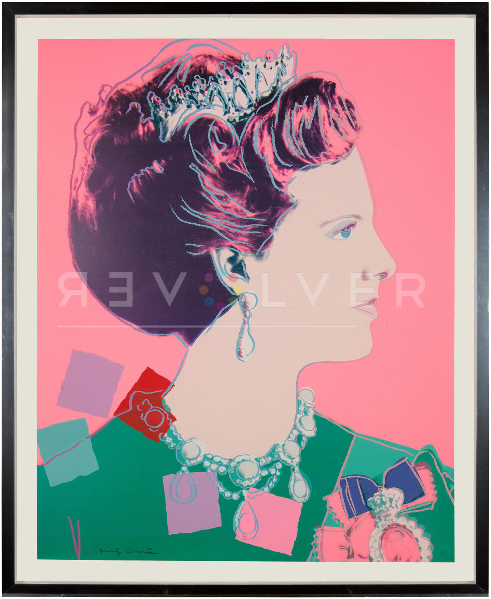
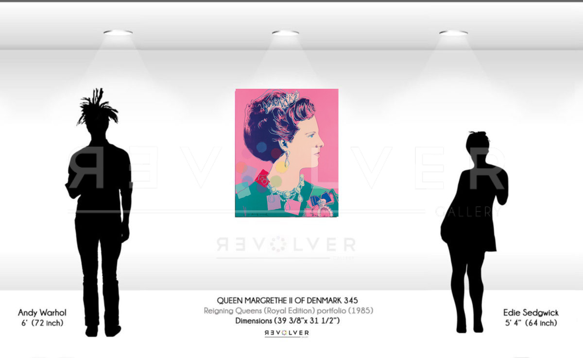

Queen Margrethe II 345 by Andy Warhol is a portrait from the Reigning Queens series published in 1985. The series includes sixteen portraits of reigning queens at the time. Included in this series are Queen Margrethe II of Denmark, Queen Ntombi Twala of Swaziland, Queen Elizabeth II of the United Kingdom, and Queen Beatrix of the Netherlands.
Warhol captured the queens as individual female rulers, not just as royal women married to a king. In this series, Warhol uses bold colors similar to his portraits of male leaders, such as Richard Nixon, Mao Zedong, Jimmy Carter, and Vladimir Lenin. His portraits of male political leaders depict them as intimidating, serious men. However, instead of using deep reds or rusty oranges Warhol utilizes bright pink to emphasize the queen’s femininity.
In Reigning Queens he played on his subjects’ mystique and femininity. In his later series, Reigning Queens (Royal Edition), he accented these portraits with diamond dust to further emphasize the elegance of the queens.
Surprisingly, Warhol did not want this series to be shown in America. In fact, he became infuriated with George Mulder, a print publisher, for showing the portfolio. Warhol expressed his frustration in his diary. “I had my opening at Leo Castelli’s to go to, of the Reigning Queens portfolio that I just hate George Mulder for showing here in America. They were supposed to be only for Europe—nobody here cares about royalty and it’ll be another bad review”. Written in 1985.
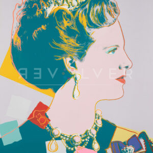
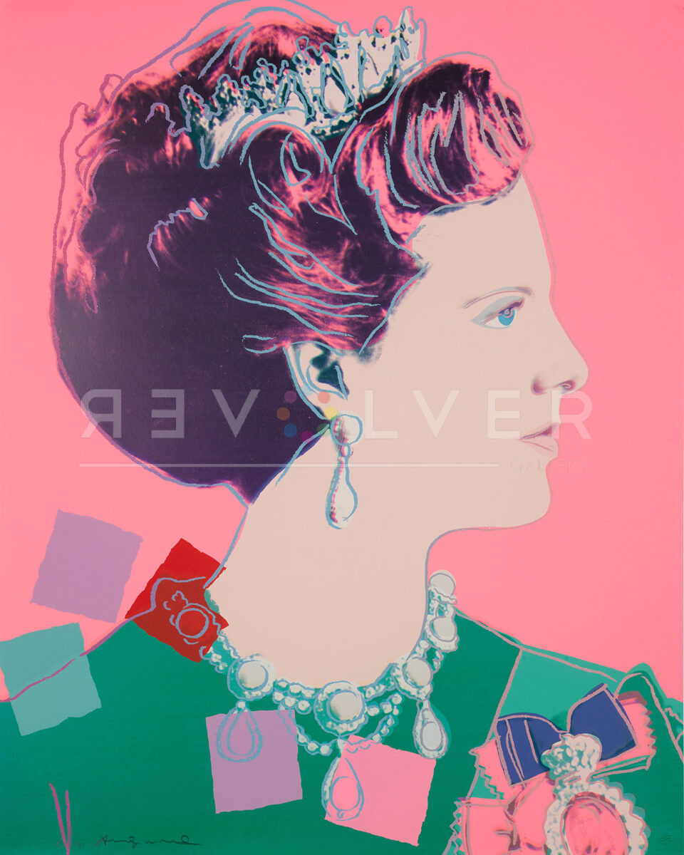
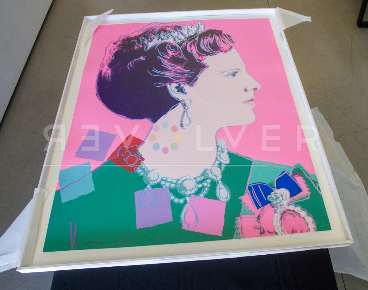
Even though the subjects in this series are royalty, Warhol presents them as celebrities similar to his other works. Compared to his other portraits of Queen Margrethe, Warhol uses bright, vibrant colors in Queen Margrethe 345 that match his signature Pop Art style.
Warhol’s use of colorful patches throughout the portrait marks a shift from his usual technique. The screen print thus exhibits some elements of collage, similar to his Mick Jagger portfolio. These patches add a new element to the series, making these portraits slightly different from his traditional works. These patches are strategically placed to bring your attention to the queen’s jewelry, reminding the viewer of her opulence.
Warhol uses colors that don’t quite match, but function to take your eyes away from most of the positive space. The Queen’s hair blends in with the background, but her crown is the brightest area in the portrait. The crown on her head stands out more than every other element in this portrait. The viewer’s eyes instinctively notice the crown. This element shows, above all else, that she isn’t a celebrity like his other subjects, but a truly royal figure. The crown is the defining feature in Queen Margrethe II, and serves as a reminder that she is a powerful monarch.
Photo credits:
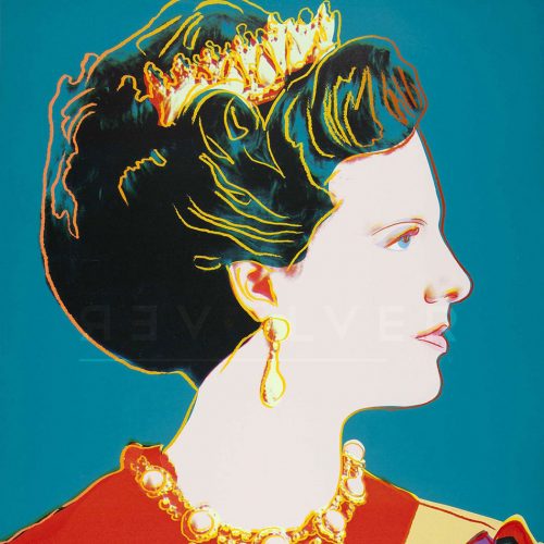
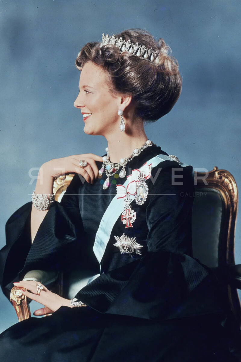
- The first official photograph of Queen Margrethe II of Denmark after her ascension to the throne in 1972. Courtesy of the Hulton and Getty archives.
- Andy Warhol signing an offset lithograph that was issued for the promotion of the print of Queen Beatrix of the Netherlands. Unknown photographer.