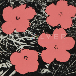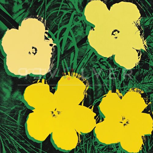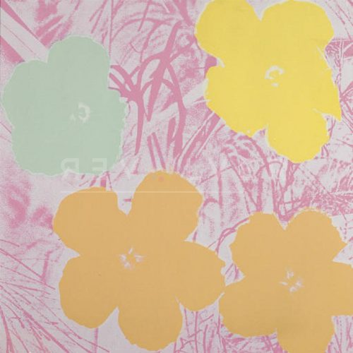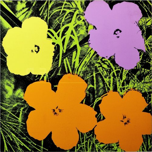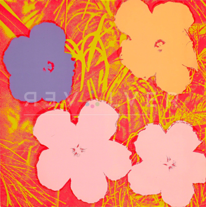
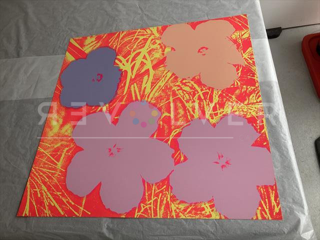
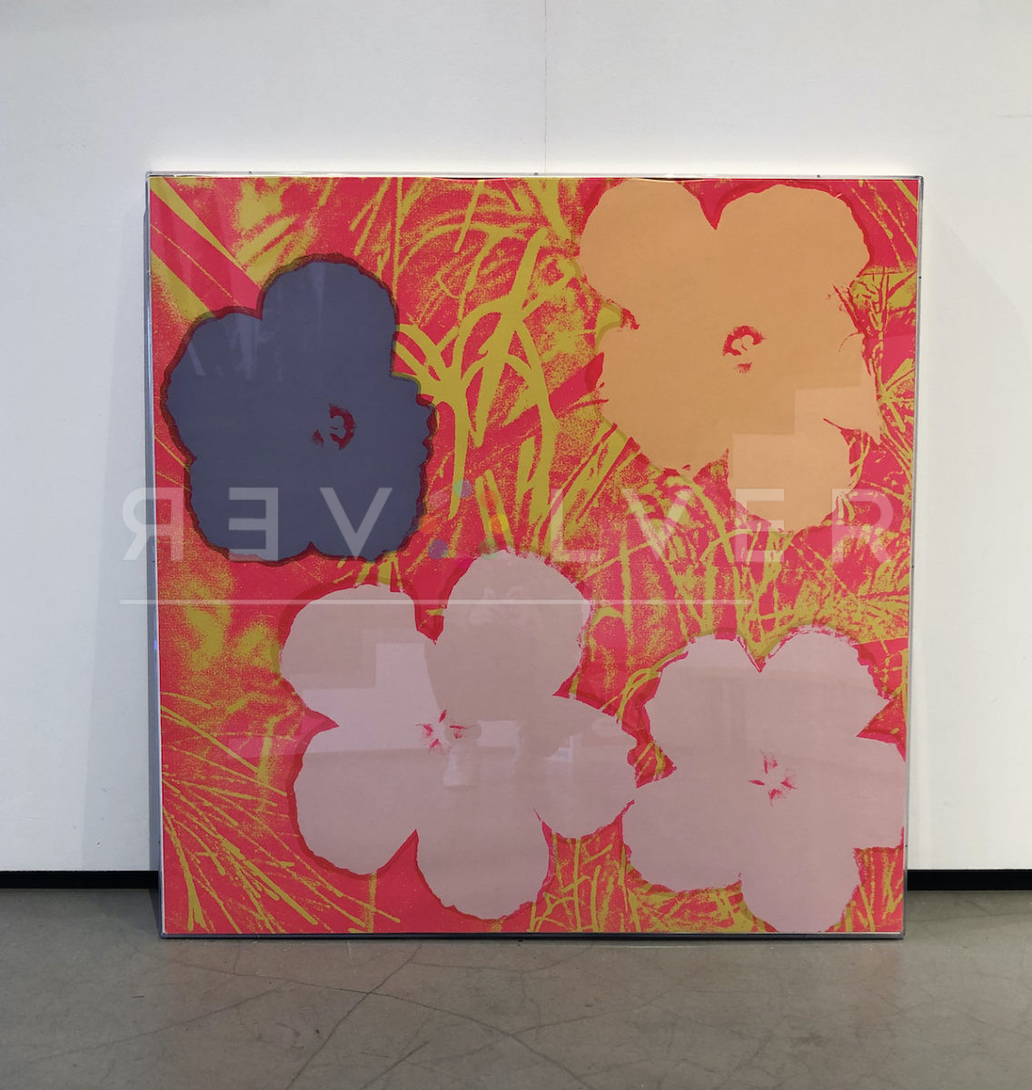
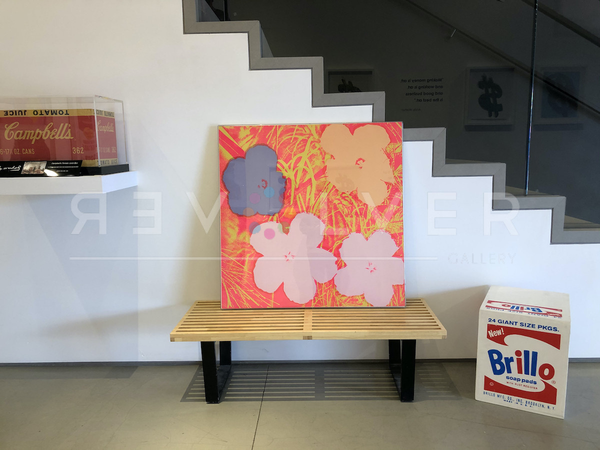
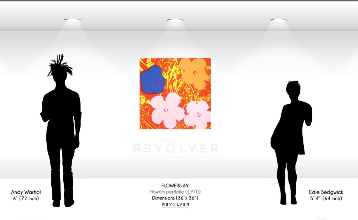
Flowers 69 by Andy Warhol is a screenprint from the artist’s Flowers portfolio, published in 1970. The clash of radiant colors in Flowers 69 is distinctive of Warhol’s Pop sensibilities. In this image, he amplifies the appearance of hibiscus flowers blooming in a field of grass. By removing minute details and leaving the naked shape of four flowers, Warhol distills the subject’s beauty to its quintessence. “In the sixties,” he said, “you’d go and play up what a thing really was, you’d leave it ‘as is’.” Though the flowers appear stripped down, even deconstructed, they are still easily recognizable and familiar. Moreover, Warhol knew he could employ color and contrast to modernize such a classic symbol.
Warhol first revealed his Flowers portfolio in 1964 at the Leo Castelli gallery. He revisited the subject again in 1970 and went on to create additional portfolios, like Flowers (Hand-Colored) and Flowers (Black and White). Warhol often professed that he most enjoyed portraying the things he liked, and he had a clear affection for flowers. Additionally, the artist aimed to leave his mark on the timeless subject.
Warhol used a picture from the 1964 issue of Modern Photography for Flowers 69 and the rest of the prints in this series. His friend Henry Geldzahler found the photograph, and suggested he paint it in the spirit of portraying a more peaceful subject. Photographer Patricia Caulfield sued Warhol a few years later when she discovered the appropriation of her image. After, she won the case and even took home two prints from the collection. The incident troubled Warhol; from then on he chose to shoot his own photographs. “His entry into photography vis à vis his creation of silkscreen paintings was done out of necessity,” Gerard Malanga explained.
Flowers 69 displays the pale pink, blue and orange flowers against a hellish red backdrop. While the hibiscus blossoms remain front and center in this print, the intense, near-blinding hues in the background overshadow them. More than likely, Warhol chose to present the foreground as less important to challenge others’ expectations. After all, he claimed “Pop is just taking the outside and putting it on the inside or taking the inside and putting it on the outside”. With that being said, the choice to use loud, electric colors is characteristic of Warhol’s standpoint as a Pop artist. With a strong background in commercial art, Warhol always intended to magnetize the viewer’s attention. This approach is also particularly evident in Andy Warhol’s Marilyn Monroe portfolio as well as his later, 1985 Ads series. Therefore, it’s likely that, partly due to his training, he naturally made Flowers 69 as arresting as possible.
The 1970 Flowers series is a true classic and one of the most iconic works of Warhol’s career. It also marked the start of a productive decade for Warhol. In the ‘70s he would write his first book, The Philosophy of Andy Warhol (From A to B and Back Again), create the album cover for the Rolling Stones’ Sticky Fingers and publish numerous series like Space Fruit and Electric Chairs. Flowers 69 takes root as the beautiful budding of Andy Warhol’s artistic evolution that continues to blossom with every passing season.
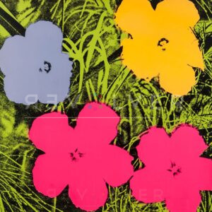
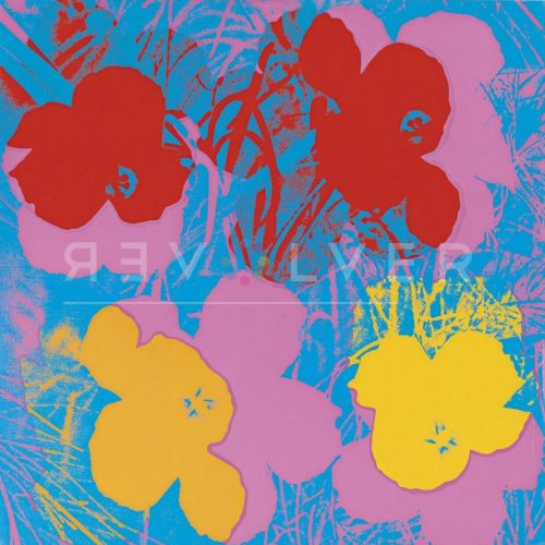
The Flowers series also includes Flowers 6, Flowers 71, and Flowers 73.
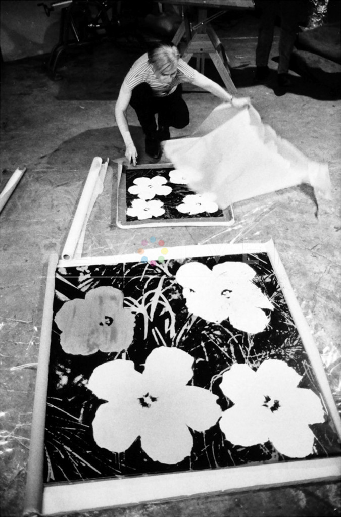
Photo credit: Andy Warhol silk-screening Flowers, 1965-7. Photo by © Stephen Shore.